SCROLLWORK
Unit III · Lesson 11BROAD NIBS & POINTED NIBS
Professor Quillberry Nocturne
Master Scribe & Illuminator
The Scrollwork Library • School of Evershade
Professor's Introduction
Settle, scholars, and welcome to the last lesson of our third unit.
In our ninth lesson, you studied the feather: its structure, its curing, the reason the left wing was prized. In our tenth, you studied the cut: the slit, the bevel, the moment a feather becomes a pen. Tonight we finish the arc and ask the question the cut has been waiting for: now that you can shape a nib, which shape do you choose?
Every nib in the history of writing belongs to one of two great families. The broad edge: a flat, chisel-like tip that makes thick and thin strokes according to the angle at which you hold it. The pointed nib: a fine, flexible tip that makes thick and thin strokes according to the pressure of your hand. Same ink. Same hand. Utterly different writing.
This is not a lesson about which family is better. That question has no answer, and I distrust students who ask it. This is a lesson about what each family can do, what each one cost history to invent, and how the tool in your hand quietly decides what your letters are allowed to become.
Choose carefully. The nib always has opinions.
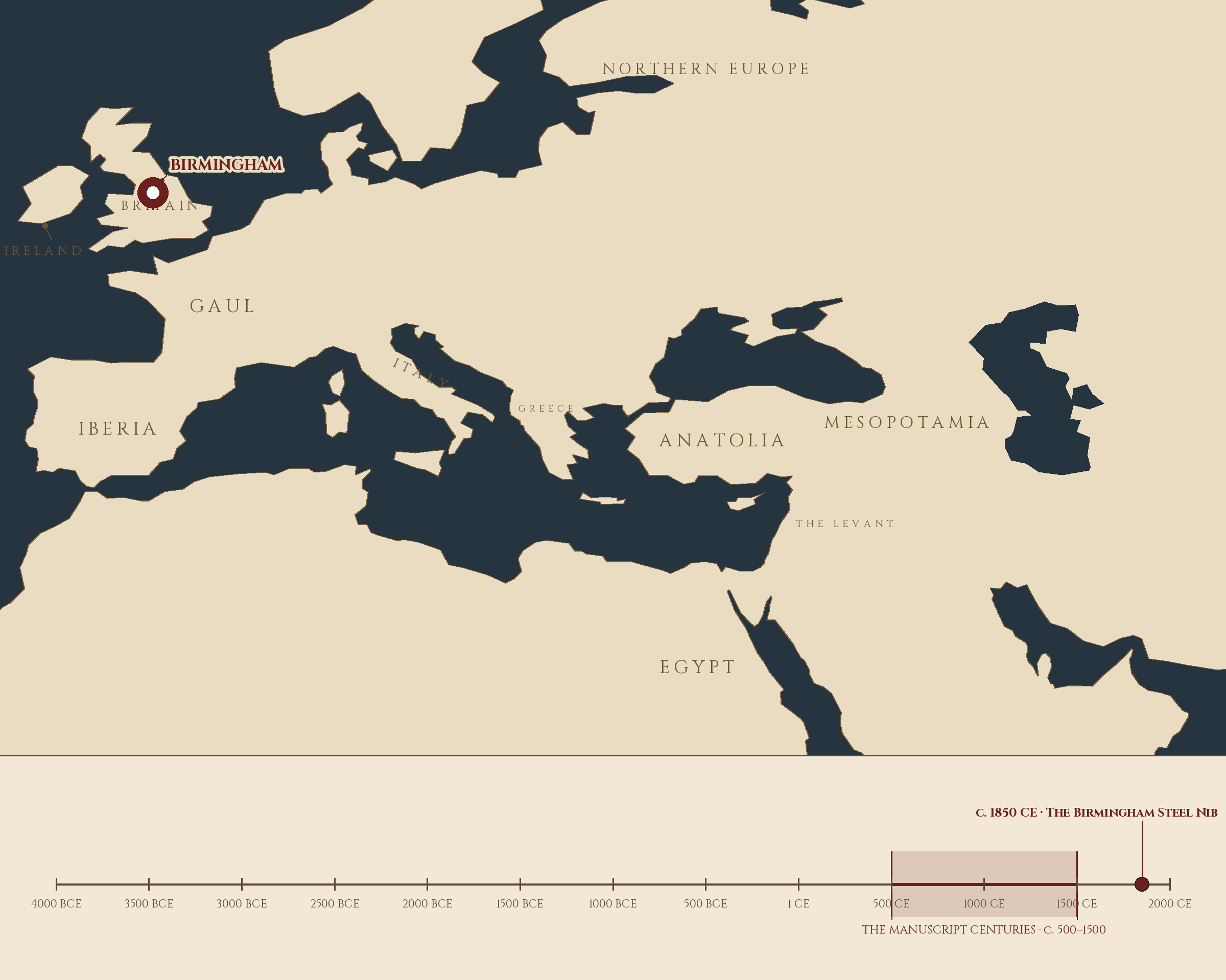
Where and when: Birmingham, England, c. 1850 CE — The Birmingham Steel Nib. The pin is this lesson. The line beneath the map is our road: every stop a place where writing changed, every lesson a pin.
Lesson Objectives
By the end of this lesson, students should be able to:
- Define the broad-edge nib and the pointed nib and distinguish the two families.
- Explain how the broad-edge nib creates thick-thin contrast through pen angle.
- Explain how the pointed nib creates thick-thin contrast through pressure variation.
- Describe the historical arc from the broad reed and quill to the Birmingham steel nib.
- Compare Copperplate and Spencerian as the two great pointed-pen scripts.
- Choose the appropriate nib family for a given script and justify the choice.
- Trace the full arc of Unit III: from feather, to cut, to nib family.
Reading this lesson: ★ marks the passages to remember. They return on the unit quiz and the class test. Check in questions ask the material back as you go; answer them in your workbook when you meet them.
Working this lesson: Your assignment packet is the first download on this page. Work in it as the lesson moves along, answering each assignment as its subject is taught — or read the lesson through for your notes and take the assignments as homework afterward. Both are proper ways to sit this class. Signposts in the reading tell you where each assignment belongs. Written answers are short answers in your own words; a few honest lines are worth more than a filled page.
Your Assignment Packet
This lesson's assignments live in its packet: the Lexicon Handout (every term, course terms marked ◆), Materials, Guided Practice, the Assignment Manual with its answer key for self-checking, the Reflection Questions, and the Workbook Checklist. Download the packet before you begin and keep it beside you as you read.
The Two Families
Put every writing nib ever made on a long table, from a cut reed found in an Egyptian tomb to a steel point fresh from a Birmingham factory, and they sort themselves into two families. There is no third. Every nib you will ever hold belongs to one of them, and the family decides, before you write a single letter, what kind of thick and thin your writing can have.
Check in: A new nib appears in a shop, made of a material no scribe has used before. What one question — about the shape of its tip alone — decides its family before anything else is known about it?
The broad-edge nib ends in a flat chisel. The pointed nib ends in a fine, flexible point. That is the whole taxonomy, and it is enough, because everything else follows from the shape of the tip: how the ink leaves the pen, where the thick strokes fall, what the hand must do, and which scripts the tool can serve.
★ You have already met the broad edge, though we did not name it then. The reed pen of Lesson 2, the calamus, cut from a hollow stem: slice a reed at an angle and the opening is a flat edge. It is a broad-edge nib by nature, not by design. The quill, cut with a straight-across tip as you learned in Lesson 10, is a broad-edge nib by craft. For thousands of years, nearly all formal writing in the West was done with one broad edge or another. The pointed nib, as a practical everyday tool, is barely two hundred years old. It arrived with the factory, and it changed everything.
Neither family is the better one. I will say this once, and I expect it remembered: the question "which nib should I learn" is really the question "which script do you want to write," and the script chooses the nib, not the student.
❦ In your workbook: record the two families and what decides each one's thick and thin in your own way — copy, sketch, or note what matters.
The Broad Edge: The Ancient Chisel
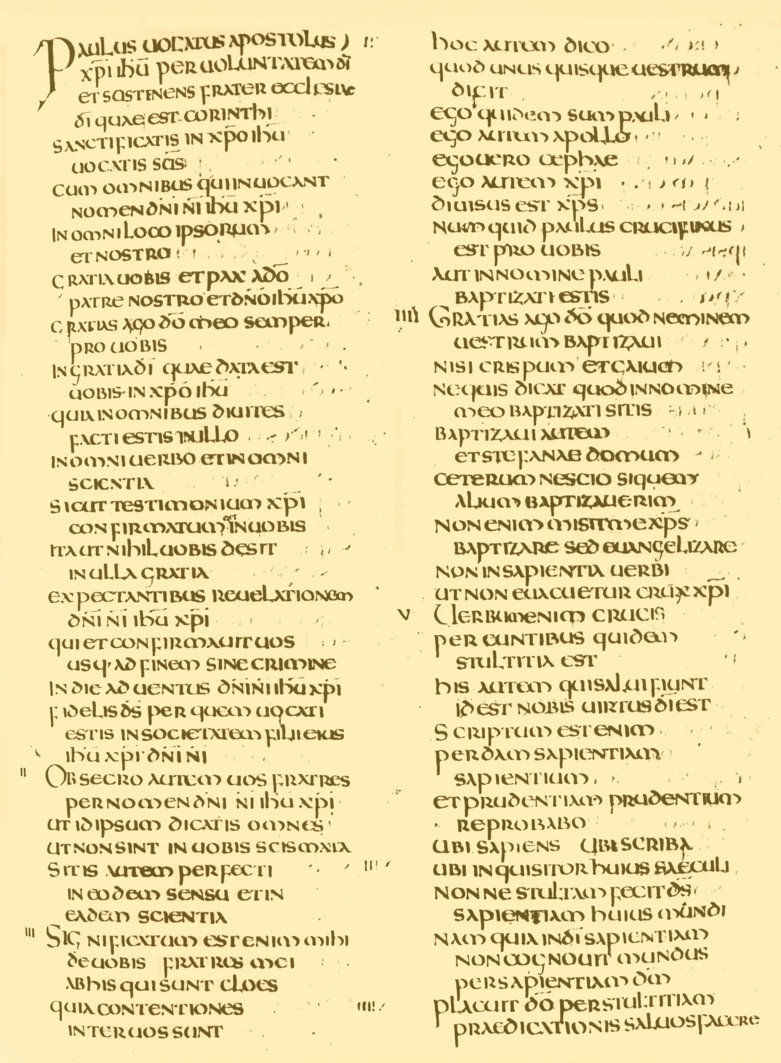
Uncial itself: a working page of the Codex Amiatinus (1 Corinthians), written in Northumbria about 700 in the round, spacious book hand the broad edge was born to write.
Codex Amiatinus, Biblioteca Medicea Laurenziana, Florence, via Wikimedia Commons. Public domain.
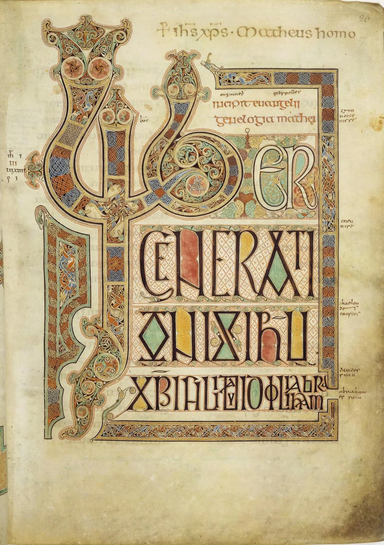
The broad edge at festival pitch: the Lindisfarne scribes' display capitals for the opening of St Matthew, thick downstrokes and hairline turns cut by the same chisel geometry as the Uncial page above.
Lindisfarne Gospels, British Library (Cotton MS Nero D IV), fol. 27r, via Wikimedia Commons. Public domain.
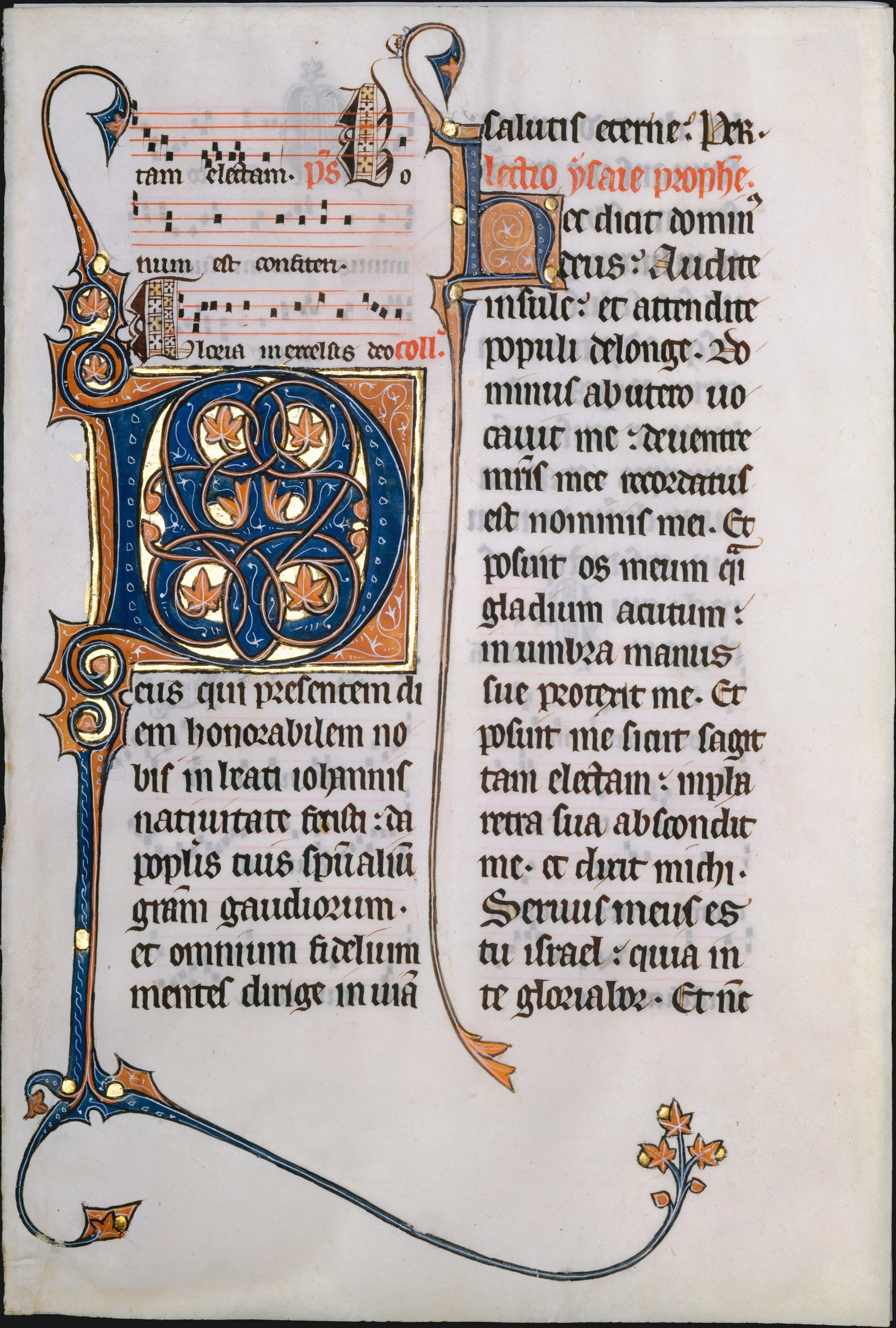
Blackletter in its own century: a missal leaf of about 1290, text in Gothic textualis, every stem ruled by the broad nib's square stop, the diamond foot it leaves when the edge comes down and halts.
Manuscript leaf from a Missal, c. 1290, The Metropolitan Museum of Art, New York. Public domain (Open Access).
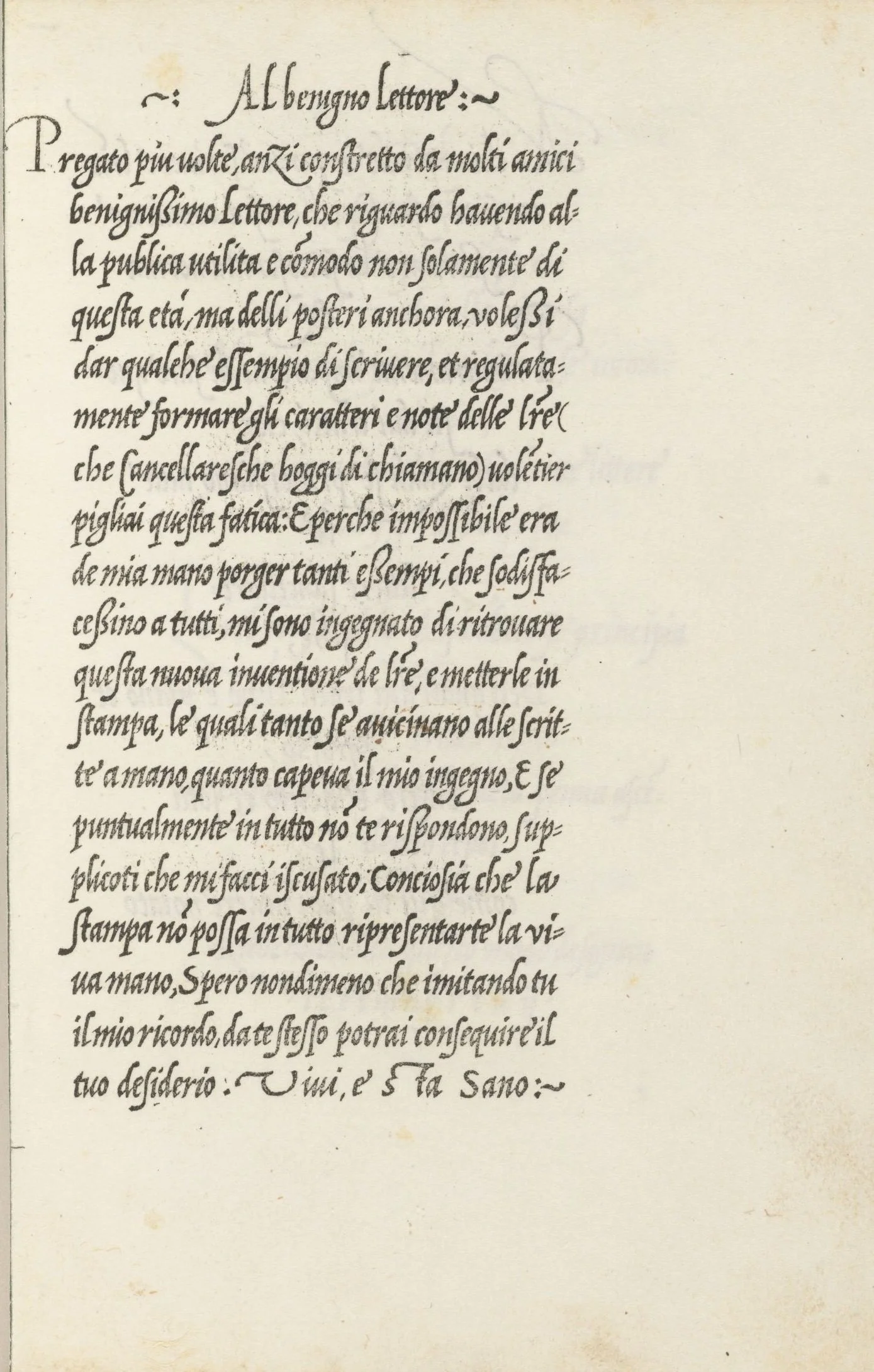
Italic being born: Arrighi teaches the chancery hand in a page written in it, La Operina, Rome, 1520s, the slanted, economical writing that became the Italic of every later century.
Ludovico Arrighi, La Operina (Rome), Houghton Library, Harvard University (TypW 525.24.162), via Wikimedia Commons. Public domain.
★ The broad edge is the elder family, and its logic is geometric. Hold the chisel at a constant angle to the writing line, and the nib does the rest. A stroke pulled across the full width of the edge lays down a thick line. A stroke traveling along the edge, parallel to it, leaves only a hairline. Diagonal strokes fall somewhere between, thickening and thinning as the direction of travel changes against the fixed angle. The writer's job is to keep the angle steady and let the geometry speak.
★ The pen angle — the angle at which the broad edge meets the writing line — is held constant through a script; for Italic, the traditional pen angle is about 45 degrees. At that angle, horizontal and vertical strokes carry nearly equal weight, opposing diagonals contrast strongly, and curves swell and taper — the gradual thickening within a stroke is its swell — as they turn through the angle. Change the angle and you change the hand: the same nib at 30 degrees writes a different Italic than at 45. The English calligrapher Edward Johnston, who revived broad-edge writing in the early twentieth century, taught his students to measure letterforms in pen widths, the width of the nib's edge as a unit, because with the broad edge, the nib itself is the ruler.
Check in: A scholar writes Italic first at 45 degrees, then at 30, with the same nib and the same even pressure, and the letters change character completely. In your own words: what changed, and what did not?
This is the engine behind the great book hands you will study in Unit IV: Uncial's rounded openness, Carolingian's clarity, Blackletter's dense verticality, Italic's slanting grace. Different angles, different widths, different centuries, but one physics. The reed pens of Egypt, the quills of the medieval scriptorium, and the steel broad-edge nibs in a modern calligrapher's drawer all obey it. When you pick up a broad-edge tool, you are holding the oldest technology of formal writing in the world, and it has not needed improving.
❦ In your workbook: record the broad edge: the chisel, the constant angle, and where its thick strokes fall in your own way — copy, sketch, or note what matters.
In your packet: Exercise I — The Angle Alphabet ⚒ begins here. Work it now, or mark the place and take it as homework — your choice.
The Pointed Nib: The Flexible Revolution
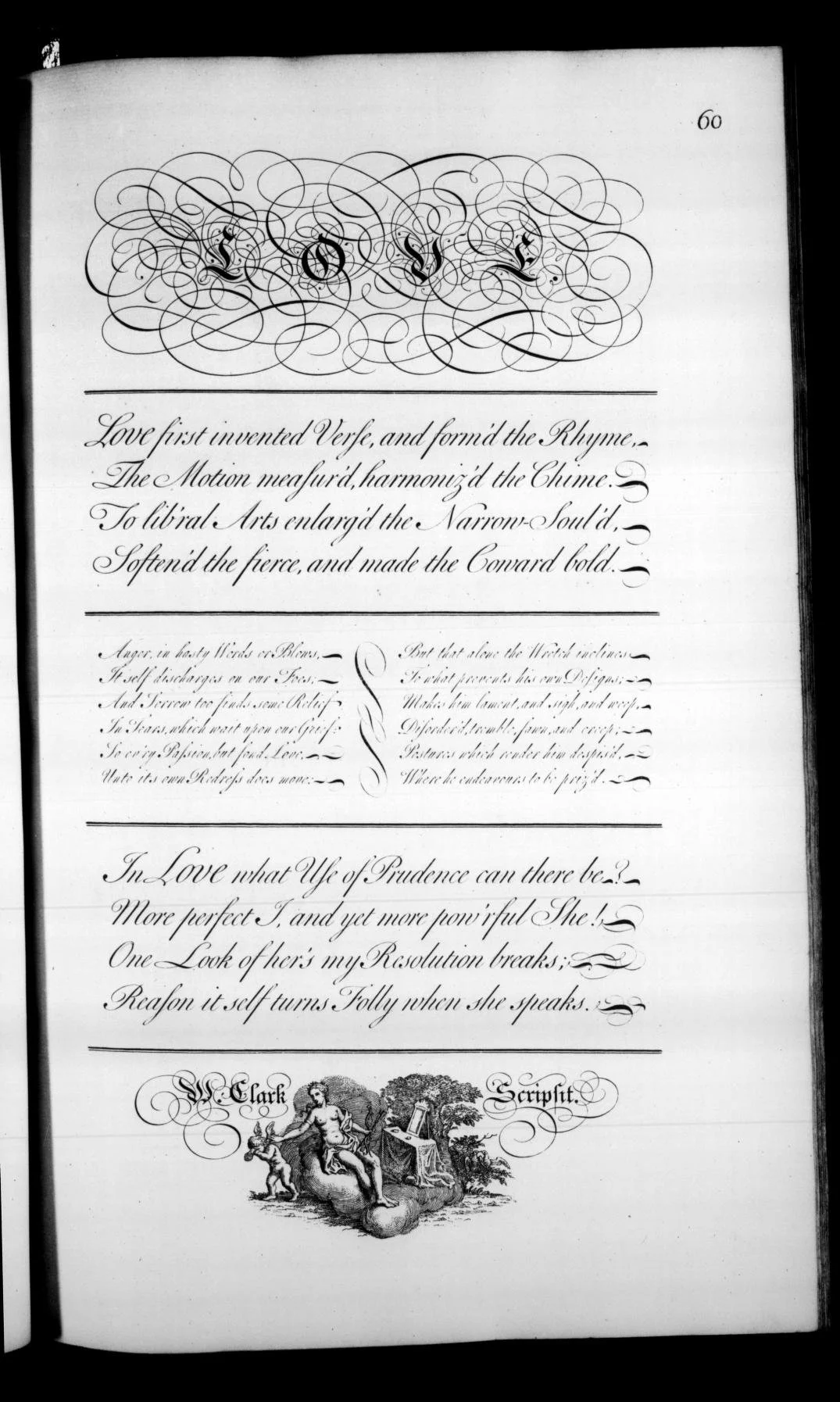
Copperplate in its great pattern book: a plate of Bickham's Universal Penman, every shaded downstroke pressed from the same point that draws the hairlines, work no broad edge could ever make.
George Bickham (engraver), The Universal Penman (London, 1733–41), plate 60, scan via the Internet Archive. Public domain.
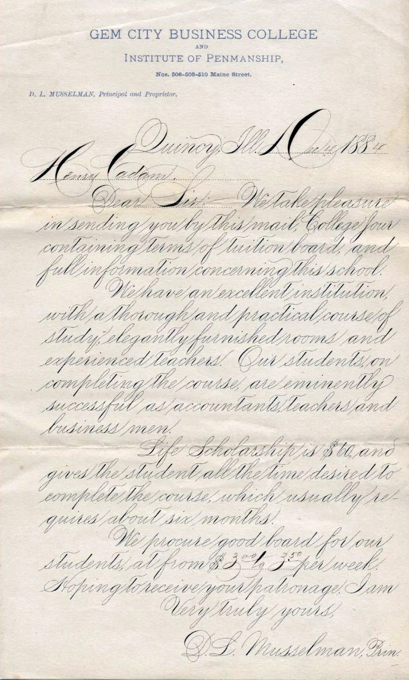
Spencerian at work, not on a copybook page but in business: an 1884 letter in Musselman's hand, the American system Spencer built on the pointed nib, taught in colleges like this one.
Letter of D. L. Musselman, Gem City Business College, 1884, via Wikimedia Commons. Public domain.
★ The pointed nib works on the opposite principle, and it is a child of industry. A fine metal point, slit like a quill, with two tines that flex. Worked stroke by stroke, that flexing is pressure variation: press down and the tines spread, opening a channel that floods the downstroke with ink. That is the shade. Lift the pressure and the tines spring closed, and the pen draws a hairline fine enough to seem drawn by a needle. Thick and thin come not from geometry but from the hand's weight, modulated stroke by stroke, dozens of times in a single word.
★ Metal nibs were not new. Copper-alloy nibs turn up as rare, expensive curiosities from far back in history. What was new, in the 1820s, was Birmingham. In that city's Jewellery Quarter, manufacturer after manufacturer began mass-producing steel dip-pen nibs: John Mitchell pioneering machine-cut nibs, Josiah Mason developing a cheap slip-in nib in 1828, Joseph Gillott building the great pen factories. By the 1850s, Birmingham held over a hundred steel nib manufacturers producing half the nibs in the world, employing thousands of workers, most of them women, turning out nibs by the billion. A precision flexible point that once would have cost a craftsman's day could now be bought for pennies. An American consul in Britain reported that Joseph Gillott's name was known to American schoolchildren as familiarly as Noah Webster's.
Check in: Metal nibs existed for centuries as expensive curiosities. What exactly did Birmingham change? Answer in one sentence, and name whose hands the change put pens into.
The pointed nib made two great scripts possible, and they are the glory of the family.
★ Copperplate, properly English Roundhand, began as the formal cursive of English writing masters in the late seventeenth century, preserved and spread through copybooks engraved on copper plates. George Bickham's The Universal Penman, published between 1733 and 1741, gathered script samples from twenty-five of London's finest writing masters and became the style's bible. The early masters wrote it with broad-edged quills, forcing the round, shaded forms from an unbending tool through sheer skill. But the flexible steel nib was the instrument the engraved ideal had been waiting for: suddenly the swelling shades and hairline ovals of the copybooks could be written as drawn, and Copperplate became the formal hand of the English-speaking world.
★ Spencerian is the American answer, and the younger of the two. Platt Rogers Spencer, an American writing master, developed it in 1840: an oval-based, flowing script designed for speed as well as beauty, meant for the counting house and the correspondence desk rather than the engraver's plate. Spencer took his inspiration, he said, from the smooth pebbles in a stream. He founded schools to teach it; his sons published his Spencerian Key to Practical Penmanship in 1866, two years after his death; and the script became the standard American hand, the official hand of government clerks, taught in common schools from the 1850s until the typewriter displaced it in the 1920s. You have seen it all your life without knowing its name: the Coca-Cola logo is lettered in Spencerian script, and the Ford logo is a hand-drawn script of the same family.
❦ In your workbook: record the pointed nib: the tines, the shade, and the two scripts the factory made possible in your own way — copy, sketch, or note what matters.
In your packet: Exercise II — The Pressure Alphabet ⚒ begins here. Work it now, or mark the place and take it as homework — your choice.
Angle Against Pressure: How the Tool Shapes the Script
Set the two families side by side and the difference is not a matter of taste. It is a matter of what the hand is asked to do.
The broad-edge writer holds one thing constant: the angle. Everything else, the thick strokes, the thin strokes, the swelling curves, follows from the geometry of the chisel moving through space. The skill is steadiness. The ductus of a broad-edge script is a sequence of directions, each direction carrying its predetermined weight, and the letterforms are, in a real sense, discovered by moving the nib and watching what the angle produces.
The pointed-pen writer holds nothing constant. Every stroke is a decision about pressure: press for the shade, release for the hairline, swell and diminish within a single curve. The skill is modulation, a continuous conversation between the fingers and the tines. The ductus of a pointed-pen script is a choreography of weight, and the letterforms are built, stroke by stroke, out of the hand's own dynamics.
★ This is why the tool shapes the script, and not the other way around. Uncial could not have been written with a pointed nib, because its open, even roundness is the natural product of a broad edge held at a low angle. Copperplate could not have been written with a broad edge, at least not as the engravers dreamed it, because its shades fall on the downstrokes by pressure, not by direction. When you choose a nib, you are choosing which physics will govern your letters, and the letters will obey the physics whether you understand it or not. Better to understand it.
Check in: A student takes a pointed nib to Uncial and the letters will not sit still. Using the two physics, explain what has gone wrong.
| Broad-Edge Nib | Pointed Nib | |
|---|---|---|
| Tip shape | Flat chisel | Fine flexible point |
| Contrast from | Pen angle, held constant | Pressure, varied constantly |
| Thick strokes fall | Where travel crosses the edge | On downstrokes, by pressing |
| Writer's skill | Steadiness of angle | Modulation of weight |
| Great scripts | Uncial, Carolingian, Blackletter, Italic | Copperplate, Spencerian |
| Age of family | Ancient: reed, quill, steel | Modern: the steel-nib revolution |
❦ In your workbook: record angle against pressure: what each hand holds constant, and what it keeps changing in your own way — copy, sketch, or note what matters.
In your packet: Exercise III — The Family Portrait ◐ begins here. Work it now, or mark the place and take it as homework — your choice.
Professor Nocturne
A pause, scholars, and hold both nibs in your mind at once, because this is the point of the whole unit and I will not repeat it.
In our ninth lesson, you learned the feather: keratin and barb, curvature and curing, the material the tool is made from. In our tenth, you learned the cut: the slit that feeds the ink, the bevel, the shaping of the tip. And tonight you have learned that the cut has only ever had two answers, the chisel and the point, and that each answer carries its own physics, its own history, and its own scripts.
Material, then tool, then expression. That is the order of this craft, and it does not admit shortcuts. You cannot choose a nib wisely until you understand the feather it is cut from. You cannot cut a nib well until you know which family you are cutting for. And you cannot write a script truly until you know whether its beauty comes from angle or from pressure.
The students who struggle in Unit IV are always the ones who skipped this understanding. They pick up a broad-edge pen and try to write Copperplate with it, pressing for shades the chisel cannot give. Or they take a pointed nib to Uncial and wonder why the letters will not sit still. The tool is not wrong. The choice was.
Learn the families. The scripts will follow.
Choosing Your Nib: Practical Guidance
For the practical work of this course, the rule is simple: match the nib to the script.
Writing the broad-edge hands of Unit IV, Uncial, the medieval scripts, Italic: use a broad-edge tool. The broad edge you will use is a chisel cut: a flat, straight edge across the nib's end. A chisel-tip marker serves for first experiments; a proper broad-edge dip nib, a Speedball C-series or its equivalent in a straight holder, serves for serious practice. Hold the angle constant. Let the nib do the work it was shaped to do.
Writing the pointed-pen scripts, Copperplate and Spencerian: use a pointed, flexible nib. A soft pencil (2B or softer), pressed and released, demonstrates the principle well for a beginner: its line widens as well as darkens. (A ballpoint shows the pressure habit, but only its darkness changes, not its width.) For real practice, a pointed dip nib, a Nikko G or Leonardt or their equivalents, in a straight or oblique holder, with a thin, flowing ink. Modulate constantly. The hand never rests at one weight.
Do not mix the families until you can keep them straight. The most common beginner's error in all of calligraphy is the pressure habit carried to the broad edge: squeezing a chisel nib for shades it cannot make, and blaming the pen. The second most common is the angle habit carried to the point: holding a flex nib rigidly and wondering where the shades went. Each family asks one thing of you. Give it that one thing.
❦ In your workbook: record the choosing rule: which family each script you hope to write will ask for in your own way — copy, sketch, or note what matters.
Unit III Review: From Feather to Family
Look back across the three lessons of this unit and see the arc whole.
In Lesson 9, you studied the feather: the flight feather's structure, the barbs and the shaft, keratin's properties, why the left wing was prized — and why that rule is a guide, not a law — and how curing hardens the barrel for the knife. Material.
In Lesson 10, you studied the cut: the nib shaped from the barrel, the slit that meters the ink by capillary action, the bevel and the tip, the difference a fraction of a millimeter makes. Tool.
In Lesson 11, you studied the families: the chisel and the point, angle against pressure, the ancient broad edge and the industrial pointed nib, and the great scripts each family made possible. Expression.
Material, tool, expression. You came to this unit with a feather. You leave it understanding why that feather, cut one way, writes Uncial, and cut another way, or replaced by steel, writes Spencerian. Nothing in Unit IV will surprise you now, because every script you meet there will be, underneath its history, one of the two families you have learned to recognize. When Professor Webblethorn's students ask why Uncial looks the way it does, you will know something they do not: it looks that way because of the angle of the chisel that wrote it.
❦ In your workbook: record the arc of Unit III: material, tool, expression, in one line each in your own way — copy, sketch, or note what matters.
Guided Observation: Nib Family Analysis
Before beginning the practical exercises, examine writing tools from both families and record your observations.
Study, if available:
- the tip of a broad-edge tool (a chisel marker, an italic fountain pen, a cut quill) under magnification or close light
- the tip of a pointed tool (a dip nib, a fine fountain pen), noting the slit and the tines
- samples of broad-edge writing (Italic, Blackletter) and pointed-pen writing (Copperplate, Spencerian), comparing where the thick strokes fall
Consider the following questions:
- On the broad-edge sample, do the thick strokes fall in consistent directions? What does that tell you about the pen angle?
- On the pointed-pen sample, do the thick strokes fall on the downstrokes regardless of direction? What does that tell you about pressure?
- Flex the tines of a pointed nib gently with a fingertip. How little movement opens the shade?
- Hold a chisel marker at 45 degrees and draw the same circle twice, once slowly and once quickly. Does speed change the contrast? What does that prove about where the contrast comes from?
Record your observations carefully within your workbook.
Demonstration: The Two Contrasts
Work with ordinary household materials. No special purchases are needed.
The Angle Contrast
Take a broad-edge tool: a chisel-tip marker is ideal, or a highlighter, or the flat edge of a crayon. Hold it at a constant 45-degree angle to your writing line. Check your 45 degrees against the slant line on your guide sheet. Without varying your pressure at all, draw a set of parallel vertical lines, then horizontal lines, then diagonals in both directions, then a circle. Observe: the thick strokes and thin strokes appear by direction alone. Now write the same strokes pressing hard, then pressing lightly. Observe how little changes. The contrast belongs to the angle, not to your hand's weight.
The Pressure Contrast
Take a pointed tool: a soft pencil works well — its line widens as you press. Draw a slow vertical downstroke while gradually increasing pressure, then release the pressure as you draw the upstroke back. Repeat to make an oval, pressing on the downstroke side and lifting on the upstroke side. Observe the shade blooming where you pressed and the hairline where you released. Now try the same oval keeping your pressure perfectly constant. Observe the contrast vanish. The contrast belongs to pressure, not to direction.
The Comparison
Write the same word twice, once with each tool, in the same size. Examine the two versions side by side. Note where each version places its thick strokes, and explain in one sentence per version which physics produced them.
In your packet: Exercise IV — The Unit III Synthesis ⚒ begins here. Work it now, or mark the place and take it as homework — your choice.
Materials
Required (Level One — household items)
- A chisel-tip marker or highlighter: your broad-edge tool. Any marker with a flat, chisel-shaped tip will do; the wider the tip, the clearer the angle contrast.
- A soft pencil (2B or softer): your pointed tool. Press for the shade — the line widens as well as darkens — and lift for the hairline. (A ballpoint shows the habit, but only its darkness changes.)
- Plain paper: printer or notebook paper for all writing exercises. Ruled guide sheets with a 45-degree slant line help keep the broad-edge angle honest.
- A ruler and pencil: for drawing guide lines, measuring pen widths, and marking slant angles.
Suggested (Level Two — historically closer)
- A broad-edge dip nib (Speedball C-series or equivalent) and straight holder: the real chisel. Dip in fountain-pen or calligraphy ink and feel the angle do the work your marker only approximated.
- A pointed dip nib (Nikko G, Leonardt, or equivalent) and holder: the real flex. A straight holder serves; an oblique holder eases the slant for right-handed writers. Use a thin, flowing ink, never thick acrylic.
- Smooth, sized paper: layout or marker paper that lets the nib glide without catching fibers. Rough paper fights both families.
No purchased kits are required. The core lesson (angle contrast, pressure contrast, the comparison) is fully achievable with a chisel-tip marker, a soft pencil, and paper.
Reflection Questions
Answer the following questions in your workbook.
- Why does the broad-edge nib demand a constant pen angle, and what happens to the script when the angle wanders?
- What did Birmingham's factories change about who could write, and who did the work inside those factories?
- Copperplate began with broad-edged quills but matured with steel points. What does that tell you about the relationship between a script's ideal and its tools?
- Spencerian was designed for speed; Copperplate rewards slowness. How does each script's purpose show in its letterforms?
- You have now studied the feather, the cut, and the two families. What does the arranged understanding do that none of its parts can do alone?
- Which family's discipline, the steadiness of angle or the modulation of pressure, do you find harder, and what does that suggest about your own hand?
Workbook Checklist — Lesson 11
In my workbook I have:
- ☐ defined the broad-edge nib and the pointed nib, and told the two families apart
- ☐ explained how the broad-edge nib makes thick and thin strokes through pen angle
- ☐ explained how the pointed nib makes thick and thin strokes through pressure variation
- ☐ traced the historical arc from the broad reed and quill to the Birmingham steel nib
- ☐ compared Copperplate and Spencerian, the two great pointed-pen scripts
- ☐ chosen the right nib family for a script and justified the choice
- ☐ traced the full arc of Unit III: feather, cut, and family
☐ Lesson completed Date: ___ Signature: ___
Professor's Review
And so our third unit ends where all pencraft truly begins: with the understanding that the nib is not a neutral instrument.
Look at what you have built across these three lessons. In our ninth, you learned the feather: the material, its structure, its curing, the prized left wing. In our tenth, you learned the cut: the slit, the bevel, the birth of the nib from the barrel. And tonight, you learned the families: the ancient chisel that writes by angle, and the industrial point that writes by pressure, and the great scripts each one made possible.
You came to this unit with a feather. You leave it with a complete understanding of the writing instrument: what it is made of, how it is shaped, and which of the two great families it belongs to. There are no more mysteries in the pen itself. What remains is what the pen has always been for.
In our next unit, we write. Uncial first, in the broad edge's oldest voice, and you will hear this lesson in every stroke.
PROFESSOR QUILLBERRY NOCTURNE
Scrollwork Library
Master Scribe & Illuminator
Cross-Class Connections
Runes · Lesson 17 — The Need for Speed
My scholars define ductus in my classroom, the word this lesson's lexicon sends you to, and they watch uncial ductus keep the pen moving in continuous rounded turns. You now hold the other half of my lesson: those rounded turns are what a broad edge at a low angle cannot help but make. Come for the choreography; Professor Nocturne has already given you the chisel.
Runes · Lesson 18 — The Celtic Manuscript Tradition
My scholars study the great Insular manuscripts, and my own materials send them to a broad-nibbed marker, because the wedge ascenders of that tradition require a broad edge held flat to the writing line. That hold is this lesson's constant pen angle, working in my classroom exactly as it works in his. Come and see it hold a thousand-year-old page together.
PROFESSOR THISTLELOOM WEBBLETHORN
Runes & Ancient Writing
Further Reading & Sources
For scholars who want to go deeper into the world of nibs, these are the places I send my own students first.
*Gerrit Noordzij. The Stroke: Theory of Writing. Hyphen Press, 2005.* The essential theoretical text: Noordzij's analysis of how the broad-edged pen and the pointed pen produce fundamentally different letterforms. Demanding but transformative; background reading for the stroke physics this lesson practises (Noordzij is not named in the lesson itself).
*Edward Johnston. Writing & Illuminating & Lettering. 1906. (Public domain; widely reprinted.)* The book that revived broad-edge calligraphy in the twentieth century. Johnston's foundational manual teaches the chisel nib's discipline from first principles, including the pen-width measurement system.
The Pen Museum, Birmingham. "The Steel Pen Trade." Pen Museum: Steel Pen Trade Birmingham's own museum of the industry: the factories, the workers (most of them women), and the billions of nibs. The physical home of the pointed nib's revolution.
Paul Shaw. "Calligraphy: The Basics of Italic 2 — Stress." Paul Shaw: Italic Stress A master calligrapher's tutorial on how the broad-edged pen creates thick-thin stress at a 45-degree pen angle, with reference to Johnston and Noordzij. The clearest short explanation of broad-edge physics available online.
Browse the Scrollwork shelf in the school Library for readable editions of these works.
Submit your work for this lesson using the form below.
THE UNIT III QUIZ
SCROLLWORK LIBRARY · UNIT III: QUILLS & PENCRAFT · LESSONS 9–11
Unit III is complete: the feather cured, the quill cut, and the two great nib families distinguished. This quiz gathers the whole unit, all three lessons, into one sitting. Take it from memory first, before you look back at your notes, because it measures what has stayed with you. If you completed the Exercises marked ★ in your lesson packets, you have already practiced most of what it asks.
The quiz packet is a single download. Part I gathers questions from every lesson in the unit, Part II matches the unit's vocabulary, and the answer key waits at the back for self-checking. When you have finished, score it honestly, note the result in your workbook, and revisit any lesson whose questions went wrong before you move on to Unit IV.
CONTINUE IN THE SCROLLWORK LIBRARY
← Previous · Lesson 10: Cutting the Quill Next · Lesson 12: Pen Angle & Stroke Control →
Unit III — Quills & Pencraft Scrollwork Library — All 26 Lessons
The rest of Unit III: Lesson 9 · Feather Structure & Curing · Lesson 10 · Cutting the Quill