

SCROLLWORK
Unit IV · Lesson 12PEN ANGLE & STROKE CONTROL
Professor Quillberry Nocturne
Master Scribe & Illuminator
The Scrollwork Library • School of Evershade
Professor's Introduction
Pens at the angle, scholars, and welcome to the fourth unit of our course.
You have spent three units preparing. You arranged the desk. You chose the pen. You studied the surface. You made the inks, black and red, and you learned how they live and die on the page. You took a feather apart, cured it, cut it, and learned the difference between the broad edge and the pointed nib.
All of that was preparation. Tonight, the hand begins its training.
Everything you have built so far converges on a single discipline: the angle at which the pen meets the page, held constant through every stroke, and the small family of strokes from which every broad-edge letter is made. This lesson teaches no alphabet. It teaches something more fundamental: control. The scripts of the next lessons, Roman capitals, uncial, the insular hands, are all variations on what you learn tonight.
Pick up your pen. We begin with the angle.
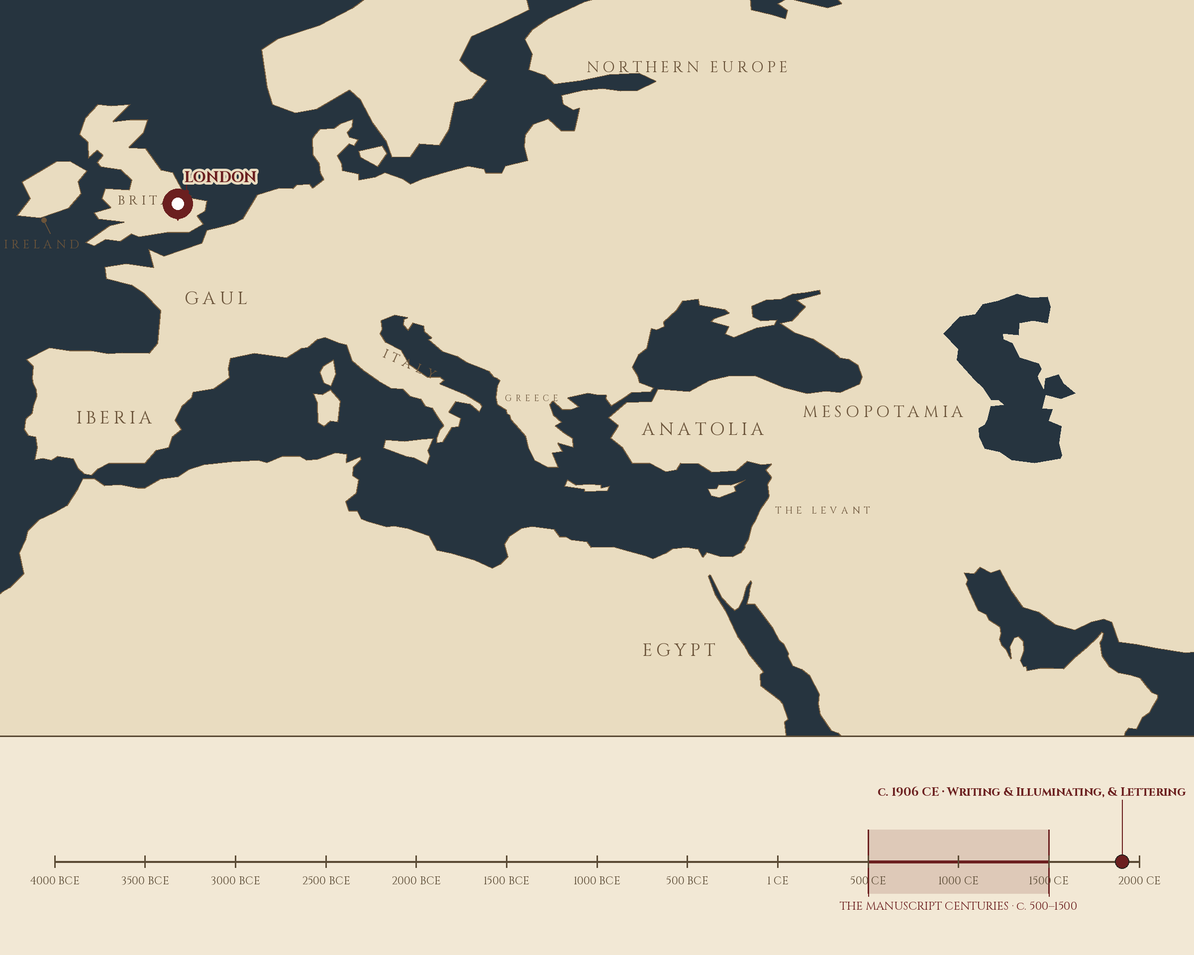
Where and when: London, England, c. 1906 CE — Writing & Illuminating, & Lettering. The pin is this lesson. The line beneath the map is our road: every stop a place where writing changed, every lesson a pin.
Lesson Objectives
By the end of this lesson, students should be able to:
- Define ductus and explain why stroke order and direction matter.
- Hold a broad-edge pen at a consistent 30-degree angle to the baseline.
- Distinguish how a broad-edge nib makes thick and thin lines (by angle and stroke direction) from how a pointed nib does it (by pressure).
- Demonstrate the four basic strokes: the downstroke, the upstroke, the oval, and the compound curve.
- Explain Edward Johnston's seven factors of letterform analysis.
- Measure x-height in nib widths and describe the relationship between nib width and letter size.
- Perform warm-up drills with attention to consistency rather than speed.
Reading this lesson: ★ marks the passages to remember. They return on the unit quiz and the class test. Check in questions ask the material back as you go; answer them in your workbook when you meet them.
Working this lesson: Your assignment packet is the first download on this page. Work in it as the lesson moves along, answering each assignment as its subject is taught — or read the lesson through for your notes and take the assignments as homework afterward. Both are proper ways to sit this class. Signposts in the reading tell you where each assignment belongs. Written answers are short answers in your own words; a few honest lines are worth more than a filled page.
Your Assignment Packet
This lesson's assignments live in its packet: the Lexicon Handout (every term, course terms marked ◆), Materials, Guided Practice, the Assignment Manual with its answer key for self-checking, the Reflection Questions, and the Workbook Checklist. Download the packet before you begin and keep it beside you as you read.
The Angle That Never Changes
Every broad-edge script ever written, from Roman capitals to the foundational hand, obeys one discipline above all others: the nib's edge holds a constant angle to the writing line, and it does not change while the letter is being formed.
★ Understand what this means in the hand. The broad-edge nib is a chisel. Its wide edge lays down a band of ink whose width depends entirely on the direction the pen travels relative to that edge. Move the pen perpendicular to the edge and you get the full width of the nib, the thickest possible line. Move it parallel to the edge and only the corner of the nib touches the page, leaving a hairline. Move it at any angle between, and the width falls somewhere in between. The scribe never presses harder for a thick line. The angle does the work.
★ This is the fundamental difference between the two nibs you studied in Lesson 11, and it is worth stating plainly because everything in this unit depends on it. The pointed nib makes thick and thin by pressure: press, and the tines spread; release, and they close. The broad-edge nib makes thick and thin by geometry: hold the angle steady, choose the stroke's direction, and the width follows. One tool answers to force. The other answers to direction.
Check in: A classmate presses harder and harder, yet her downstrokes stay thin. In your own words, what is she misunderstanding about her nib?
★ The standard teaching angle for the beginner's broad-edge hand is 30 degrees: the nib's edge tilted 30 degrees from the horizontal writing line. Different scripts call for different angles. Italic is commonly written at 40 to 45 degrees, which is part of what gives it its distinctive color and rhythm. (Do not confuse the pen angle with slant — the forward slope of the letters themselves, a separate measure that belongs to the letterforms, not the tool.) But the principle never changes: pick the angle for the script, then hold it. A wandering angle is the single most common fault in beginning calligraphy, and it announces itself immediately: strokes that should match come out in different widths, and the page loses its even texture.
❦ In your workbook: record the angle that never changes — how direction, not pressure, makes the broad-edge line — in your own way — copy, sketch, or note what matters.
In your packet: Exercise I — The Angle Journal ◐ begins here. Work it now, or mark the place and take it as homework — your choice.
Johnston's Seven Factors
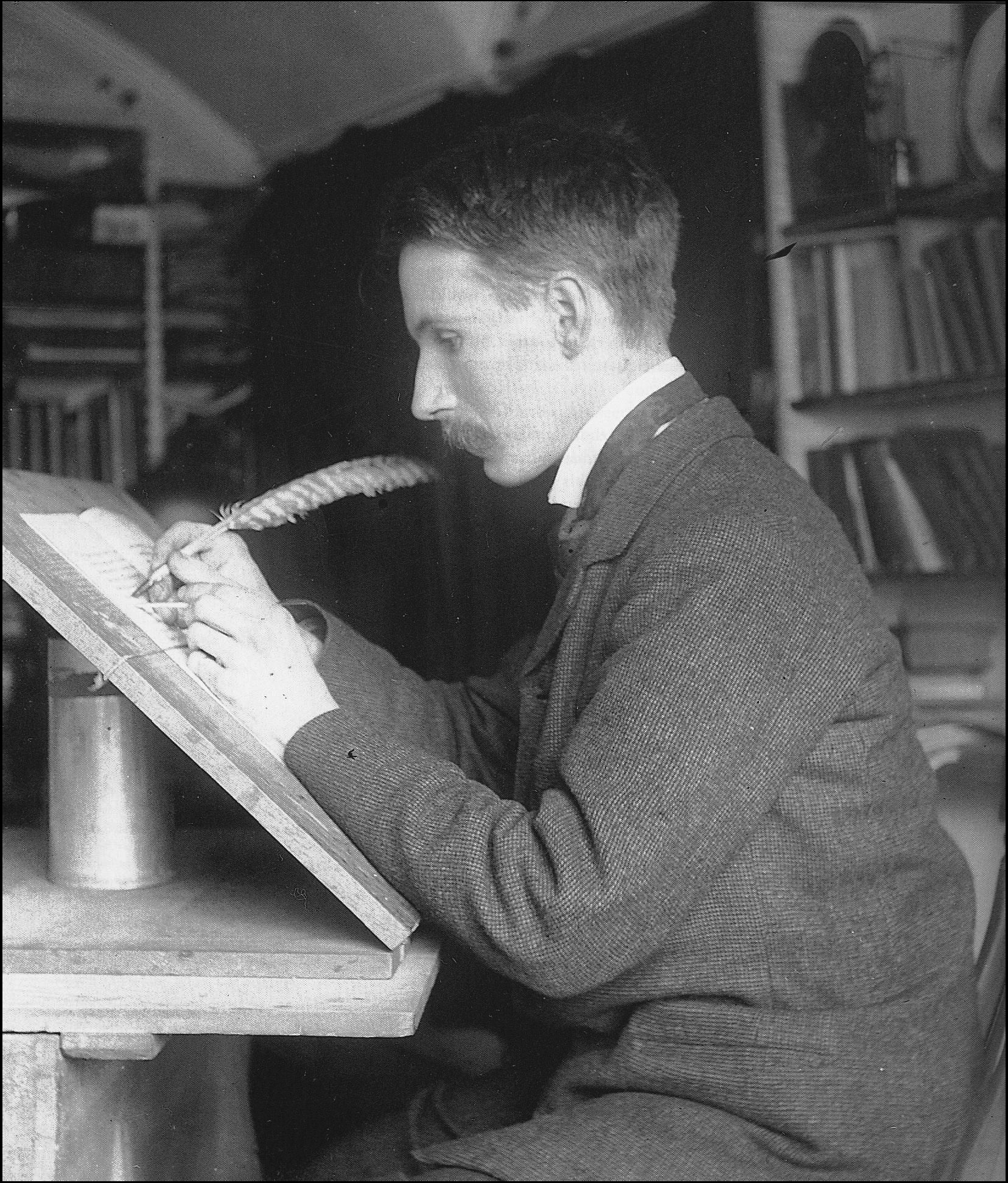
Edward Johnston at his writing desk, quill in hand, working at a sloped board — the posture behind every rule in this lesson.
Photograph of Edward Johnston (1872–1944) at work. Public domain. Via Wikimedia Commons.
★ The modern teaching of broad-edge calligraphy descends, in large part, from one man: Edward Johnston, who began teaching lettering at the Central School of Arts and Crafts in London in 1899 and published his handbook, Writing & Illuminating, & Lettering, in 1906. Johnston had studied medieval manuscripts at the British Museum at the urging of the architect William Lethaby, and he came away convinced that the broad-edged pen was the primary letter-making tool of the manuscript tradition. His foundational hand, the round script he developed from Roman and half-uncial forms, became the template from which generations of students learned.
★ Johnston taught his students to analyze any alphabet through seven factors. Three are primary: weight, angle, and form. Weight is the relationship of the pen's broadest stroke to the height of the letters, expressed in nib widths; his foundational hand carries a weight of about four nib widths at a 30-degree pen angle, with the letter o as a circle. Angle is the constant orientation of the nib to the writing line, which you are learning tonight. Form is the shape of the key letter, normally the o, from which the character of the whole alphabet radiates.
★ The remaining four factors complete the analysis: the number of the pen strokes, their order, and their direction — three factors counted separately, though together they make up ductus, the subject of this lesson's second half — and, seventh, the speed of writing. Seven factors, and with them a student can take apart any broad-edge script ever written and understand how it was built. We will use them throughout this unit.
Check in: Name Johnston's three primary factors from memory. Which one is your hand training tonight, and which one will you meet again in the second half of this lesson?
★ A word of honesty, in this class's habit: medieval scribes did not measure their pen angles in degrees. The degree measurements are modern teaching conventions, Johnston's analytical framework applied to historical practice. What the medieval scribe had was the discipline itself: the steady hand, the unchanging angle, learned by years of repetition. We measure what they felt.
❦ In your workbook: record Johnston's seven factors — and which three stand first — in your own way — copy, sketch, or note what matters.
The Four Basic Strokes
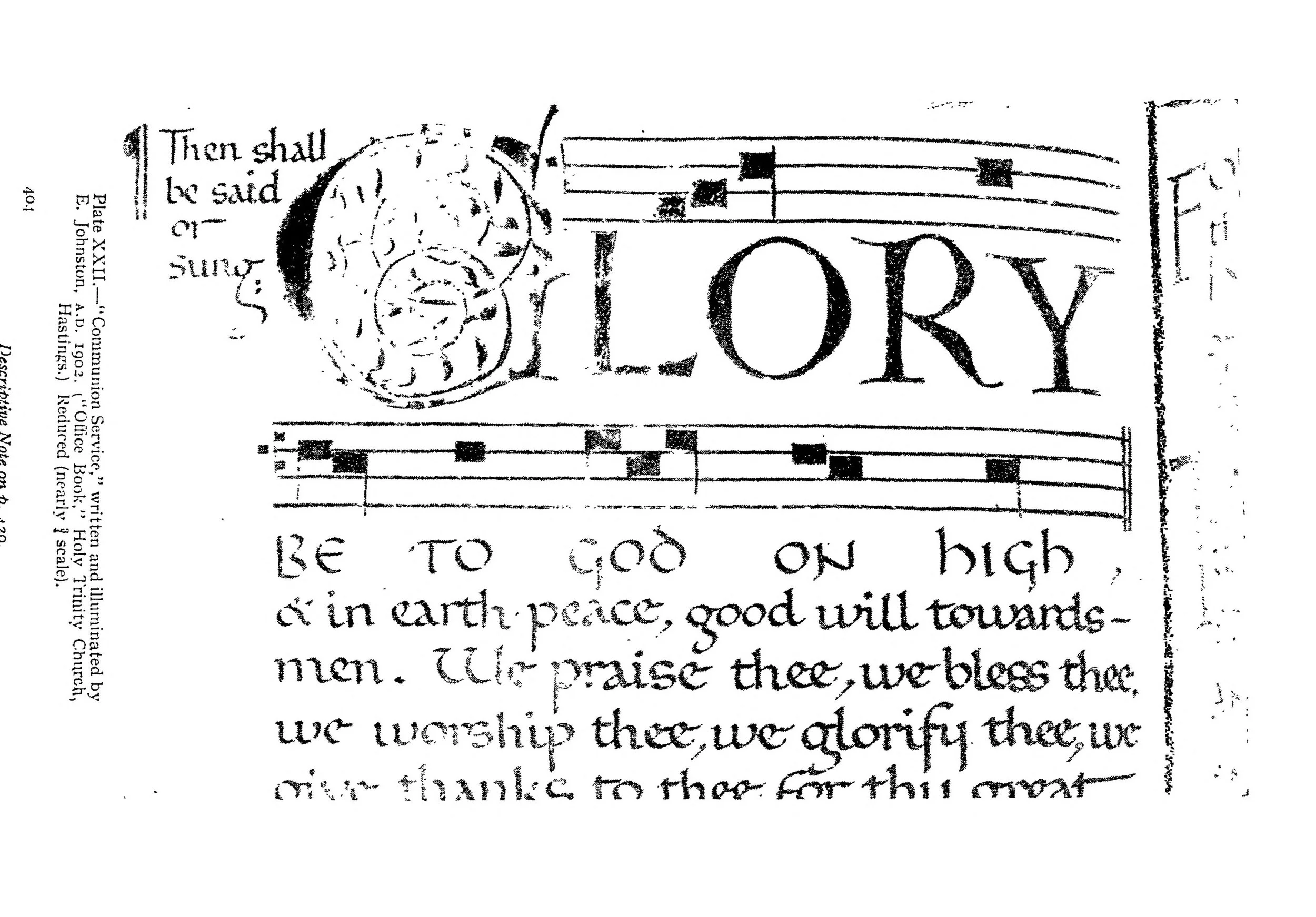
The foundational hand by its maker's own hand: a page of the Communion Service written and illuminated by Edward Johnston in 1902 (Plate XXII of his Writing & Illuminating, & Lettering, 1906). Measure the letters against the drills: this is what they are for.
Edward Johnston, "Communion Service" (1902), Plate XXII in Writing & Illuminating, & Lettering (London, 1906). Public domain. Scan: Internet Archive, Digital Library of India copy (in.ernet.dli.2015.105487).
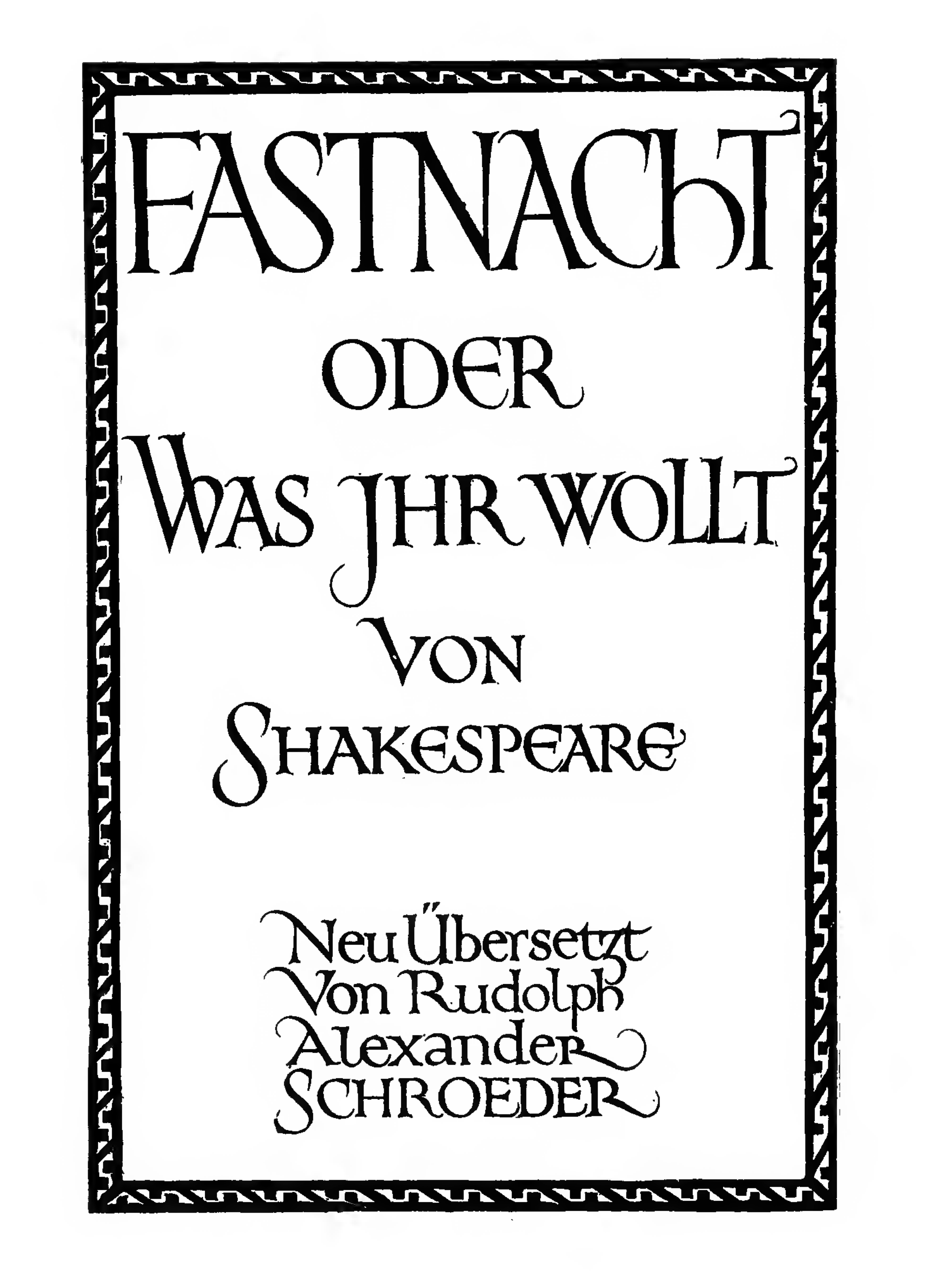
Formal lettering designed by Edward Johnston (cut by Noel Rooke) for a 1909 edition of Twelfth Night — the revived broad-pen hand at work in print, three years after Writing & Illuminating, & Lettering.
Edward Johnston (design) and Noel Rooke (woodcut), title page reproduced in Manuscript & Inscription Letters (1909). Public domain. Via Wikimedia Commons.
Every broad-edge letter is built from a small family of strokes. Learn these four and you own the raw material of every script in this unit.
The downstroke. Hold the nib at 30 degrees. Pull the pen straight down from the waist line — the line the tops of the lowercase bodies touch — to the baseline. The full width of the nib engages the page, and the stroke comes out thick and even. This is the stem of the letter, its weight-bearing member. Practice rows of downstrokes until every one matches its neighbors in width, length, and spacing. The downstroke is the first stroke because it is the simplest test of the angle: if your angle wanders, the downstrokes will tell you.
The upstroke. From the baseline, draw the pen upward and to the right at a shallow diagonal. Only the corner of the nib touches the page, and the line comes out thin. (A stroke travelling across the line at that same shallow angle, corner only, is an upstroke too.) The upstroke connects, it lifts, it prepares; it rarely stands alone. In the broad-edge hand the upstroke is thin by geometry, not by released pressure. Keep the pressure light and constant throughout. If you find yourself pressing for thick strokes, you are thinking like a pointed-pen writer. Stop, reset the angle, and let direction do the work.
★ The oval. Begin at the top and draw a counterclockwise curve, the left side thick as the nib crosses perpendicular to its edge, the right side thinning as the stroke runs more parallel. Close the curve or leave it nearly closed. The oval is the foundational hand's key letter, and it is also the hardest of the four strokes, because the width changes continuously while the angle must not. Practice ovals in both directions. When your ovals are even, your hand is ready for letters.
The compound curve. Draw an S: down on the left curving into up on the right, thin to thick to thin in one continuous motion. The compound curve is the stroke of arches and branches, the top of the h, the shoulders of the m and n. It demands what the oval demands, a steady angle through changing direction, with the added difficulty of the reversal at the middle. Slow down for it. Speed is the last of Johnston's factors for a reason.
Check in: Which of the four strokes changes its width the most while it moves — and what must not change while it does?
❦ In your workbook: record the four basic strokes — downstroke, upstroke, oval, compound curve — in your own way — copy, sketch, or note what matters.
In your packet: Exercise II — The Thousand Strokes ⚒ begins here. Work it now, or mark the place and take it as homework — your choice.
Professor Nocturne
Stop, scholars. Put the pen down and look at your practice sheet.
You will be tempted to judge these rows of strokes as ugly. They are not meant to be beautiful. They are meant to be consistent, and consistency is a different virtue, the one on which beauty is later built.
Find your best downstroke. Not your most expressive, your most even. Now make the next one match it. That is the whole of calligraphy in miniature: the decision that the next stroke will be as good as the last, repeated ten thousand times.
The medieval scribe did not practice on separate sheets and then write the manuscript. The practice was the manuscript, line after line, year after year. You are doing in an evening what they did across a lifetime. Be patient with the hand. It is learning a new geometry, and geometry does not hurry.
Pick up the pen. Again.
Ductus: The Order of Things
A letter is not only a shape. It is a sequence of movements, and the sequence matters as much as the shape.
★ Ductus is the established order and direction of strokes for each letter in a script. It tells you which stroke comes first, which comes second, and which way the pen travels for each. In broad-edge calligraphy, most strokes are pull strokes: written from left to right and from top to bottom, the pen drawn after the hand rather than shoved ahead of it. Pulling keeps the nib trailing cleanly across the fibers. Pushing digs the chisel edge in, and the pen stutters, spatters, or stops.
This is why beginners are taught ductus before they are taught letters. If you learn the shape of an a but invent your own stroke order, you will produce something that looks like an a exactly once, under ideal conditions, and never again. The ductus is what makes the letter reproducible: same strokes, same order, same directions, every time, until the hand knows the path without consulting the eye. That is muscle memory, and it is the entire goal of the drills in this lesson.
Different scripts have different ductus for the same letter. The Roman capital A of Lesson 14 and the uncial A of Lesson 15 share an ancestor but not a stroke order, and part of what you will study in those lessons is how the ductus changed as the script changed. For tonight, the principle is enough: order and direction are part of the letter, not decoration on it.
Check in: Why would learning a letter's shape without its ductus fail you the second time you tried to write it?
❦ In your workbook: record ductus — the order of things, and why the sequence is part of the letter — in your own way — copy, sketch, or note what matters.
In your packet: Exercise III — The Ductus Notebook ⚒ begins here. Work it now, or mark the place and take it as homework — your choice.
Measuring with the Nib
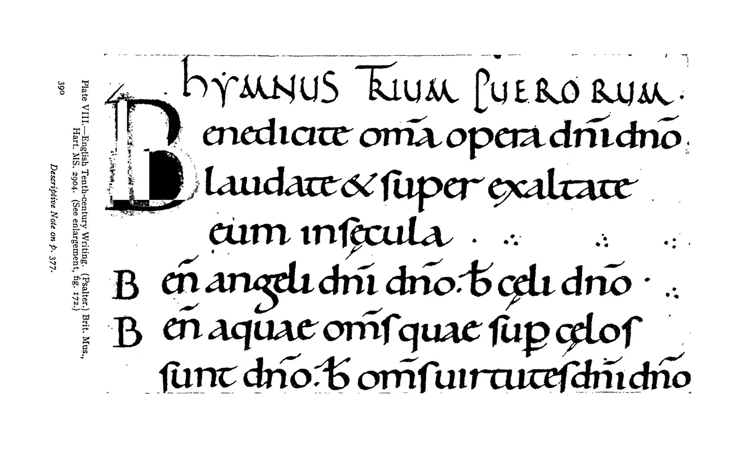
The source: the Ramsay Psalter's own writing enlarged (Plate VIII of Johnston's book). Tenth-century English minuscule, letter by letter — the angle never changes, and you can watch it not changing.
Ramsay Psalter (British Library, Harley MS 2904), enlarged portion, Plate VIII in Edward Johnston, Writing & Illuminating, & Lettering (1906). Public domain. Scan: Internet Archive, Digital Library of India copy (in.ernet.dli.2015.105487).
The broad-edge scribe carries a ruler built into the tool. Because the nib has a fixed width, every measurement in the script can be expressed in nib widths, and calligraphers do exactly that.
★ The x-height, the body height of the lowercase letters, is the fundamental unit. In the foundational hand it is commonly about four nib widths; in italic, about five. Ascenders rise above and descenders fall below by measured amounts, also counted in nib widths. When you change to a wider or narrower nib, the whole script scales proportionally, because every dimension was defined relative to the nib in the first place.
This is worth pausing over, because it reveals something elegant about the manuscript tradition. The scribe did not need a ruler to keep letters consistent. The pen itself was the measure. Choose the nib, count the widths, and the proportions follow. It is one more way the tool shapes the art: the broad-edge pen does not merely draw the letters, it dimensions them.
For your practice tonight, rule guidelines at four nib widths for the x-height, with ascender and descender spaces above and below. Write your drills between the lines. The lines are not a crutch; they are the script's own coordinate system, and learning to live inside them is part of the training.
❦ In your workbook: record measuring with the nib — x-height counted in nib widths — in your own way — copy, sketch, or note what matters.
Guided Observation: Reading the Angle
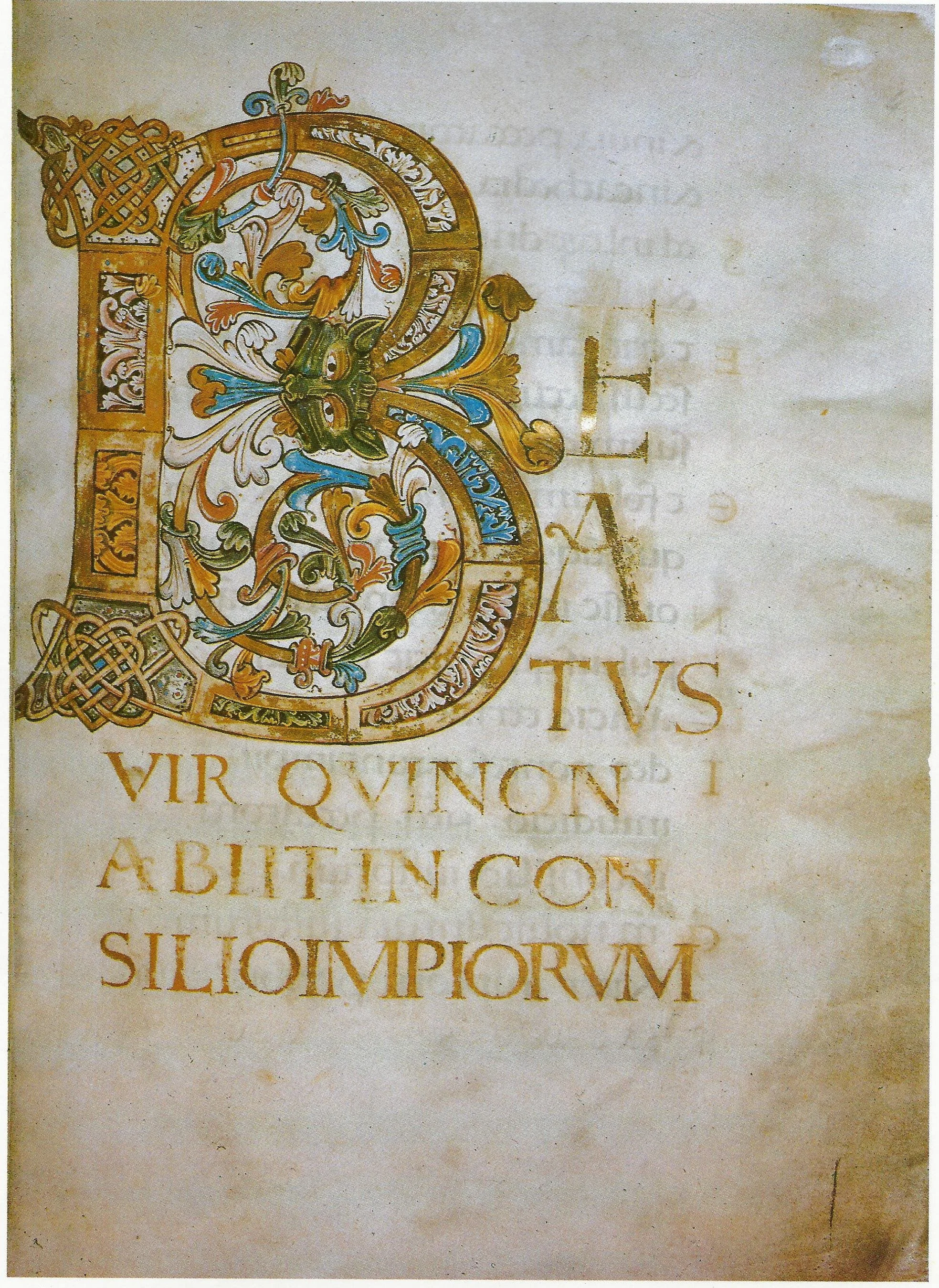
The Ramsay Psalter's opening page (fol. 4): BEATUS VIR in gold display capitals. The same book as the enlarged writing above — display face on, working face off.
Ramsay Psalter, British Library, Harley MS 2904, fol. 4r, late 10th century. Public domain. Via Wikimedia Commons.
Before you begin the drills, study the angle itself. You need to see it before you can hold it.
Examine:
- a broad-edge nib held against a ruled baseline, noting the 30-degree tilt of the nib's edge to the line
- the difference in stroke width between a stroke drawn perpendicular to the nib edge and one drawn parallel to it
- your own hand in a mirror or photograph as you hold the pen, checking that the grip stays relaxed and the wrist stays steady
- a printed exemplar of the foundational hand, identifying the thick downstrokes and thin upstrokes and confirming that the angle never visibly changes
Consider:
- Why does a constant angle produce consistent stroke widths, while a wandering angle does not?
- What happens to the stroke when the pen is pushed instead of pulled?
- How does the broad-edge method of making thick and thin differ from the pointed nib's method, and why does the distinction matter for this unit?
Record your observations in your workbook.
Demonstration: The First Drills
Work with ordinary household materials for Level One: a chisel-tip marker (the flat kind, not the bullet kind) makes a serviceable broad-edge nib, or cut a strip of stiff cardboard to a chisel edge and dip it in ink. For Level Two, use a broad-edge dip pen with bottled ink. In both cases the principle is identical: the edge holds its angle, and direction makes the width.
Calibrate the Angle
Rule a baseline. Lightly pencil a 30-degree guide angle at the left margin: the tilt your nib's edge will hold. Place the nib against the guide, check the tilt, and draw five downstrokes, each four nib widths tall. Stop. Compare the five. Select the most even and mark it with a small pencil tick. Draw five more, aiming to match the ticked one. Repeat until a full row holds together.
The Stroke Families
Rule fresh guidelines. Draw one row each of: upstrokes (thin diagonals rising right), ovals (counterclockwise, thick left and thin right), and compound curves (S-shapes, thin to thick to thin). Keep every stroke inside the x-height. Do not rush; Johnston listed speed last among his factors, and he meant it.
The Ductus Exercise
Choose three simple minuscule letters, i, l, and t. For each, write out its ductus in words before touching pen to page: which stroke first, which direction, where the pen lifts. Then execute the letters following your written ductus exactly. Compare the result against letters drawn without planned ductus. Note the difference in consistency.
Materials
Required (Level One — household items)
- Chisel-tip marker: a flat-tipped marker (not the bullet kind) makes a serviceable broad-edge nib. Two or three in different widths are ideal; one is enough to begin.
- Or a cardboard nib: cut a strip of stiff cardboard to a chisel edge and dip it in ink or thinned paint. This is the Level One broad-edge pen, and it teaches the angle honestly.
- Paper: plain printer or notebook paper for drills. Smooth paper is kinder to the nib edge than rough.
- Ruler and pencil: for ruling baselines, waist lines, and the 30-degree guide angle.
- Ink or thinned dark paint: for the cardboard nib. Any bottled ink or watered-down acrylic works.
- A mirror or phone camera: to check your pen hold — the relaxed tripod grip of thumb and first two fingers — from the side without twisting your neck.
Suggested (Level Two — historically closer)
- A broad-edge dip pen: a straight holder with a broad-edge nib (Speedball C-series or similar). This is the tool the lesson's geometry was written for.
- Bottled calligraphy ink: sumi or fountain-pen ink flows cleanly from a broad-edge nib.
- Layout paper or marker paper: smooth practice paper that shows stroke edges crisply.
- A protractor: for checking the pencilled 30-degree guide angle against the true angle.
- A printed exemplar of the foundational hand: for the Guided Observation's comparison work.
No purchased kits are required. The core lesson (angle calibration, the four stroke families, ductus planning) is fully achievable with a chisel-tip marker, paper, and a ruler. The angle does not care what the nib cost.
Reflection Questions
Answer the following questions in your workbook.
- Why must the broad-edge nib hold a constant angle through every stroke, and what goes wrong when it wanders?
- How does the broad-edge nib produce thick and thin lines, and how does this differ from the pointed nib's method?
- What are Johnston's seven factors, and which three did he consider primary?
- Why are most broad-edge strokes pulled rather than pushed?
- What is ductus, and why is it taught before letters?
- How is x-height measured, and why is the nib itself the scribe's ruler?
- Which of the four basic strokes gave you the most trouble, and what specifically went wrong?
Workbook Checklist — Lesson 12
In my workbook I have:
- ☐ defined ductus and explained why stroke order and direction matter
- ☐ held a broad-edge pen at a consistent 30-degree angle to the baseline
- ☐ explained how a broad-edge nib makes thick and thin by angle and direction, and how a pointed nib does it by pressure
- ☐ practiced the four basic strokes: the downstroke, the upstroke, the oval, and the compound curve
- ☐ named Edward Johnston's seven factors of letterform analysis, and the three he considered primary
- ☐ measured x-height in nib widths and described how nib width sets letter size
- ☐ performed warm-up drills with attention to consistency rather than speed
☐ Lesson completed Date: ___ Signature: ___
Professor's Review
You have not written a single letter tonight, scholars, and that was deliberate.
Letters are the destination. What you practiced instead was the means of travel: the angle held steady, the strokes pulled cleanly, the order planned before the pen moved. Every script in this unit, the Roman capitals, the uncial, the insular hands, is built from the four strokes you drilled and governed by the ductus principle you studied. You now own the foundation on which the next three lessons stand.
Keep your drill pages. When the Roman capitals frustrate you in our next lesson, return to these rows of downstrokes and remember that the capital is only a downstroke with ambition. When the uncial's curves defeat you, return to the oval. The strokes do not change. Only the letters they build.
Rest the hand. In our next lesson, we raise the great stone letters of Rome.
PROFESSOR QUILLBERRY NOCTURNE
Scrollwork Library
Master Scribe & Illuminator
Cross-Class Connections

Runes · Lesson 17 — The Need for Speed
My lexicon defines ductus as the choreography of the hand, and my uncial keeps the pen moving in continuous rounded turns. My scholars learn the sequence in my classroom; tonight, your hand learns to keep it. Come and learn the steps, then bring them back to his desk and dance them.
Runes · Lesson 18 — The Celtic Manuscript Tradition
The island hand's wedge ascenders are this lesson's angle at work: my scholars press the full width of a broad nib down, lift as the stroke climbs, and hold the nib flat to the writing line so verticals fall thick and horizontals thin. The discipline you drilled tonight is the discipline that shaped the Insular page. Come and watch it shape one.
Runes · Lesson 9 — Classical Latin: The Architecture of Stone
The Roman capitals are the first script this unit's hand will write, and their story, serifs as the fossils of brushstrokes first painted on stone, is told in my classroom. Read it before the capitals come. The hand Professor Nocturne is training tonight is the hand those letters were made for.
PROFESSOR THISTLELOOM WEBBLETHORN
Runes & Ancient Writing
Further Reading & Sources
For scholars who want to go deeper into the broad-edge tradition, these are the places I send my own students first.
*Edward Johnston. Writing & Illuminating, & Lettering (1906).* The book that revived modern calligraphy. Johnston's analysis of the broad-edged pen, his foundational hand developed from Roman and half-uncial forms, and his teaching at the Central School of Arts and Crafts set the terms for everything this unit teaches. https://store.doverpublications.com/collections/ebook/products/9780486144078
Paul Shaw. "Tutorial No. 5: Calligraphy, the Basics of Italic 2." Paul Shaw Letter Design. A master calligrapher's working notes on broad-edge fundamentals: pulled strokes, the 45-degree italic pen angle, the five-nib-width x-height, and verbal ductus descriptions for each letter. https://www.paulshawletterdesign.com/2011/10/tutorial-no-5%E2%80%94calligraphy-the-basics-of-italic-2/
Wikipedia. "Ductus." The concept of stroke order and direction in calligraphy and paleography, and how ductus analysis helps identify scribal hands. https://en.wikipedia.org/wiki/Ductus
Browse the Scrollwork shelf in the school Library for readable editions of these works.
The Desk states each hand's angle because this lesson taught your hand to hold one — thirty degrees for the calibration, and each script differing from there as its nature requires. A plan that names the angle is a plan you can keep.
The Commission DeskPROFESSOR QUILLBERRY NOCTURNE · SCROLLWORK LIBRARY
Submit your work for this lesson using the form below.
CONTINUE IN THE SCROLLWORK LIBRARY
← Previous · Lesson 11: Broad Nibs & Pointed Nibs Next · Lesson 13: Spacing & Rhythm →
Unit IV — Foundational Calligraphy Scrollwork Library — All 26 Lessons
The rest of Unit IV: Lesson 13 · Spacing & Rhythm · Lesson 14 · Roman Capitals · Lesson 15 · Uncial Script · Lesson 16 · Insular & Early Medieval Scripts