

SCROLLWORK
Unit IV · Lesson 16INSULAR & EARLY MEDIEVAL SCRIPTS
Professor Quillberry Nocturne
Master Scribe & Illuminator
The Scrollwork Library • School of Evershade
Professor's Introduction
Once more, scholars, and welcome to the last lesson of our fourth unit.
In our twelfth lesson, you learned to hold the broad-edge pen at its proper angle and to command the stroke. In our thirteenth, you learned to space those strokes into rhythm, the visual breathing of the page. In our fourteenth, you built the Roman capitals, geometry made permanent in stone. In our fifteenth, you rounded the hand into uncial, the book script of an empire.
Tonight we take that uncial hand across the sea, to islands where monks reshaped it into something the Romans would barely recognize, and we learn to write it ourselves.
A word of honesty before we begin. The full story of Insular script belongs to Professor Webblethorn's classroom: Runes, Unit V, Lesson 18, "The Celtic Manuscript Tradition." The monasteries, the missionaries, the great Gospel books, the five grades of formality, all of it is hers to tell, and she tells it well. If you have not read her lesson, read it. What I give you tonight is the scribe's portion only: what the hand looks like, how the pen makes it, and what your own hand must learn to do the same. The history is the doorway. The practice is the room.
Take up your broad-edge pen. The islands are waiting.
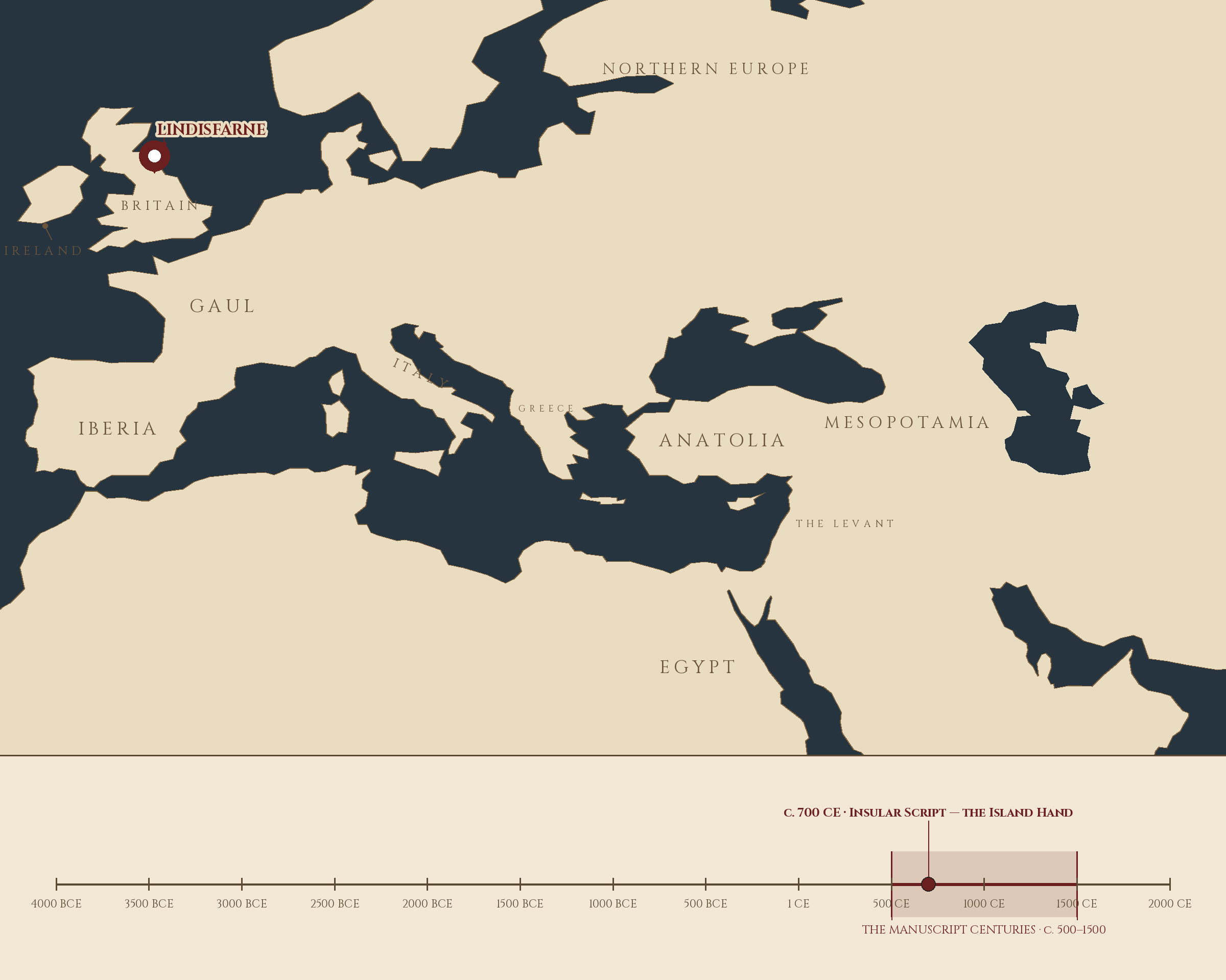
Where and when: Lindisfarne, England, c. 700 CE — Insular Script — the Island Hand. The pin is this lesson. The line beneath the map is our road: every stop a place where writing changed, every lesson a pin.
Lesson Objectives
By the end of this lesson, students should be able to:
- Define quadrilinear, pen rotation, Cló Gaelach, and the Insular forms of G, R, S, and T.
- Explain where Insular script was written, which earlier hand it grew from, and which Runes lesson tells its full history.
- Hold the broad-edge pen at the Insular minuscule angle and describe how the majuscule hold differs.
- Construct wedge-shaped ascenders using the full-width press and lift.
- Write the distinctive Insular letterforms with correct ductus.
- Rule a quadrilinear writing space and write a compressed Insular line within it.
- Execute pen rotation for spiked descenders.
- Summarize the arc of Unit IV, from pen angle through Insular script.
Reading this lesson: ★ marks the passages to remember. They return on the unit quiz and the class test. Check in questions ask the material back as you go; answer them in your workbook when you meet them.
Working this lesson: Your assignment packet is the first download on this page. Work in it as the lesson moves along, answering each assignment as its subject is taught — or read the lesson through for your notes and take the assignments as homework afterward. Both are proper ways to sit this class. Signposts in the reading tell you where each assignment belongs. Written answers are short answers in your own words; a few honest lines are worth more than a filled page.
Your Assignment Packet
This lesson's assignments live in its packet: the Lexicon Handout (every term, course terms marked ◆), Materials, Guided Practice, the Assignment Manual with its answer key for self-checking, the Reflection Questions, and the Workbook Checklist. Download the packet before you begin and keep it beside you as you read.
The Doorway: What We Are Writing
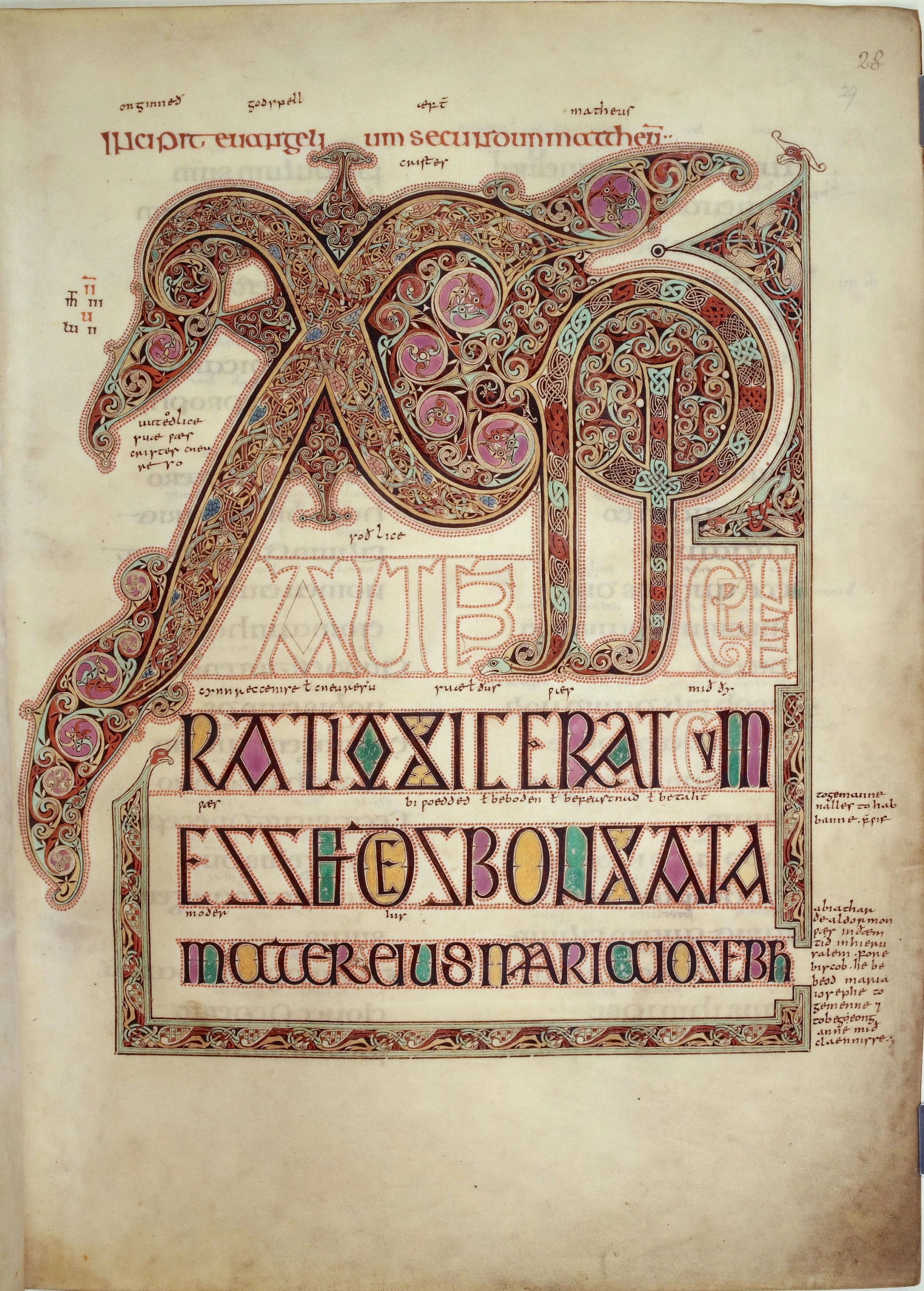
The Chi Rho page of the Lindisfarne Gospels (fol. 29). Below the monogram, the Gospel text begins in display capitals as tall as your thumb — every ascender finished with the wedge this lesson teaches you to make.
Lindisfarne Gospels, British Library, Cotton MS Nero D IV, fol. 29r. Public domain. Via Wikimedia Commons.
Insular script is the family of Latin handwriting styles developed in Ireland and Britain, the Atlantic islands at the northwestern edge of the former Roman world, between roughly 600 and 900 CE. The name is the geography: "Insular" comes from the Latin insula, meaning island.
★ The script grew from Roman uncial and half-uncial, the book hands you studied in Lesson 15, as transmitted through Irish monastic culture. Ireland had never been conquered by Rome, so no Roman administration imposed standard book hands. Irish monks learned the rounded book letters from whatever manuscripts reached them, and then, over generations of copying in hundreds of monastic workshops, developed the script in their own direction. The result was not a copy of Rome. It was a reinvention.
★ One material fact shaped everything: the tool. Mediterranean scribes wrote with reed pens, cut from river plants. The Irish and English monks wrote with quills, feather pens from goose or swan. The quill's nib is broader and more flexible than the reed's, and that flexibility is the physical cause of the island hand's most famous feature, the wedge-shaped ascender. Every wedge on an Insular page is a fossil of a quill gesture, repeated thousands of times.
★ That is the doorway, and it is all the history this lesson needs. The monasteries, the Columban network, the meeting of Irish and Roman traditions at Lindisfarne, the five great Gospel books, Julian Brown's five grades of formality: Professor Webblethorn teaches all of it in Runes, Unit V, Lesson 18, and I will not poach her lecture. My business tonight is the pen. What does the island hand ask of the hand that writes it?
❦ In your workbook: record what the island hand is, where it grew from, and the one material fact that shaped it in your own way — copy, sketch, or note what matters.
The Pen and Its Angle
You need a broad-edge nib. The National Museum of Ireland, which teaches Insular majuscule to schoolchildren, recommends a nib about two millimeters wide for practice, and that width serves our minuscule work as well. A broad chisel-tip marker will do for Level One. A cut quill does it best for Level Two.
The angle is the first decision, and Insular script asks for two of them, depending on which grade you write.
★ For the grand majuscule hand, the half-uncial of display pages, hold the pen so the flat of the nib sits parallel to the writing line. At this angle, the zero-degree hold, a vertical stroke falls at the nib's full width and a horizontal stroke at its thinnest. The pen does the work. You only steer.
★ For the minuscule, the working hand we practice tonight, raise the angle to roughly 45 degrees. This is the working angle recorded in calligraphers' handbooks for Insular minuscule: steep enough to give the compressed vertical strokes their weight, shallow enough to let the round bows open wide. Hold it there and do not let it wander. The island hand's consistency comes from the angle's consistency.
Check in: Two holds, two hands. Which angle belongs to the minuscule, and at the majuscule hold, what happens to a vertical stroke and to a horizontal one?
Before you write a single letter, draw the angle. On scrap paper, pull a series of vertical strokes at 45 degrees, then a series of horizontals. Look at the thick and the thin. That contrast is the raw material of everything that follows.
❦ In your workbook: record the two pen angles and what each one does to the stroke in your own way — copy, sketch, or note what matters.
The Wedge
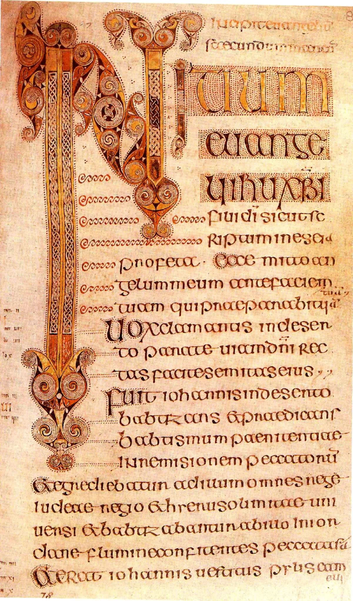
The Book of Durrow opens Mark (fol. 86): the letters start enormous and shrink, line by line, until they settle at reading size — watch the wedges, the flat tops, and the red dots that escort the initials.
Book of Durrow, Trinity College Dublin, MS 57, fol. 86r. Public domain. Via Wikimedia Commons.
Now the signature. The tall letters, b, d, h, l, and their companions, rise to triangular tops in the Insular hand. Here is how the quill makes them.
★ Begin the upstroke with the full width of the nib pressed flat to the page. Press, do not stab: the nib's whole edge kisses the vellum at once. Then, as the stroke rises, lift. Let the pressure ease and the nib rise off the page so the ink trails from full width into a point. The result is a triangle, wide at the baseline of the stroke and narrowing to nothing at the top. That is the wedge — the wedge-shaped ascender.
The temptation is to draw the triangle, to outline it and fill it in. Do not. The wedge is one gesture, press and lift, and it must be practiced until the hand does it without thinking. Fill a page with nothing but wedge-topped vertical strokes. Press, lift. Press, lift. When every stroke ends in a clean triangle, you have the foundation of the island hand.
Check in: Why must the wedge be made in a single gesture? What is lost if you draw the triangle and fill it in?
There is a reason to take this seriously beyond beauty. The palaeographer Stanley Morison, who devoted real study to these wedges, proposed that they were deliberate craftsmanship with a disciplinary purpose: a carefully wrought serif corrects sloppiness in writing. Every tall letter forces the scribe to begin with intention, full nib down, controlled lift, or the wedge fails visibly. The ornament is also the drill. The island monks built quality control into the letterform itself.
❦ In your workbook: record how the wedge is made: the press, the lift, and the triangle the gesture leaves on the page in your own way — copy, sketch, or note what matters.
In your packet: Assignment II — The Wedge Drill ⚒ begins here. Work it now, or mark the place and take it as homework — your choice.
The Island Letters
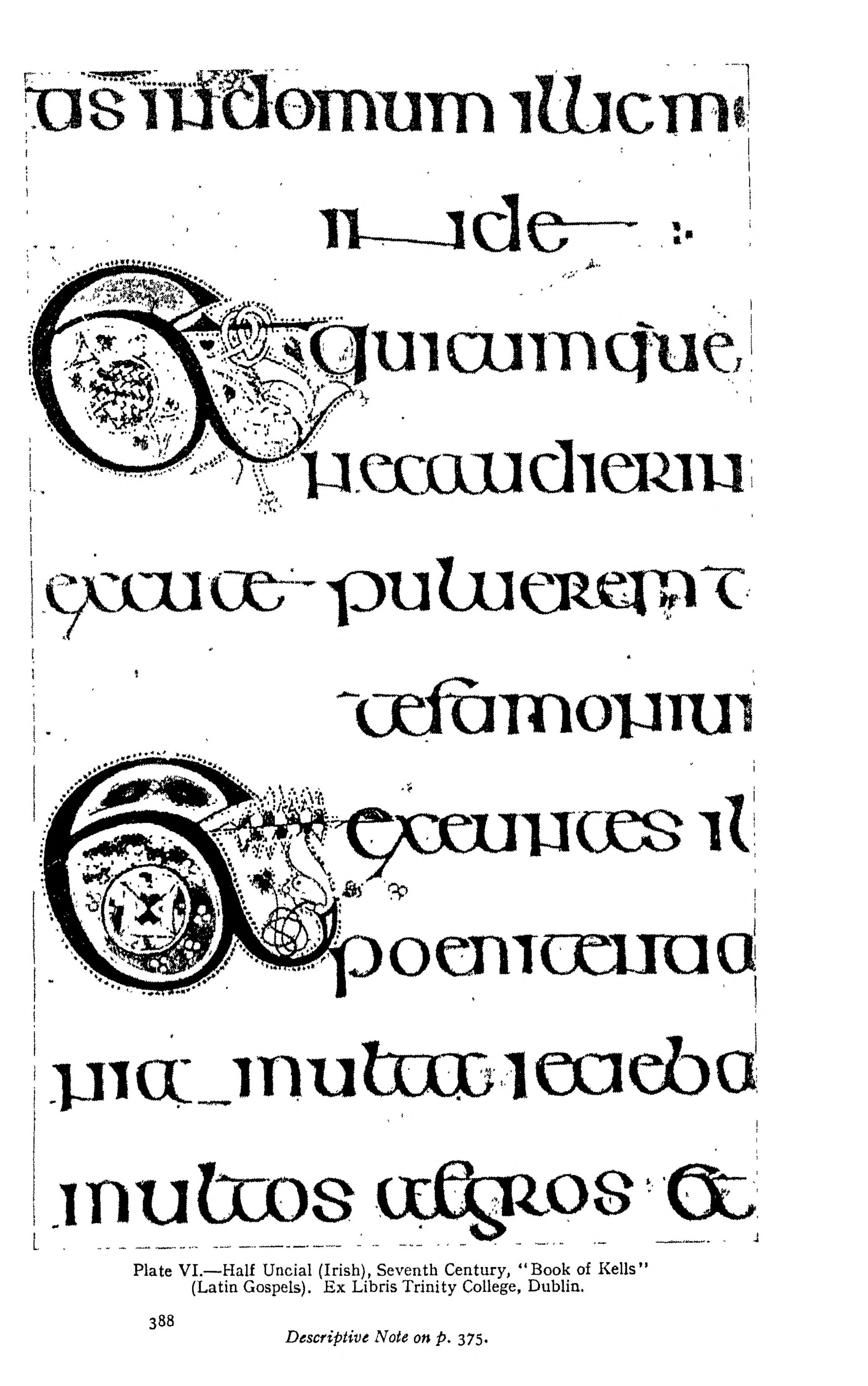
The island letters at study size: enlarged lines of Irish half-uncial (Mark 6), Plate VI of Johnston's Writing & Illuminating, & Lettering (1906), from a Trinity College Dublin Gospel book. Find the wedge tops, then each of the six island letters.
Irish half-uncial (Trinity College Dublin Gospel book), Plate VI in Edward Johnston, Writing & Illuminating, & Lettering (1906). Public domain. Scan: Internet Archive, Digital Library of India copy (in.ernet.dli.2015.105487).
With the wedge in your hand, meet the letters that make Insular script unmistakable. Build each one from the two parent forms the National Museum of Ireland names: the I, father of the alphabet, the straight stroke everything vertical descends from, and the O, mother of the alphabet, the round bow everything curved grows from.
The G. The Insular G looks like nothing on the continent. Draw a flat top stroke, then a lower bow that curls inward like a flattened spiral. The form survived for centuries: in later handwriting it became the letter yogh (ȝ, the Middle English letter), and you can still see its ghost in old spellings. Practice it large before you practice it small. The G is the letter students get wrong by making it continental. Keep the top flat and let the bow curl.
★ The R. The Insular R descends. Its main stroke drops below the baseline, and its shoulder curves like a wave breaking right. In Gaelic type it survives as ꞃ. Write it after the I: straight down past the line, then the shoulder. The descender is where beginners hesitate. Do not hesitate. The R goes down.
The S. The tall Insular S ꞅ rises above the waistline, narrow and upright, looking to modern eyes more like a long s or an R than the S you know. It is a close Insular cousin of the long s ſ that English printers used into the 1800s. Keep it narrow. The Insular S is a blade, not a bowl.
The T. The Insular T ꞇ is small and quick: a stem with its crossbar drawn low, lower than a continental T would place it. Do not write a modern T and call it island work. Drop the bar.
The D. The Insular D ꝺ carries the wedge on a slanting ascender, then opens into one of the script's famously wide bows. The bow should be generous, rounder and more spacious than anything you wrote in uncial. Let it breathe.
The F. The Insular F ꝼ is a tall letter that both rises and descends, wedge at the top, tail below the line. It is the most vertical letter in the alphabet, and it sets the rhythm for the compressed lines to come.
Check in: The Insular R and the tall S are the pair beginners confuse. What single feature settles which letter you are looking at?
Write each letter twenty times before moving to the next. Then write them in sequence, G R S T D F, until the hand moves between them without pausing. The island scribes wrote these forms thousands of times a day. Your twenty is a beginning, and beginnings are honorable.
❦ In your workbook: record the six island letters and the one feature that marks each of them in your own way — copy, sketch, or note what matters.
In your packet: Assignment III — The Island Letterforms ⚒ begins here. Work it now, or mark the place and take it as homework — your choice.
The Compressed Line
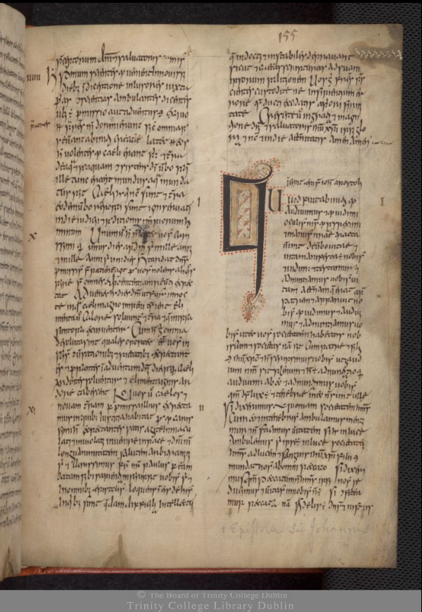
The family's working clothes: a page of the Book of Armagh (c. 807) in compressed Insular minuscule, two columns of it — the same island letterforms, written small, fast, and close for a book meant to be carried.
Book of Armagh, Trinity College Dublin, MS 52 (fol. 155 in the Library's digitisation). CC0. Via Wikimedia Commons.
Insular minuscule lives in four lines. Rule them now: the ascender line at the top, the waistline, the baseline, and the descender line at the bottom. This quadrilinear space is the room the script rents, and it is a smaller room than the majuscule hands occupy. The minuscule is confined, compressed, disciplined by all four lines at once.
The Insular line is dense. Compared to the spacious Caroline hand that would follow it on the continent, Insular minuscule packs its letters tight, the vertical strokes close together, the wide bows almost touching. The rhythm is upright and pulsing: tall wedges rising, descenders dropping, round bows swelling between them. Do not spread the letters out to make it easier. The compression is the style. Write narrow, write upright, and let the wedges and descenders do the talking.
Keep the pen at 45 degrees through the whole line. The most common failure in Insular practice is angle drift: the hand tires, the nib flattens toward zero, and the line goes slack and continental. Check your angle every few words. The island hand's consistency is the angle's consistency, and I will keep saying it until your hand believes it.
❦ In your workbook: record the four lines of the quadrilinear space and what the compression does to the written line in your own way — copy, sketch, or note what matters.
The Rotated Descender
Some descenders in Insular minuscule end in spikes, sharp tapered points that the flat nib cannot draw at 45 degrees. For these, the scribe rotates the pen.
★ The technique is pen rotation: begin the descending stroke at your working 45 degrees, then turn the pen in your fingers as the stroke falls, rotating the nib toward 90 degrees, until only the corner of the nib touches the page. The corner draws the spike. It is the same rocking motion you learned for decorative work in earlier lessons, applied here as a core letterform technique, not an ornament.
Practice on the descending R and the tall S. First apply a little pressure to lay down ink, then rotate and pull. The spike should taper to a clean point, not a blob. If you get a blob, you rotated too late or pressed too long. If you get a scratch, you rotated too early. The timing lives in the fingers, and the fingers learn it only by repetition.
This rotation is one of the things that separates writing Insular script from drawing it. Anyone can copy the shapes. The scribe's hand knows the angles.
❦ In your workbook: record how the rotated descender is timed: the pressure, the turn, and the corner's point in your own way — copy, sketch, or note what matters.
In your packet: Assignment IV — The Insular Line ⚒ begins here. Work it now, or mark the place and take it as homework — your choice.
A Hand That Outlived Its Century
Here is the fact I want you to carry out of this room.
★ The Insular minuscule you have been practicing did not die with the monasteries. When printing came to Ireland, the first Gaelic typeface was cut in 1571, modeled directly on the island hand. That family of typefaces, called Cló Gaelach, the Gaelic type, became the standard way of printing the Irish language, and it held that position until the mid-twentieth century. Irish schoolchildren learned Cló Gaelach in school until the 1960s. What finally replaced it was Roman type, adopted for Irish printing and schooling in the mid-twentieth-century reforms. Your grandparents' generation could have read it.
Check in: The island hand reached print in 1571 and stayed Ireland's standard into the twentieth century. What carried it that far, and what finally replaced it?
Fourteen hundred years, from monastic vellum to the schoolroom. The wedge ascenders, the island G, the tall S, the Tironian et (⁊) for "and": all of it survived the printing press, the penal laws, and the twentieth century, and it still appears on Irish road signs and official seals today.
You are not learning a dead hand. You are joining a line of hands that never quite broke. Write carefully. The line is long, and you are now in it.
❦ In your workbook: record the island hand's long survival, from monastic vellum to Cló Gaelach and the schoolroom, in your own way — copy, sketch, or note what matters.
Professor Nocturne
Hands still, scholars, and look at what your hand has done tonight.
You came into this room with a pen angle and a stroke. You leave it with a wedge, six island letters, a quadrilinear discipline, and a rotated descender. That is not a small evening's work.
But I want you to notice something larger. Across this whole unit, every lesson has been about the same negotiation: the negotiation between the tool and the letter. In Lesson 12, the angle of the nib decided the stroke. In Lesson 13, the space between strokes decided the rhythm. In Lesson 14, the geometry of the Roman letter decided the form. In Lesson 15, the rounded book hand decided the page. Tonight, the quill decided the wedge, and the wedge decided the hand.
The tool always has a vote. The master scribe is the one who lets it vote and still gets the letter he intended.
Now write your line, and let the quill vote.
Guided Observation: Reading the Island Page
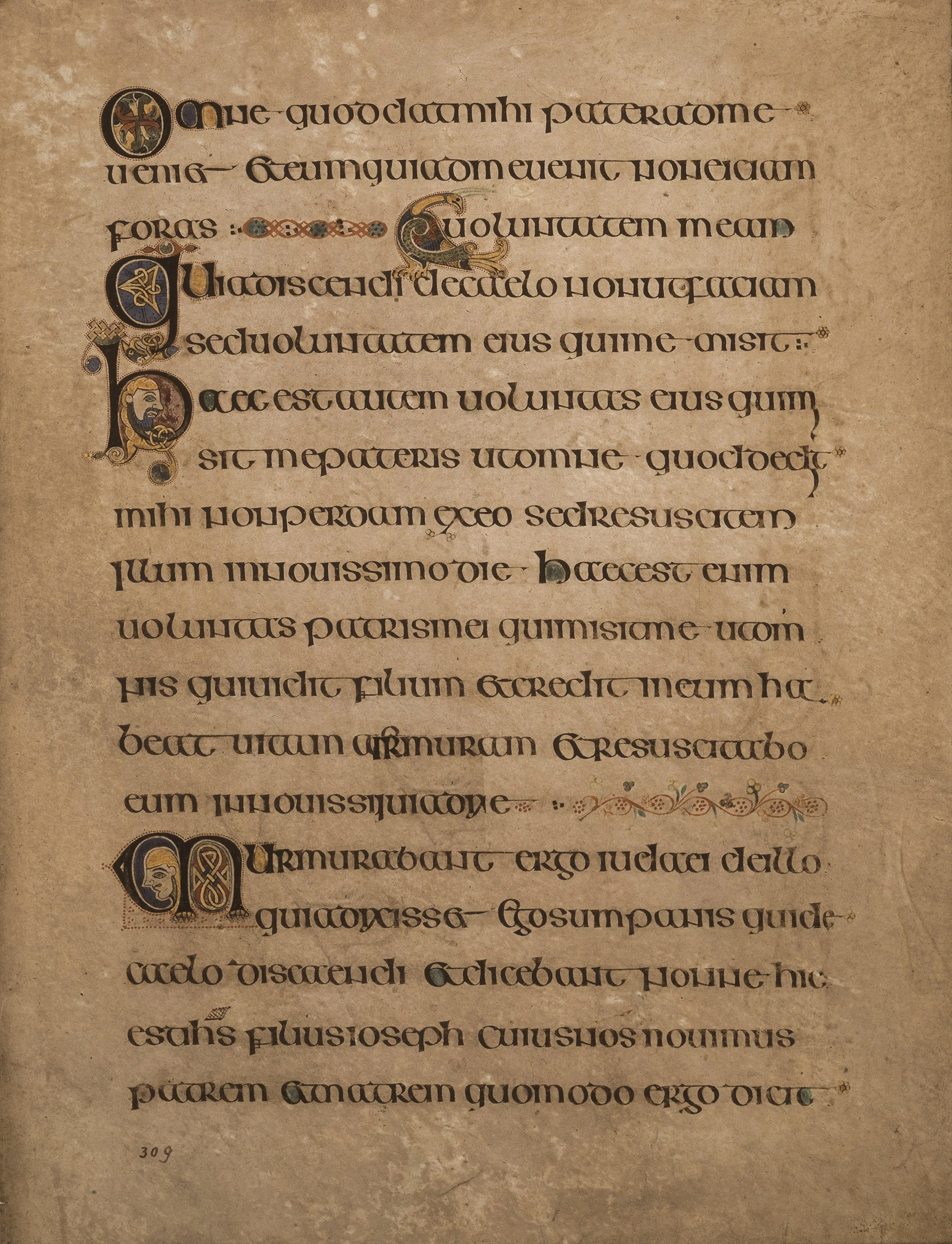
A working page of the Book of Kells (fol. 309, John's Gospel): no carpet page, no monogram — just the island hand doing its daily work, wedges, tall S's, flat-topped G's and all.
Book of Kells, Trinity College Dublin, MS 58, fol. 309r. Public domain. Via Wikimedia Commons.
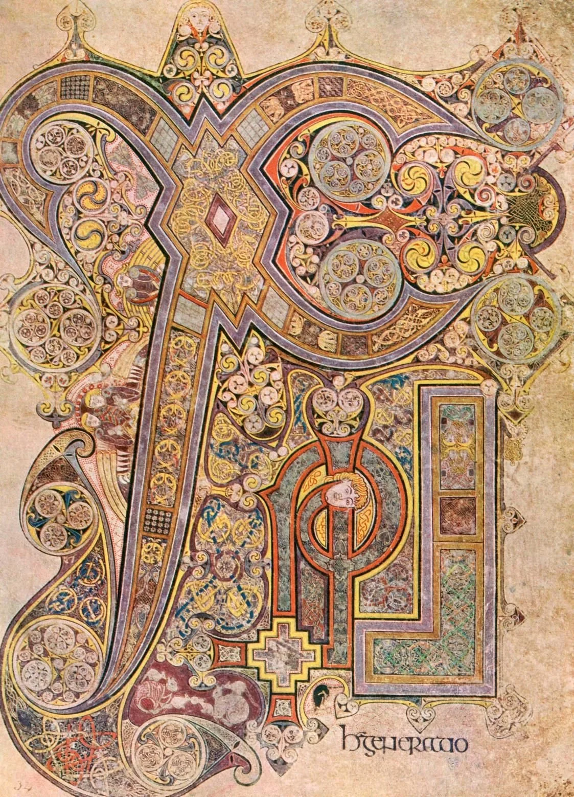
The other great Chi Rho: the Book of Kells (fol. 34), a century after Lindisfarne. Same monogram, same island — compare how the two workshops fill a page, then find the small written words waiting at the foot.
Book of Kells, Trinity College Dublin, MS 58, fol. 34r. Public domain. Via Wikimedia Commons.
Before beginning the practical exercises, study an Insular manuscript page. Use the British Library's or Trinity College Dublin's digital collections, or the further reading links at the end of this lesson.
Study:
- the wedge-shaped ascenders: find five and trace their triangles with your eye
- the wide bows of b, d, p, and q — the curved bowls of those letters, an Insular hallmark
- one diminuendo passage, if the page has it: the letters step down in size, smaller and smaller after a great initial — follow them shrinking
- the red dots around a large initial: great initials were often ringed with dots of red pigment
- the density of the line: how close the vertical strokes stand
Consider the following questions:
- Where does your eye land first on the page, and what put it there?
- Which letters can you identify as Insular at a glance, and what gives them away?
- How does the page's density compare to the uncial pages you studied in Lesson 15?
- What does the wedge tell you about the pen that made it?
Record your observations carefully within your workbook.
Demonstration: Writing Insular Minuscule
Work with a broad-edge nib: a chisel-tip marker for Level One, a cut quill for Level Two. Rule quadrilinear guidelines on every practice sheet before writing.
Set the Angle
Draw a 45-degree angle guide in the margin. Pull ten vertical strokes and ten horizontals at the working angle. Confirm the thick-thin contrast before writing any letter.
Drill the Wedge
Fill one full line with wedge-topped vertical strokes: press the full nib width down, lift as the stroke rises. Press, lift. When every stroke ends in a clean triangle, move on.
Build the Island Letters
Write each of the six island letters twenty times: G, R, S, T, D, F. Use the ductus from the lesson. Check the wedge on every ascender and the descender on the R and F.
Rule and Write the Line
Rule a quadrilinear space. Write a single line of Insular minuscule: your name, or a short phrase. Keep the angle at 45 degrees, keep the letters compressed, keep the wedges clean. Check the angle every few words.
Rotate the Descender
On a fresh line, practice the spiked descender: begin at 45 degrees, rotate toward 90 as the stroke falls, let the nib's corner draw the point. Apply pressure first, then rotate. Repeat until the spikes taper cleanly.
In your packet: Assignment V — Unit IV Review: The Tool's Vote ✎ begins here. Work it now, or mark the place and take it as homework — your choice.
Materials
Required (Level One — household items)
- A broad chisel-tip marker: any wide felt-tip marker with a flat chisel edge, about 2 millimeters wide. This is your broad-edge nib. Dark ink or paint shows the thick-thin contrast best.
- Printer or notebook paper: plain smooth paper for drills and the finished line. Avoid heavily textured paper; the chisel edge needs a smooth surface.
- A ruler and pencil: for ruling quadrilinear guidelines. A protractor or printed 45-degree angle guide for checking your pen angle.
- Your workbook: for the guided observation notes, the unit review paragraphs, and the reflection questions.
Suggested (Level Two — historically closer)
- A cut quill and dip ink: a goose quill cut to a broad edge, with carbon or iron gall ink. The quill's flexibility is what makes the true wedge; the marker approximates it.
- Laid or parchment paper: a smooth, firm sheet that takes dip ink without feathering. Modern calligraphy paper or parchment paper from a craft store.
- A penknife: for recutting the quill, with appropriate supervision and safety instruction. Quill maintenance belongs to the scribe's real toolkit.
No purchased kits or specialty tools are required. The core lesson (the wedge drill, the island letterforms, the Insular line, and the unit review) is achievable with a chisel-tip marker, paper, and a ruler — the wedge approximated on the marker, as the Level Two note grants.
Reflection Questions
Answer the following questions in your workbook.
- Why does the lesson send you to Runes, Unit V, Lesson 18 for the full history instead of teaching it here?
- What is the physical cause of the wedge-shaped ascender, and why does the lesson insist you not draw the triangle?
- How does the 45-degree minuscule angle differ from the majuscule hold, and what does each one do to the stroke?
- What did Morison propose about the purpose of the wedge, and what does it suggest about how the monks thought about their work?
- Why is the compression of the Insular line part of the style rather than a flaw to fix?
- What does the fourteen-hundred-year survival of the island hand, into Cló Gaelach and the twentieth century, tell you about the relationship between a script and its culture?
- Across Unit IV, the tool always had a vote. Which lesson's vote surprised you most, and why?
Workbook Checklist — Lesson 16
In my workbook I have:
- ☐ defined quadrilinear, pen rotation, Cló Gaelach, and the Insular forms of G, R, S, and T
- ☐ explained where Insular script was written, which earlier hand it grew from, and which Runes lesson tells its full history
- ☐ held the broad-edge pen at the Insular minuscule angle and described how the majuscule hold differs
- ☐ constructed wedge-shaped ascenders using the full-width press and lift
- ☐ written the distinctive Insular letterforms with correct ductus
- ☐ ruled a quadrilinear writing space and written a compressed Insular line within it
- ☐ executed pen rotation for spiked descenders
- ☐ summarized the arc of Unit IV in my review: five paragraphs, and the five letterforms in a row
☐ Lesson completed Date: ___ Signature: ___
Professor's Review
And so our fourth unit ends where all calligraphy truly lives: in the negotiation between the hand and the tool.
Look at what you have built across these five lessons. In our twelfth, you learned that the nib's angle decides the stroke before the hand moves. In our thirteenth, you learned that the space between strokes is as much a decision as the strokes themselves. In our fourteenth, you built the Roman capitals and learned that geometry can be permanent. In our fifteenth, you rounded the hand into uncial and learned how an empire's book script feels in the fingers. And tonight, you took that uncial across the sea and let the quill reshape it into wedges and island letters.
Five lessons, one lesson: the tool always has a vote. The angle, the space, the geometry, the roundness, the quill. The master scribe does not fight the vote. He hears it, he understands what the tool wants to do, and then he gets the letter he intended anyway. That is the whole craft, and you have been practicing it for five lessons whether you knew it or not.
You came to this unit with a pen. You leave it with five hands.
In our next unit, we decorate what we have learned to write. Gold, borders, and beasts in the margins. Bring your steadiest hand.
PROFESSOR QUILLBERRY NOCTURNE
Scrollwork Library
Master Scribe & Illuminator
Cross-Class Connections

Runes · Lesson 18 — The Celtic Manuscript Tradition
I teach the full history this lesson deliberately leaves to me: the monasteries, the missionaries, the great Gospel books, and the five grades of the island hand. The history is mine; the handwriting is Professor Nocturne's. Read my lesson, then bring its manuscripts back to his practice desk and look at them with a scribe's eyes.
Runes · Lesson 21 — The Shorthand Abbreviation Matrix
In my matrix you will meet the whole family of the Tironian ⁊ you used in your Insular line: the Tironian notes, the brevigraphs, and the one sign that survives in Irish print for agus, 'and.' One small sign with thirteen thousand relatives. Come and meet them.
PROFESSOR THISTLELOOM WEBBLETHORN
Runes & Ancient Writing
Further Reading & Sources
For scholars who want to go deeper into the island hand, these are the places I send my own students first.
National Museum of Ireland. "Insular Majuscule" practice worksheet. National Museum of Ireland: Insular Majuscule The museum's own practice sheet: the pen, the angle (nib parallel to the writing line for majuscule), the two-millimeter nib, and the I and O as father and mother of the alphabet. Print it and practice alongside this lesson.
"Insular script." Wikipedia. Wikipedia: Insular script The script's appearance, its grades from half-uncial to cursive minuscule, the diminuendo, and the Hiberno-Scottish mission that carried the island hand to England and back to the continent.
"Gaelic type." Wikipedia. Wikipedia: Gaelic type Cló Gaelach: the printed afterlife of Insular script, from the first typeface of 1571 through its use as Ireland's standard printed hand into the mid-twentieth century. Includes the insular letterforms ꞃ ꞅ ꝺ ꝼ ᵹ ꞇ and the Tironian ⁊.
"Irish Letters: Sacred and Secular Usage." Irish Letters: Sacred and Secular Usage (PDF) A scholarly survey of Insular letterforms in sacred and secular contexts, with close analysis of the triangular serif, the quadrilinear minuscule, and the Tironian et. The source for Morison's reading of the wedge as deliberate craftsmanship.
*Christopher de Hamel. Scribes and Illuminators. British Museum Press, 1992.* The classic short introduction to medieval manuscript production. The Insular Gospel books appear here as working scribes' products, not just art objects. An ideal next book after this lesson.
*Raymond Clemens and Timothy Graham. Introduction to Manuscript Studies. Cornell University Press, 2007.* The standard student-friendly textbook. The chapters on writing and scripts give the Insular hand its place in the full sequence from Roman to Gothic, with manuscript illustrations throughout.
Browse the Scrollwork shelf in the school Library for readable editions of these works.
Submit your work for this lesson using the form below.
THE UNIT IV QUIZ
SCROLLWORK LIBRARY · UNIT IV: FOUNDATIONAL CALLIGRAPHY · LESSONS 12–16
Unit IV is complete: pen angle and spacing, Roman Capitals, Uncial, and the Insular hands. This quiz gathers the whole unit, all five lessons, into one sitting. Take it from memory first, before you look back at your notes, because it measures what has stayed with you. If you completed the Exercises marked ★ in your lesson packets, you have already practiced most of what it asks.
The quiz packet is a single download. Part I gathers questions from every lesson in the unit, Part II matches the unit's vocabulary, and the answer key waits at the back for self-checking. When you have finished, score it honestly, note the result in your workbook, and revisit any lesson whose questions went wrong before you move on to Unit V.
Download the Unit IV Quiz packet
Forty-five degrees, narrow and upright, and no drift — this lesson's discipline is the Desk's assumption when it plans in Insular. The compression is the style, and the plan keeps it so. Master the angle here, and the Desk will do the measuring.
The Commission DeskPROFESSOR QUILLBERRY NOCTURNE · SCROLLWORK LIBRARY
CONTINUE IN THE SCROLLWORK LIBRARY
← Previous · Lesson 15: Uncial Script Next · Lesson 17: Hierarchy & Page Layout →
Unit IV — Foundational Calligraphy Scrollwork Library — All 26 Lessons
The rest of Unit IV: Lesson 12 · Pen Angle & Stroke Control · Lesson 13 · Spacing & Rhythm · Lesson 14 · Roman Capitals · Lesson 15 · Uncial Script