
SCROLLWORK
Unit V · Lesson 17HIERARCHY & PAGE LAYOUT
Professor Quillberry Nocturne
Master Scribe & Illuminator
The Scrollwork Library • School of Evershade
Professor's Introduction

Rulers out, scholars, and welcome to Unit V.
For sixteen lessons you have studied the parts of the manuscript maker's craft: the desk, the ink, the quill, the letterforms. Tonight we step back and look at the whole page the way an architect looks at a building before a single stone is laid. Because that is what the medieval page was: a building. And like any building, it was planned before it was built.
No scribe simply began writing in the upper corner of a blank skin and hoped for the best. Long before the pen touched the parchment, decisions had been made: where the text would sit, how wide the margins would run, how many lines the page would hold, where the great initials would rise, where the red headings would catch the eye. The page you admire in a museum case is not the result of beautiful writing alone. It is the result of beautiful planning.
Tonight you will learn to read that planning. And then you will do some of your own.
Where does the eye go first?
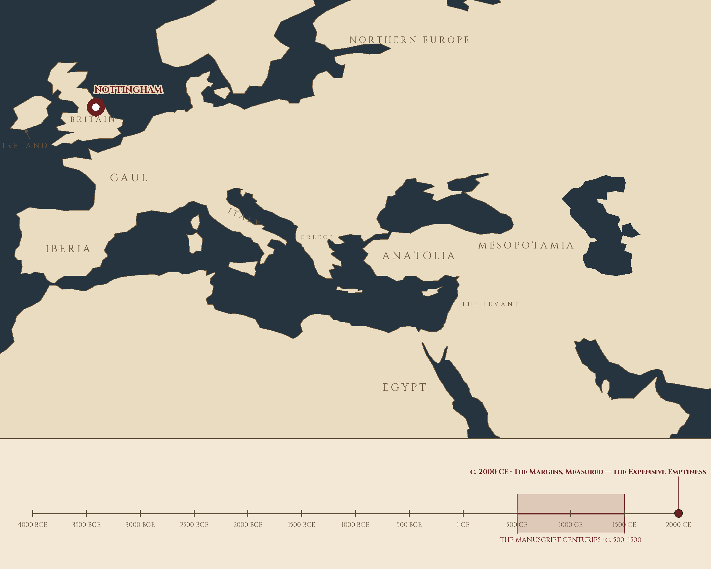
Where and when: Nottingham, England, c. 2000 CE — The Margins, Measured — the Expensive Emptiness. The pin is this lesson. The line beneath the map is our road: every stop a place where writing changed, every lesson a pin.
Lesson Objectives
By the end of this lesson, students should be able to:
- Define mise-en-page and explain why medieval scribes planned the page before writing.
- Describe the pricking and ruling process and distinguish blind ruling, plummet ruling, and ink ruling.
- Explain the relationship between margin size and the cost of a book.
- Describe the hierarchy of decoration and how initial size signaled textual importance.
- Define the quire, the catchword, and the signature mark and explain how they kept a book in order.
- Rule a page and design a simple mise-en-page with justified hierarchy decisions.
Reading this lesson: ★ marks the passages to remember. They return on the unit quiz and the class test. Check in questions ask the material back as you go; answer them in your workbook when you meet them.
Working this lesson: Your assignment packet is the first download on this page. Work in it as the lesson moves along, answering each exercise as its subject is taught — or read the lesson through for your notes and take the exercises as homework afterward. Both are proper ways to sit this class. Signposts in the reading tell you where each exercise belongs. Written answers are short answers in your own words; a few honest lines are worth more than a filled page.
Your Assignment Packet
This lesson's exercises live in its packet: the Lexicon Handout (every term, course terms marked ◆), Materials, Guided Practice, the Exercise Manual with its answer key for self-checking, the Reflection Questions, and the Workbook Checklist. Download the packet before you begin and keep it beside you as you read.
The Page Before the Word
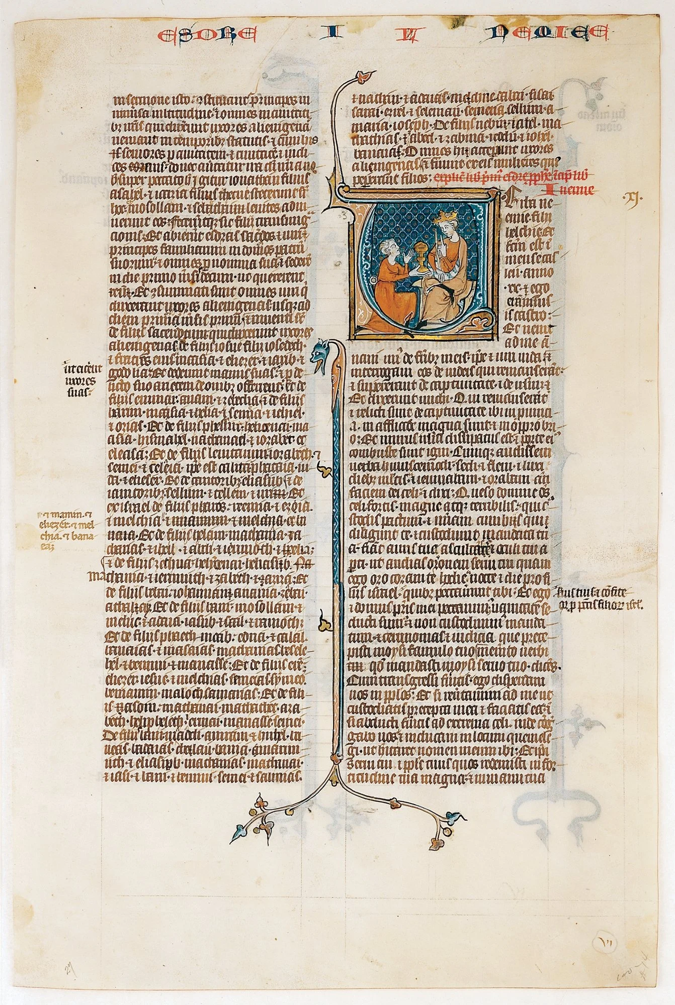
One leaf, whole plan. A Bible leaf (France, about 1280–1300) opening the Book of Nehemiah: the running head across the top in red and blue, the red rubric announcing the new book, a great initial with Nehemiah the cupbearer before the king, small initials stepping down the columns, and the margins widening toward the foot of the page — everything on this page was decided before a word was written.
Manuscript Leaf with Opening of The Book of Nehemias, from a Bible. French, ca. 1280–1300. The Metropolitan Museum of Art, New York (1998.538.1).
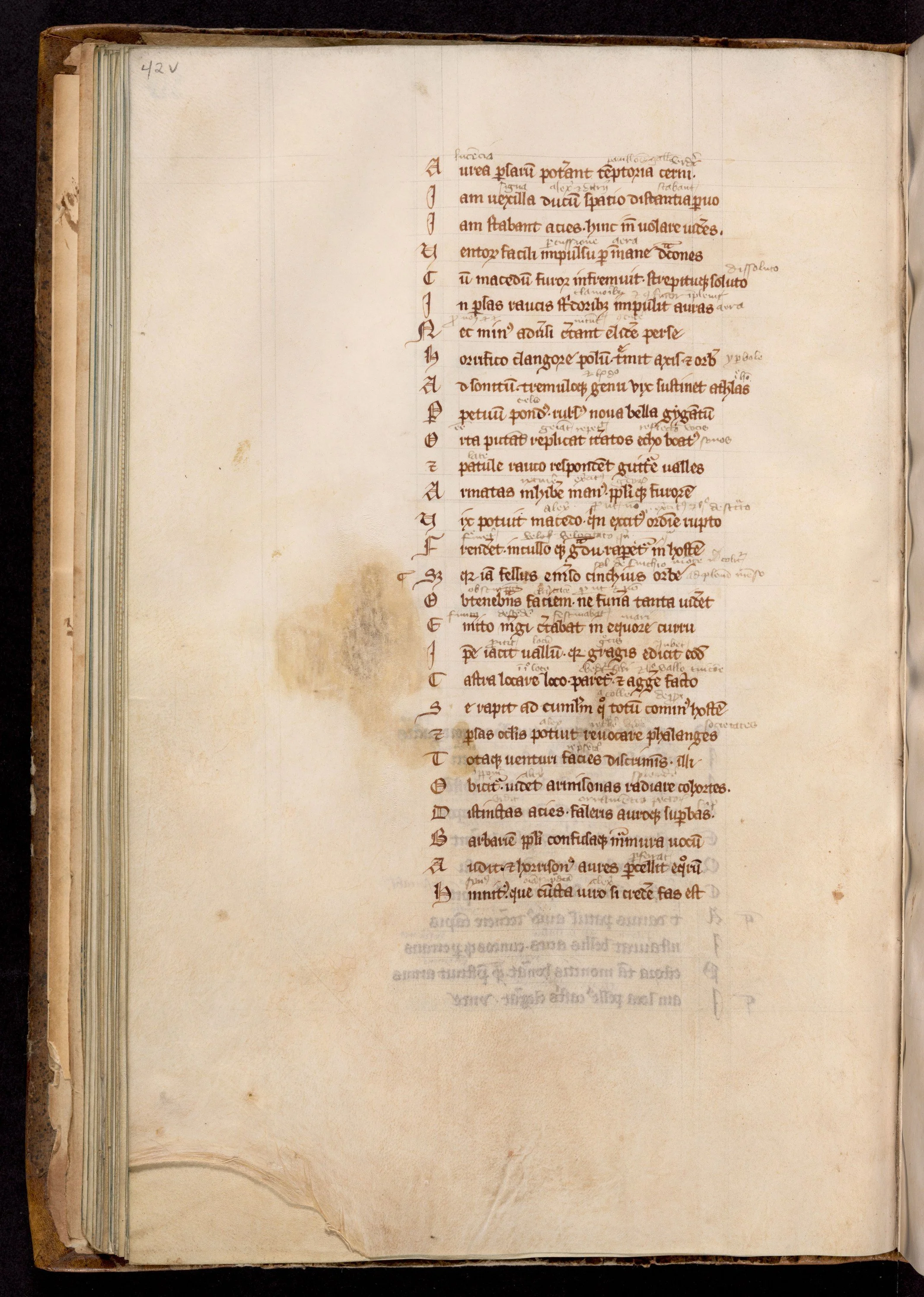
The plan, left visible. A page of the Alexandreis (France, mid-1200s) laid out with room for a commentary that was never completed: a little glossing between the lines, and the margins and the foot of the page standing empty exactly as the scribe reserved them. An unfinished page is the most honest witness of all — nothing hides the plan.
Alexandreis, with gloss. Written in France, mid-13th century. Boston Public Library.
Consider what the scribe faced. A skin, scraped and stretched, blank and expensive. A text to copy, perhaps long. And a reader, months or years in the future, who would need to find their way through it.
The scribe did not begin writing. The scribe began measuring.
★ This is the first thing to understand about medieval page design: the writing was nearly the last step in the planning. Before it came a sequence of decisions that scholars now gather under the French term mise-en-page, the putting-on-the-page. How large would the text block — the ruled area the writing would occupy — be? How wide the margins? One column or two? How many lines? Where would the great initials fall, and how many lines tall would each be? Where would the red headings go? All of this was settled, marked, and ruled before the pen was ever dipped.
The evidence survives on the pages themselves. If you look at a medieval manuscript in a library's digital collection, and I urge you to do so, you can still see the planning: the tiny prick holes marching down the outer margins, the faint ruled lines crossing the page, the spaces left blank where initials were meant to go but sometimes never came. An unfinished manuscript is the most honest witness of all. It shows the plan without the performance.
Why plan so carefully? Partly for beauty, and we should not be embarrassed to say so. But mostly for the reader. A book is a tool for finding things, and the medieval page was designed the way a good tool is designed: so the hand, or in this case the eye, knows where to go. Hierarchy, which is the subject of this lesson, is simply the plan made visible. It tells the reader what matters most, what begins here, what is new, where to look first.
The page is architecture. Tonight we study its blueprints.
Check in: A scribe sits down to a blank, expensive skin. What has already been decided before the pen is ever dipped, and who is all that planning really for?
❦ In your workbook: sketch a blank page and mark where the text block, the margins, and the great initial would fall on it: the plan before the word, drawn in your own hand.
Pricking and Ruling: The Grid Beneath the Writing
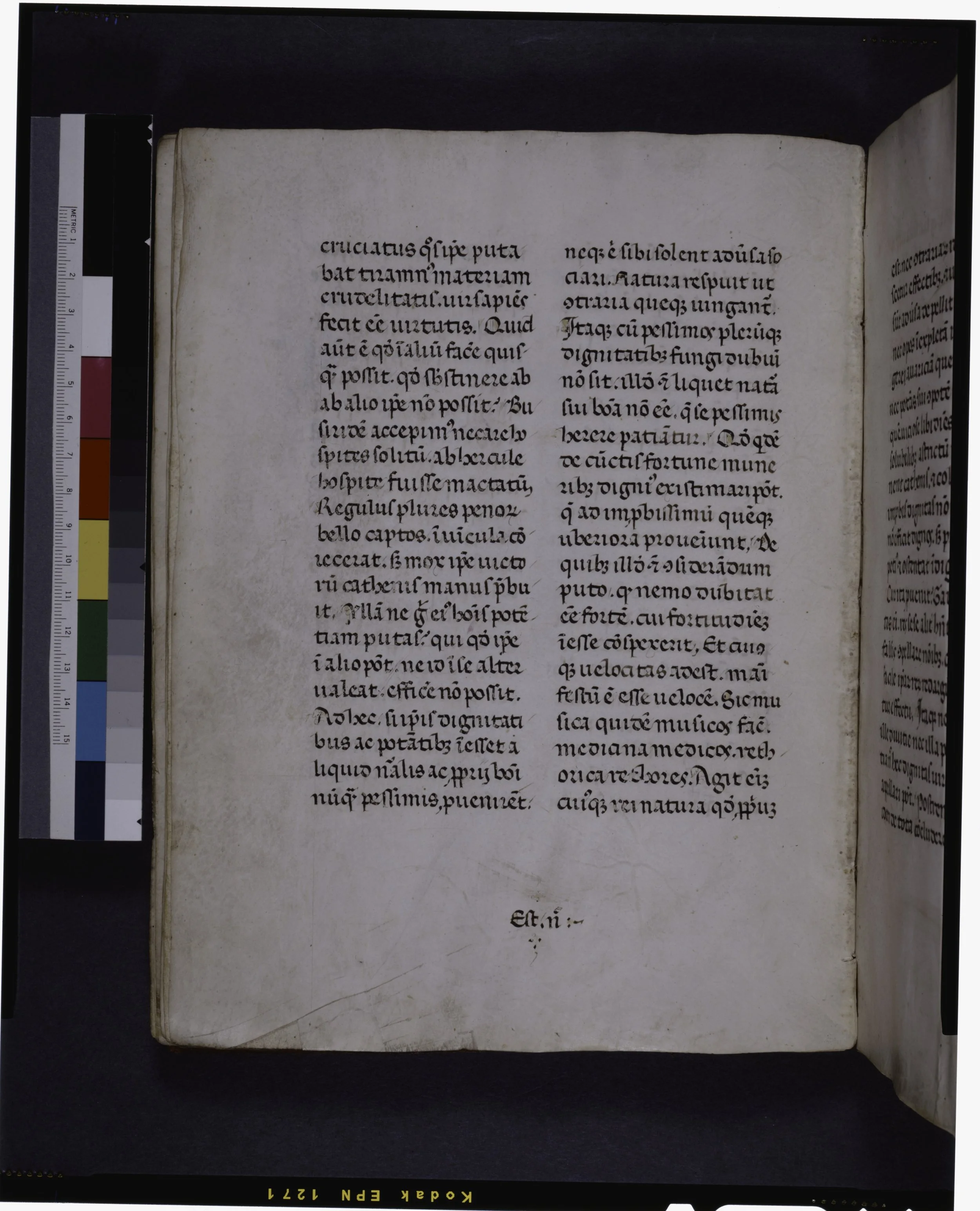
Ruled before it was written. A two-column page from a manuscript dated by its scribe to 1381, its lines ruled in drypoint and faint pencil — and at the foot, centred where the binder would look, the catchword "Est enim," the first words of the next gathering, holding the book's order together.
Manuscript page with centred catchword. New York Public Library (Manuscripts and Archives Division); census of medieval manuscripts (De Ricci) no. 1318.
★ Every ruled medieval page began with holes. The scribe took a sharp implement, the point of a knife or a pair of dividers, and pierced the parchment at carefully measured intervals along the edges: up the outer margin, across the top and bottom. These prick marks recorded the entire ruling plan in miniature. Then, with a straightedge laid from prick to prick, the scribe drew or pressed the lines that would guide the writing: horizontal lines for the rows of text, vertical lines bounding the text block left and right.
★ Cleverly, the pricking could be done through a whole stack of leaves at once. Press an awl through the top sheet of a quire and the holes travel through every sheet beneath, so one careful measuring serves many pages. For the same reason, early ruling was done by pressure: the scribe pressed a hard point, the back of a knife or a stylus, into the parchment, leaving a blind groove that the pen could feel. Scholars call this blind ruling or drypoint ruling, and because it was pressed through the stack, its grooves appear on page after page, a ghost of the planning shared across the quire.
★ Technique changed with the centuries, and the ruling itself can date a manuscript. Until the twelfth century, the hard point ruled. In the twelfth century, scribes began ruling with plummet, a piece of lead that left soft gray lines, more visible than the old pressed grooves. From the thirteenth century, the pen itself was often used, sometimes in colored ink. For pages needing many parallel lines at once, such as musical staves or heavily glossed pages, scribes sometimes joined several pens together into a rake-like instrument called a rastrum, drawing a whole set of lines in a single pass.
Complex layouts produced complex grids. A page with two columns of text, a wide gloss margin, spaces reserved for initials, and running heads might carry a ruling pattern so intricate that scholars describe it as a cobweb of lines. That cobweb is the plan, made permanent. The writing sits within it the way a house sits within its foundation lines.
One more detail, and it is a humble one. The prick holes were usually placed in the outer margins, and when the book was bound and its edges trimmed, the binder's knife often sliced them away. Surviving prickings are therefore a small accident of preservation: the plan was meant to be invisible in the finished book. The scribe pricked, ruled, wrote, and then the evidence of the labor was cut off and discarded. What we see in museums is what the trimming spared.
Check in: Why did the scribe prick through a whole stack of leaves at once, and what did each century rule with: the hard point, the plummet, or the pen?
❦ In your workbook: note the three ruling techniques in the order the centuries used them, and beside each one, the mark it leaves on the page.
Margins: The Expensive Emptiness
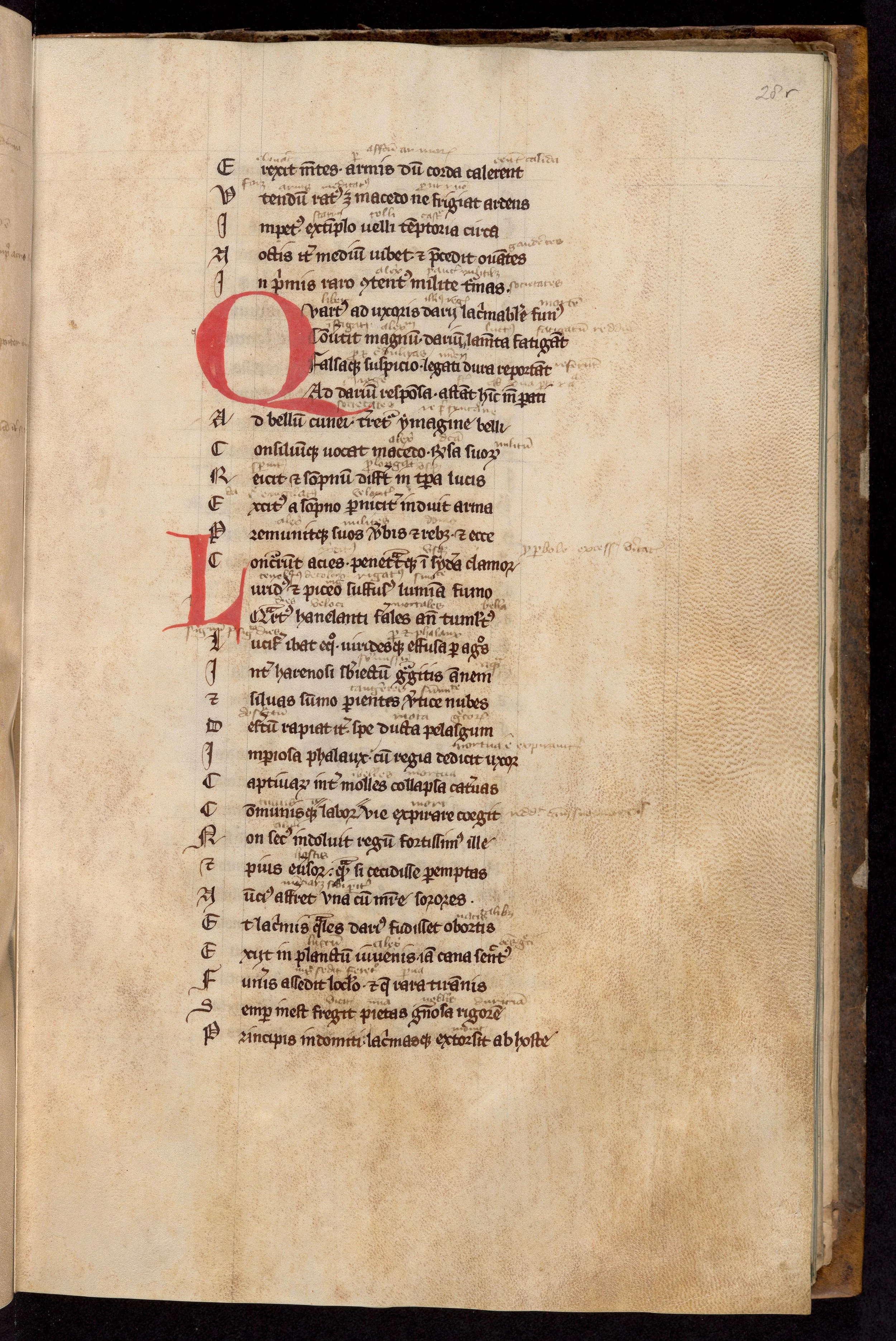
The margin at work. On this page of the Alexandreis (France, mid-1200s) the commentary lives between the lines and in the margins in several readers' hands, the red initials reach into the margin, and every verse's first letter stands in its own column at the edge — the page was planned wide so that the book could keep talking.
Alexandreis, with gloss. Written in France, mid-13th century. Boston Public Library.
★ Look at the margins of a fine medieval book and you are looking at money. Parchment was costly, every inch of it, and a wide margin is a deliberate decision to leave costly material empty. The University of Nottingham's manuscript researchers put it plainly: in general, the larger the margins are, the more expensive the book was. A grand choir book with vast borders announces its patron's wealth before a word is read. A student's pocket grammar, its text crowded to the very edge, announces the opposite.
But margins were never merely display. They worked. Wide margins gave the reader room to add glosses, notes, and commentaries, and many scholastic texts were designed with exactly this in mind: the central text in a measured block, the commentary flowing around it like a frame, each page a small conversation between author and reader. Margins held corrections, cross-references, and the little pointing hands that readers drew to mark passages worth returning to. The empty space was a workspace.
★ Modern scholars, measuring hundreds of surviving manuscripts, noticed something remarkable about those margins. In book after book, the proportions fall into a consistent pattern: the inner margin — the gutter, the margin nearest the binding — is the narrowest, the top margin wider, the outer margin wider still, and the bottom margin the widest of all. The twentieth-century typographer Jan Tschichold, building on the work of other researchers, described this as a kind of canon: the outer margin roughly twice the inner, the bottom roughly twice the top, the text block sitting on the page the way it does in the finest printed books that followed.
★ I must be honest with you about this finding, because honesty is the whole of our craft. Tschichold's canon is a modern observation, not a medieval rulebook. No surviving manual tells scribes to double their margins in this exact way. What the measurements show is habit, not law: generations of scribes, trained by eye and by example, placing the text block where it looked right, and "right" turning out to be remarkably consistent across centuries. The pattern is real. The explanation is practice, not geometry lessons.
There is one more practical reason for generous margins, and it concerns the binder's knife. Books were trimmed when bound, sometimes more than once across a long life of rebinding. A narrow margin could be trimmed into the text itself. The scribes who left wide borders were buying insurance as well as beauty: room for the knife to do its work without touching a single letter.
Check in: Name the four margins in order from narrowest to widest, and the canon's two proportions. Then say what wide margins were for, besides display.
❦ In your workbook: write the margin order, narrowest to widest, and the two proportions of the canon; then note one thing margins were for besides display, and one thing they insured against.
In your packet: Exercise II — The Margin Study ✎ begins here. Work it now, or mark the place and take it as homework — your choice.
The Hierarchy of Decoration
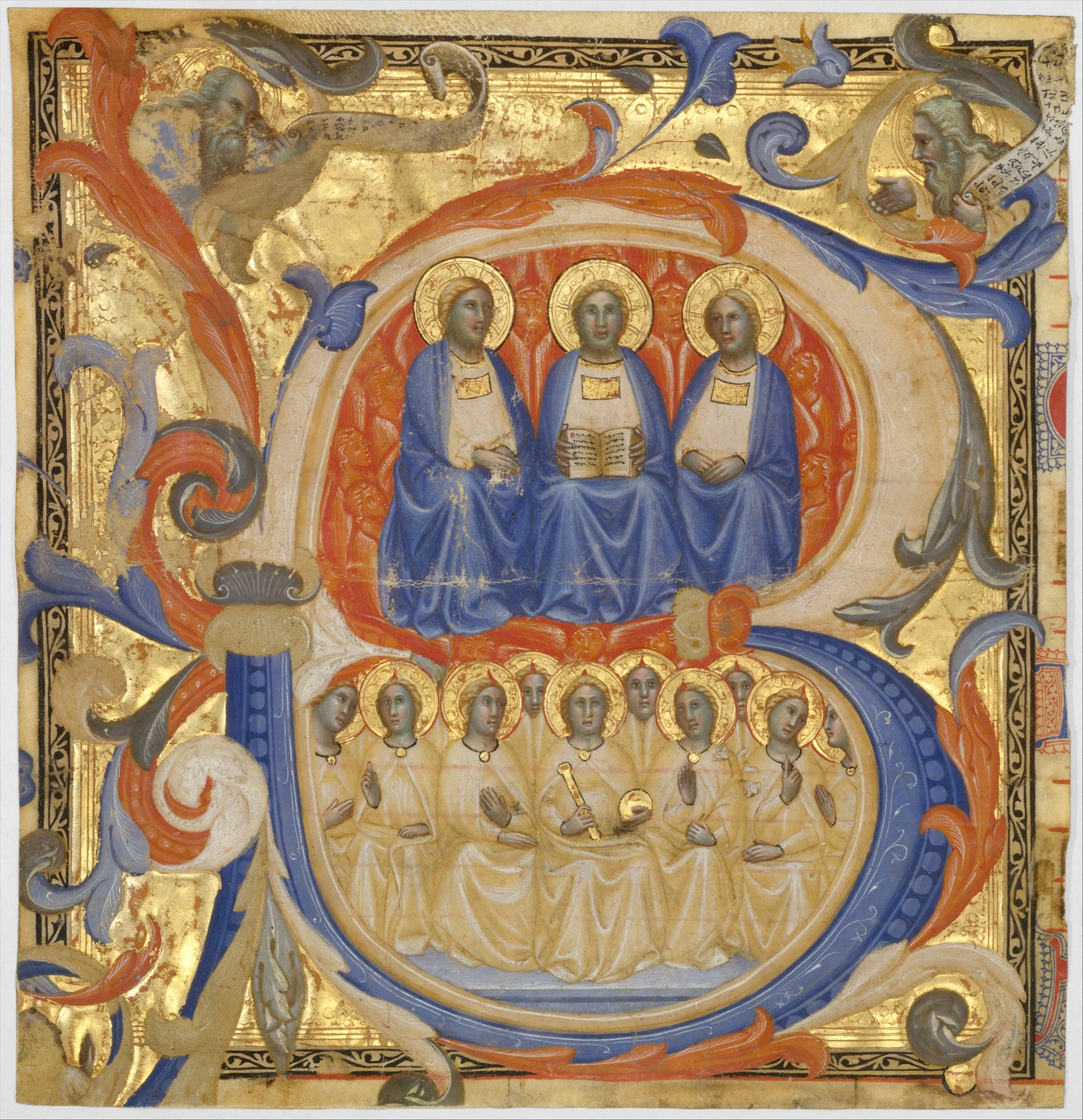
The top of the ladder. A historiated initial B (Siena, probably 1387): the Trinity enthroned in the letter's upper bowl, a choir of angels below, the letter itself standing on burnished gold. When one letter carries a whole scene, every reader knows without being told that what follows outranks everything else on the page.
The Trinity in an Initial B. Master of the Codex Rossiano, Italian (Siena), probably 1387. The Metropolitan Museum of Art, New York, Robert Lehman Collection (1975.1.2476).
Here is the heart of the lesson. Medieval decoration was not applied where there happened to be room. It followed a strict internal logic that scholars call the hierarchy of decoration, and its rule can be stated simply: the decoration of a book repeats and reinforces the structure of the text.
★ Every manuscript has its own consistent design logic, grand or modest. At the top stand the largest and most lavish initials, marking the beginnings of the most important texts, and they are placed, by strong convention, at the top left of the page, where the eye lands first. Their ornament can climb upward and spread sideways into the margin, claiming space the way important things claim attention. Below them come smaller initials for subdivisions within the text or for lesser texts, set partway down the page. Below those, perhaps, simple one-line initials in alternating red and blue, marking new sentences or verses.
★ The scholars who study this system describe it almost as a measuring language. An initial's importance could be read in the number of ruled lines it filled: a great historiated initial, twelve lines tall, opening a Gospel; a decorated initial of three or four lines marking a chapter; a single-line red or blue initial starting a paragraph. The scribe and the patron agreed on this grammar before the work began, and the reader, fluent in it, could open any page and know instantly where they were in the architecture of the book.
Color worked alongside size. You learned in our seventh lesson how rubrication, writing in red, catches the eye and says "something new starts here." The hierarchy used every tool available: size of initial, presence or absence of gold, red against blue, pen flourishing against painted miniatures. A historiated initial, with its tiny narrative scene enclosed in the letter's frame, outranked a merely decorated one. A decorated initial outranked a plain red versal — a simple enlarged letter, usually in red, standing as an emphasized capital within the text. Each step down the ladder was a step down in textual importance, and the whole system was as legible to a medieval reader as chapter titles and subheadings are to you.
★ Notice what this means for the scribe's planning. The spaces for the great initials had to be left empty during copying, sometimes for weeks or months until the turn of the illumination — the gold and painted decoration — came, and the illuminator with it. The scribe wrote around holes in the text block, trusting the plan. And sometimes, as unfinished manuscripts show us, the illuminator never came, and the holes remain: blank squares in the text, with perhaps a tiny guide letter penciled in the margin telling the painter which letter to draw. The plan outlived its execution, and we can still read it.
Check in: An initial fills twelve ruled lines; another fills one. What is each one telling the reader, and what else besides size did the hierarchy use to rank them?
❦ In your workbook: draw the ladder of decoration as a ranked list: great initial, lesser initial, one-line initial, with the ruled lines each fills and what each one announces.
In your packet: Exercise III — The Hierarchy Analysis ✎ begins here. Work it now, or mark the place and take it as homework — your choice.
The Bookkeeping of the Book
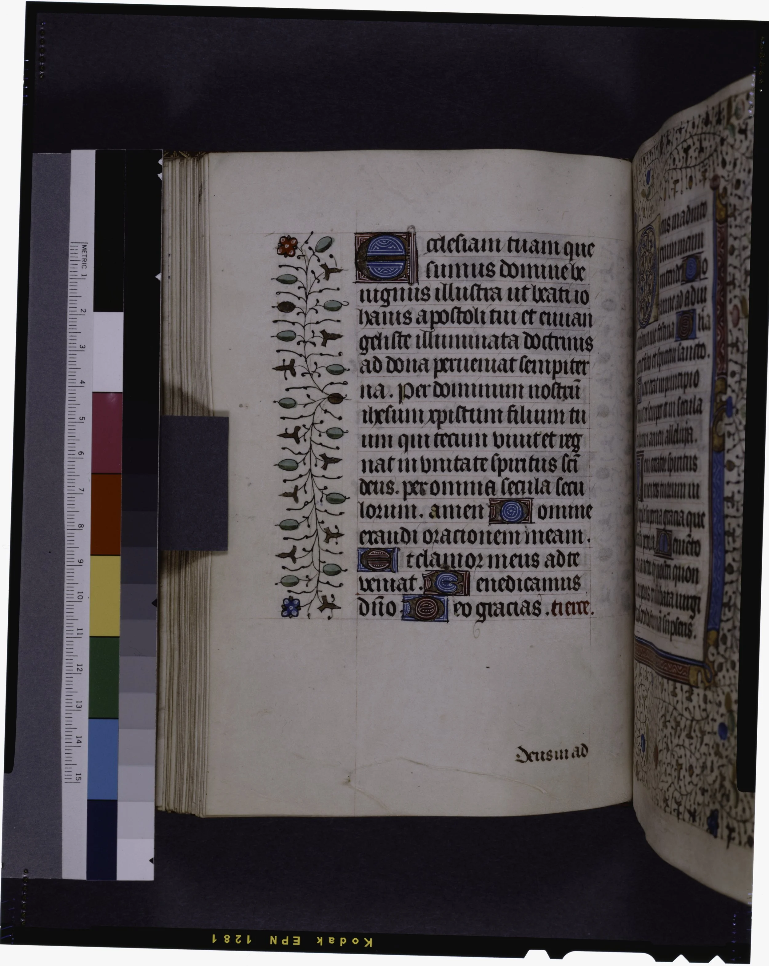
The ladder on a working page, and the bookkeeping at its foot. A Book of Hours page (France, 1400s): initials at three sizes, rubrics, line fillers, and placemarkers, the lines ruled in red — and in the lower margin the catchword "Deus in ad…," the first words of the next gathering, so the binder could keep the book in order.
Book of Hours page with catchword, initials, rubric, and placemarkers. New York Public Library (Manuscripts and Archives Division); census of medieval manuscripts (De Ricci) no. 1319.
A book is many quires, and quires must go in order. The medieval book trade solved this with a set of small, practical marks that are worth knowing, because they show the same planning mind at work on the scale of the whole volume.
The quire itself is the basic unit: a few sheets folded together into a booklet, usually of four to six folded sheets making eight to twelve leaves. The scribe copied onto the quire's pages while they were still loose and flat, which is far easier than writing in a bound book, and the quires were assembled and sewn only after the writing and most of the decoration were done.
★ To keep the quires in sequence, scribes used two devices. The first was the signature mark: a letter or numeral written on the quire's leaves, such as the letter of the quire plus the leaf number, telling the binder exactly where each leaf belonged. The second was the catchword: the first word or words of the next quire, copied into the lower margin of the last page of the current one. If the catchword matched the first word of the following quire, the order was correct. Catchwords are so characteristic of organized, professional production that scholars treat them as evidence of a proper workshop, and some scribes made them beautiful, flourished and colored, little artworks in their own right.
Smaller navigational aids worked at the level of the page. The running head, repeated across the tops of pages, told the reader which work or section they were in. Chapter numbers, paragraph marks, and foliation, the numbering of leaves, accumulated over the centuries as readers demanded more from their books. Each of these is a small piece of hierarchy, a small decision about how the eye should travel. Two more name tags belong to the age before title pages: the incipit, the first words of a work, by which the book was known and cited, and the explicit, its last words, which closed it — a book's name tags at either end.
Step back now and see the whole system. The prick holes plan the lines. The lines bound the text block. The margins frame it and insure it. The initials and rubrics rank its parts. The catchwords and signatures order its quires. The running heads orient its reader. From the placement of a single line to the assembly of a hundred quires, one mind, the planning mind, governs it all. That is mise-en-page: not decoration applied afterward, but architecture decided first.
Check in: A binder picks up two quires and must know which one follows which. Which two devices on the pages answer him, and how does each one work?
❦ In your workbook: note how a catchword and a signature mark each keep a book in order, in one sentence apiece; then list the smaller aids that orient the reader page by page.
In your packet: Exercise IV — Design the Opening ◐ begins here. Work it now, or mark the place and take it as homework — your choice.
Professor Nocturne
A breath, scholars, and consider what you have just learned to see.
Every medieval page you will ever examine is a record of decisions made before the writing began. The prick holes are decisions. The ruled lines are decisions. The width of the margin is a decision about money. The size of the initial is a decision about importance. The catchword is a decision about order. Nothing on the page is accidental, and that is precisely why the page rewards study: it was designed to be read by eyes that understood its grammar.
You have spent four units learning the parts: the desk, the ink, the quill, the letter. This unit teaches you the whole. When you rule your own page in the demonstration that follows, you will feel the shift. You will stop thinking like someone holding a pen and start thinking like someone building a room the reader will walk through.
Measure twice. Rule once. The page remembers everything.
Guided Observation: Reading the Plan
Before beginning the practical exercises, study a medieval manuscript page and record your observations. Use a library's digital collection: the British Library's Digitised Manuscripts, the Getty's collection, or Gallica, the digital library of the Bibliothèque nationale de France.
Study:
- the margins: which is widest, which is narrowest, and what the proportions suggest
- the ruling: can you see prick holes in the margins, or the lines themselves
- the text block: one column or more, and how the columns are arranged
- the hierarchy: the largest initial on the page, and what it marks
- the color: where red appears, and what each red element announces
- the navigation: any running heads, catchwords, or quire marks you can find
Consider the following questions:
- Where does your eye go first on the page, and what put it there?
- How many levels of hierarchy can you distinguish?
- What was left for the reader to add, and where?
- If the illuminator had never come, what would the scribe's plan still tell you?
Record your observations carefully within your workbook.
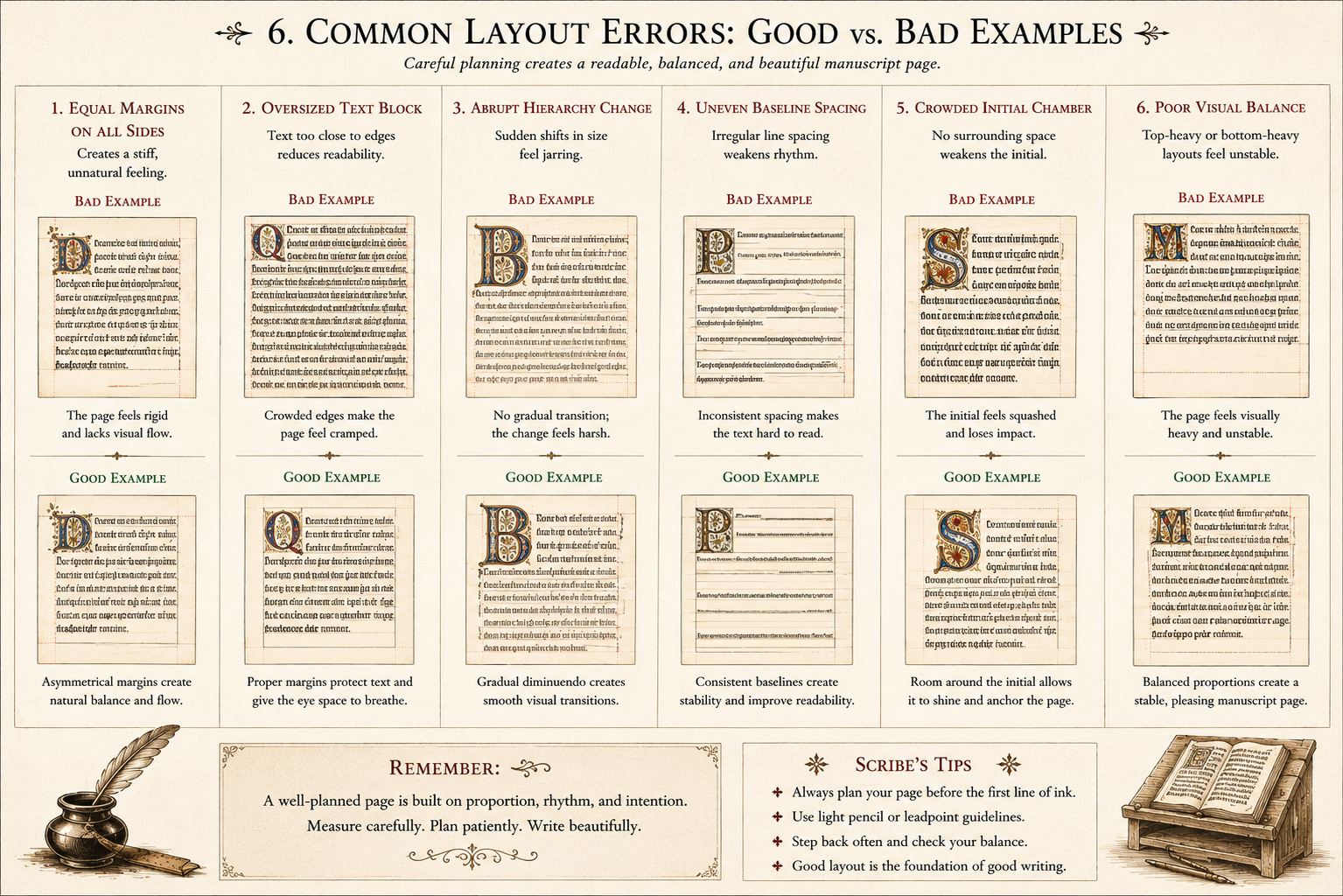
Six faults to hunt for in any plan you read: equal margins on all sides, an oversized text block, abrupt hierarchy changes, uneven baseline spacing, a crowded initial chamber, and poor visual balance - each fault shown beside the same choice made well.
School of Evershade teaching plate.
Demonstration: Rule the Page
Work with ordinary household materials: plain paper, a pencil, a ruler, and a pin or needle for pricking. No special purchases are needed.
Plan the Mise-en-page
Decide the purpose of your page before you measure anything. Is it a grand page for an important text, with wide margins and room for a great initial? Or a student's working page, its text block filling the sheet, its margins narrow? Write one sentence stating the page's purpose, and let every later decision serve it.
Prick the Margins
Mark the corners of your text block with pinpricks at measured intervals down the outer margin and across the top and bottom. Keep the inner margin narrowest, the top wider, the outer wider still, and the bottom widest. Note how the pricks record the whole plan before a single line is drawn.
Rule the Lines
Lay your ruler from prick to prick and draw the horizontal writing lines and the vertical bounding lines of the text block. Rule in pencil, as the twelfth-century scribe ruled in plummet. Count your lines and record the number: this is the measure by which your initials will later be sized.
Reserve the Initial
Choose where your great initial will fall, at the top left of the text block, and mark the space it will occupy: how many ruled lines tall? Leave that space empty. Write a tiny guide letter in the margin beside it, as the scribe did for the illuminator. If you are working at Level One, simply leave the space; at Level Two, sketch the initial's frame in pencil.
Add the Hierarchy
Write three lines of text in your best hand within the ruled block. Then add the hierarchy: a red heading above the text, a red initial for the first line, and a running head at the top of the page naming your text. Step back and ask the lesson's question: where does the eye go first?
Two typeset exhibits in your packet's Guided Practice set the plan at a glance: the canon of the margins, drawn as a planned page, and the ladder of the hierarchy, ranked as the lesson ranks it. Both are typeset from this lesson's own words, letter for letter.
In your packet: Exercise I — The Ruled Page ⚒ begins here. Work it now, or mark the place and take it as homework — your choice.
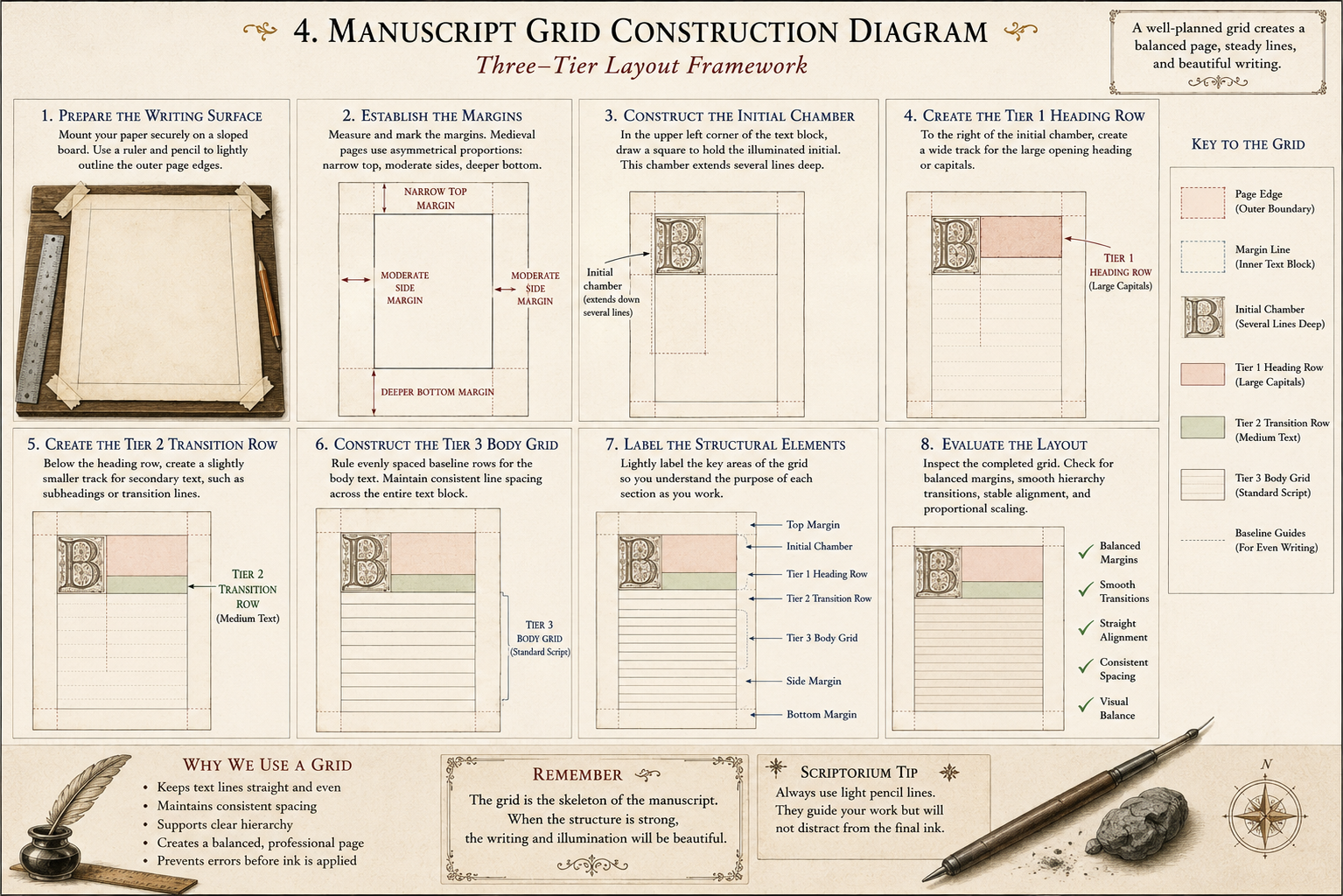
Building the grid in eight steps: prepare the surface, set the margins in their medieval proportions (narrow top, moderate sides, deeper bottom), construct the initial chamber, lay the three tiers in turn, label every part, and judge the finished layout before any ink touches the page.
School of Evershade teaching plate.
Materials
Required (Level One — household items)
- Plain paper: several full sheets for the ruling and layout exercises. Printer or drawing paper is ideal; avoid lined paper.
- A pencil and a ruler: your plummet and straightedge. A soft pencil (2B) marks like lead on parchment.
- A pin or needle: for pricking the margins. A thumbtack works as well. Mind your fingers.
- A red pen or marker: your rubricator's tool for headings, initials, and running heads.
- A dark pen: any pen for the text block itself. A broad-edge marker shows the hierarchy best.
- Internet access: for studying manuscript pages in a digital collection (British Library Digitised Manuscripts, the Getty, or Gallica).
- Your workbook: for the lesson's workbook prompts, the reflection answers, and the checklist.
Suggested (Level Two — historically closer)
- Parchment paper: from a craft store, for ruling and writing on a skin-like surface. Notice how differently it takes the pencil line.
- A pair of dividers or a compass: the scribe's measuring tool for stepping off even prick intervals.
- Red and black dip-pen inks: for writing the text block and rubricating the headings the way the lesson describes.
- A bone folder: for scoring blind-ruled lines by pressure, the pre-twelfth-century way.
No purchased kits or specialty tools are required. The core lesson (pricking, ruling, and designing a page) is fully achievable with paper, a pencil, a ruler, a pin, and two pens.
Reflection Questions
Answer in your workbook.
- Why did scribes plan the page before writing, rather than simply beginning in the upper corner?
- What does the survival of prick holes tell us about the binder's work, and what does their absence tell us?
- How does the hierarchy of decoration help a reader navigate a book without page numbers or a table of contents?
- Why might a scribe leave a space for an initial that was never painted, and what does the empty space still communicate?
- What is the difference between decoration and hierarchy, and why does the lesson insist the distinction matters?
- You have now studied the desk, the ink, the quill, and the letter. What does the planned page add that none of those parts provides alone?
Workbook Checklist — Lesson 17
In my workbook I have:
☐ defined the lesson's terms: mise-en-page, text block, recto, verso, quire, catchword, signature mark, running head, versal, historiated initial, gutter, incipit, and explicit ☐ explained why the page was planned before the writing began ☐ described pricking, and blind, plummet, and ink ruling in their centuries ☐ stated the margin order, narrowest to widest, and the canon's two proportions ☐ explained what margins cost, and what work they did besides display ☐ ranked the hierarchy of decoration and read an initial's size as its rank ☐ explained how catchwords and signature marks kept a book's quires in order ☐ ruled a full page from my own pricking, and designed a two-page opening with a design statement
☐ Lesson completed Date: ______________ Signature: ______________________
Professor's Review
And so the first lesson of Unit V is complete, and with it your view of the craft changes permanently.
Until tonight, you have been studying parts: the desk that holds the work, the ink that marks the page, the quill that carries the ink, the letterforms the quill draws. Tonight you studied the whole: the page as a planned architecture, every margin measured, every line ruled, every initial ranked, every quire ordered, before the writing began.
Carry this sight with you through the rest of the unit. In our next lessons we gild, we border, we people the margins with creatures. All of that ornament will make sense only if you remember what you learned tonight: decoration is not applied to the page. The page is designed for the decoration. The plan comes first, always.
Measure twice. Rule once.
PROFESSOR QUILLBERRY NOCTURNE
Scrollwork Library
Master Scribe & Illuminator
Cross-Class Connections

Runes, Unit V, Lesson 18 — The Celtic Manuscript Tradition.
Professor Webblethorn's Insular scribes worked this same hierarchy from the other side of the desk: great dotted initials, diminuendo stair-steps, pages planned for reverence. Her lesson carries the manuscripts' full history, which is hers to tell; this one teaches you to plan a page as those scribes planned theirs. Read hers for the story, scholars, then come back and rule your own.

Creative Arts, Unit II, Lesson 11 — Case Binding & Archival Boxes.
The catchwords and signature marks of this lesson exist for Professor Timberclank's binder: in his workshop the sewn gatherings you learned to order tonight become a text block, trimmed, lined, and cased in. Plan the quires well, scholars. His knife and his sewing frame are waiting at the end of your ruling.
Further Reading & Sources
For scholars who want to go deeper into the planned page, these are the places I send my own students first.
*Christopher de Hamel. Scribes and Illuminators. British Museum Press, 1992.* The classic short introduction, with a clear account of how manuscripts were planned, ruled, and laid out before writing began. De Hamel treats the scribe as a working professional making practical decisions, which is exactly the view this lesson takes.
*Raymond Clemens and Timothy Graham. Introduction to Manuscript Studies. Cornell University Press, 2007.* The standard student textbook. Chapter 4 covers the making of the manuscript: pricking, ruling, page layout, and the hierarchy of scripts and decoration, with diagrams of ruling patterns you can compare against your own ruled page.
Smarthistory. "The Work of the Scribe." Smarthistory: The Work of the Scribe A clear illustrated essay on pricking, ruling, quires, catchwords, and page design, with manuscript details you can zoom. The section on ruling patterns, including the "cobweb" of complex layouts, pairs directly with this lesson's demonstration.
University of Nottingham. "Laying Out the Text." Manuscripts and Special Collections. Nottingham: Laying Out the Text Margins, columns, and ruling explained with manuscript images, including the plain statement that larger margins meant a more expensive book, and scholastic pages designed with wide margins for glosses.
Dartmouth Ancient Books Lab. "Pricking and Ruling." Dartmouth: Pricking and Ruling A hands-on teaching page with a pricking and ruling template you can print and follow, plus a bibliography pointing to Clemens and Graham, the Oxford Handbook of Papyrology, and Stanford's online ruling-patterns course.
Erik Kwakkel. "The Medieval Page as a Designed System." Medievalbooks.nl. Kwakkel: Medievalbooks The blog of Leiden University's medieval book historian, full of short illustrated posts on ruling, layout, and the material logic of manuscript pages. Search the archive for "ruling" and "layout" for a term's worth of examples.
Browse the Scrollwork shelf in the school Library for readable editions of these works.
This lesson is the Commission Desk's whole trade. The canon of the margins, the ladder of initials, the plan made before the word — the Desk applies all of it to your own sheet and your own text, and hands you the measures. Rule the lesson's page first; then commission one of your own.
The Commission DeskPROFESSOR QUILLBERRY NOCTURNE · SCROLLWORK LIBRARY
Submit your work for this lesson using the form below.
CONTINUE IN THE SCROLLWORK LIBRARY
← Previous · Lesson 16: Insular & Early Medieval Scripts Next · Lesson 18: Gold Leaf & Gilding →
Unit V — Manuscript Decoration Scrollwork Library — All 26 Lessons
The rest of Unit V: Lesson 18 · Gold Leaf & Gilding · Lesson 19 · Botanical Borders & Ornament · Lesson 20 · Marginalia & Manuscript Creatures
From the Scrollwork Shelf
The printed companions to this lesson, from Professor Nocturne’s shelf in the shop.