SCROLLWORK
Unit IV · Lesson 14ROMAN CAPITALS
Professor Quillberry Nocturne
Master Scribe & Illuminator
The Scrollwork Library • School of Evershade
Professor's Introduction

Broad edges ready, scholars.
You have learned the desk, the ink, and the pen. You have cut the quill and felt the difference between the broad edge and the pointed nib. Now, at last, we write. And we begin where every serious student of Western lettering has begun for two thousand years: with the Roman capitals.
These are the letters on the monuments of Rome. They are the ancestors of every capital letter on your keyboard, every inscription on every courthouse, every title on every book you own. Before you learn them, understand what you are undertaking. The Roman capitals are not difficult because they are complicated. They are difficult because they are simple, and simplicity leaves nowhere to hide.
One warning before we begin, and I give it plainly because I respect you: this lesson will not make your hand elegant in an evening. It will give you the geometry, the stroke order, and the discipline. Elegance comes later, and only with repetition. Now pick up your pen.
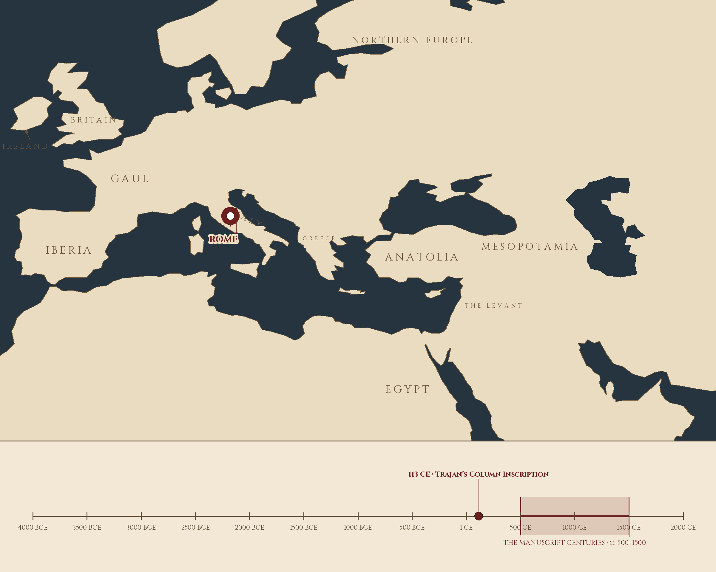
Where and when: Rome, Italy, 113 CE — Trajan's Column Inscription. The pin is this lesson. The line beneath the map is our road: every stop a place where writing changed, every lesson a pin.
Lesson Objectives
By the end of this lesson, students should be able to:
- Define ductus and explain why stroke order matters in broad-edge lettering.
- Identify the stem, bowl, and counter in a capital letter and explain each part's job.
- Define cap height and baseline and explain how they organize the letter.
- Describe the square-and-circle geometry behind Roman capital proportions.
- Explain why the 30-degree pen angle is the standard teaching convention for Roman capitals, and what it does to thick and thin strokes.
- Write the twenty-five capitals of this lesson — the classical twenty-three, plus U and W in their later forms — in their width groups, following the correct stroke sequence.
- Distinguish quadrata from rustic capitals and name the use of each.
- Explain the connection between the brush, the pen, and the chisel in the making of Roman letters.
Reading this lesson: ★ marks the passages to remember. They return on the unit quiz and the class test. Check in questions ask the material back as you go; answer them in your workbook when you meet them.
Working this lesson: Your assignment packet is the first download on this page. Work in it as the lesson moves along, answering each assignment as its subject is taught — or read the lesson through for your notes and take the assignments as homework afterward. Both are proper ways to sit this class. Signposts in the reading tell you where each assignment belongs. Written answers are short answers in your own words; a few honest lines are worth more than a filled page.
Your Assignment Packet
This lesson's assignments live in its packet: the Lexicon Handout (every term, course terms marked ◆), Materials, Guided Practice, the Assignment Manual with its answer key for self-checking, the Reflection Questions, and the Workbook Checklist. Download the packet before you begin and keep it beside you as you read.
The Letter That Taught the World
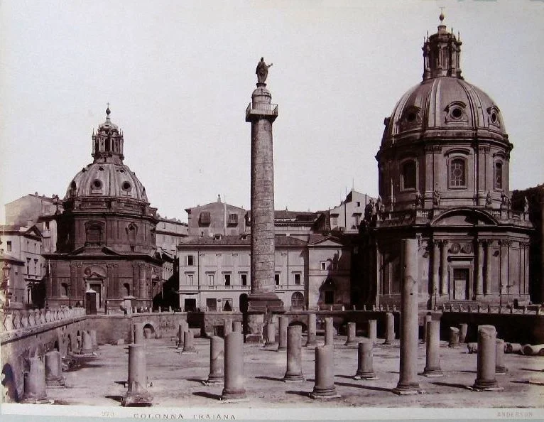
Trajan's Column in its Forum, Rome — photographed by James Anderson in the 19th century. The inscription this lesson studies is carved on the pedestal; the next two pictures bring you to reading distance.
James Anderson (1813–1877), photograph of Trajan's Column and Forum, Rome. Public domain. Via Wikimedia Commons.
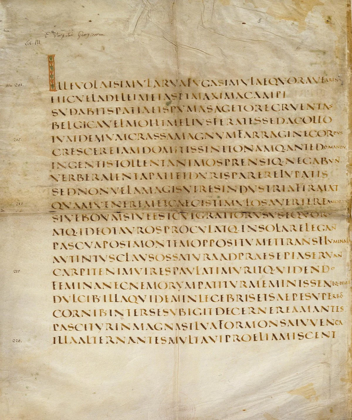
The Vergilius Augusteus (Berlin): Virgil's Georgics written in capitalis quadrata — the inscription's alphabet turned into a book hand.
Vergilius Augusteus, Staatsbibliothek zu Berlin, Lat. fol. 416. Public domain. Via Wikimedia Commons.
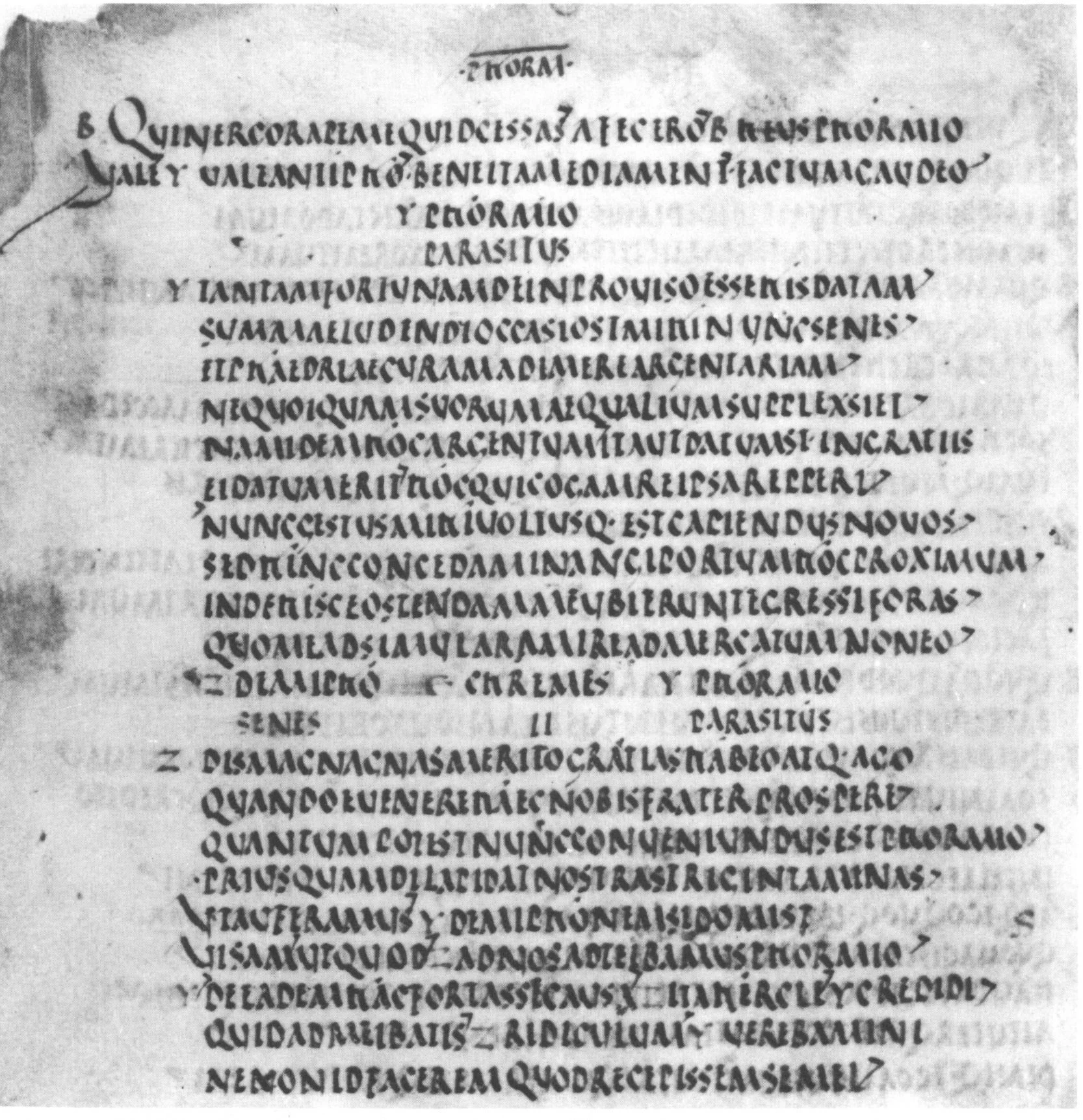
The Bembine Terence (Vat. lat. 3226, fol. 72r): Phormio in rustic capitals — narrower, quicker, denser than quadrata, and the hand most Roman books were actually read in.
Codex Bembinus (Terence), Biblioteca Apostolica Vaticana, Vat. lat. 3226, fol. 72r, 5th century. Public domain (black-and-white facsimile photograph). Via Wikimedia Commons.
Every alphabet you have met in the Runes course, from the Phoenician merchants' marks to the Carolingian minuscule, passes through Rome. The Roman capitals are the trunk of the Western lettering tree. They were carved on the monuments of an empire, painted on its walls, and written in its finest books, and when the empire fell, the letters remained: copied, revived, and taught ever since as the foundation of formal lettering.
★ The Romans themselves used several capital styles for different jobs. For everyday writing they had cursive hands, quick and informal. For literary manuscripts they used rustic capitals, a narrower pen-driven form you will meet in the lexicon. But for monuments, for the words meant to outlast the speaker, they used quadrata: square capitals, carefully proportioned, cut with serifs, the small finishing strokes at the ends of the stems, and separated by the centered dot called the interpunct. The inscription on Trajan's Column in Rome, dedicated in 113 CE, is the most famous surviving example, and it has served as the model for students of lettering for centuries.
★ Here is the fact that changes how you see these letters. In 1968, Father Edward Catich, a priest, calligrapher, and scholar who had spent years studying the Trajan inscription stone by stone, published The Origin of the Serif. His argument, built from close examination of the carved forms, was that the letters were not designed on the stone at all. They were painted first, with a flat brush, the way a sign painter lays out letters today, and the carvers cut the stone following the painted strokes. The serifs, the thick-and-thin (the alternation of wide and narrow strokes a flat tool lays down), the whole ductus of the inscriptional capitals: all of it began as brushwork.
This is why you, with a broad-edge pen in your hand, can learn these letters at all. The flat brush and the broad-edge nib are cousins. Both lay a wide mark in one direction and a thin mark in another. When you hold your pen at the fixed angle and pull the strokes in their proper order, you are retracing, stroke for stroke, the movements of the brush that painted the model the chisel followed. The pen teaches the hand what the brush knew.
Check in: Catich argued that the carved letters began as something else entirely. What was it, and why does that argument put a brush, not a chisel, at the start of the inscription's story?
One honesty is owed before we proceed. The 30-degree pen angle, the eight-nib-width letter height, the stroke sequences taught below: these belong to the revival tradition of calligraphy, the teaching lineage that runs through Edward Johnston and the twentieth-century calligraphers who reconstructed Roman capitals for the pen. We cannot know the exact angle at which a Roman brush-holder held his brush. What we know is the letterforms themselves, and the reconstruction is faithful to them: hold the pen as taught, follow the ductus as given, and the letters that result match the inscriptional model. That is the claim, and the letters on your page will test it.
★ The Roman alphabet as the Romans wrote it had twenty-three letters. There was no J, which is a later variant of I; no U, which is a later variant of V; and no W, which did not exist. Tonight you will learn the twenty-three — and U and W beside them in their later forms, because your own alphabet cannot do without them: twenty-five capitals in all. Only J stays out, waiting for later scripts and later lessons.
❦ In your workbook: record how the Roman capitals reached you — monument, book, and brush — in your own way — copy, sketch, or note what matters.
The Geometry of the Letters
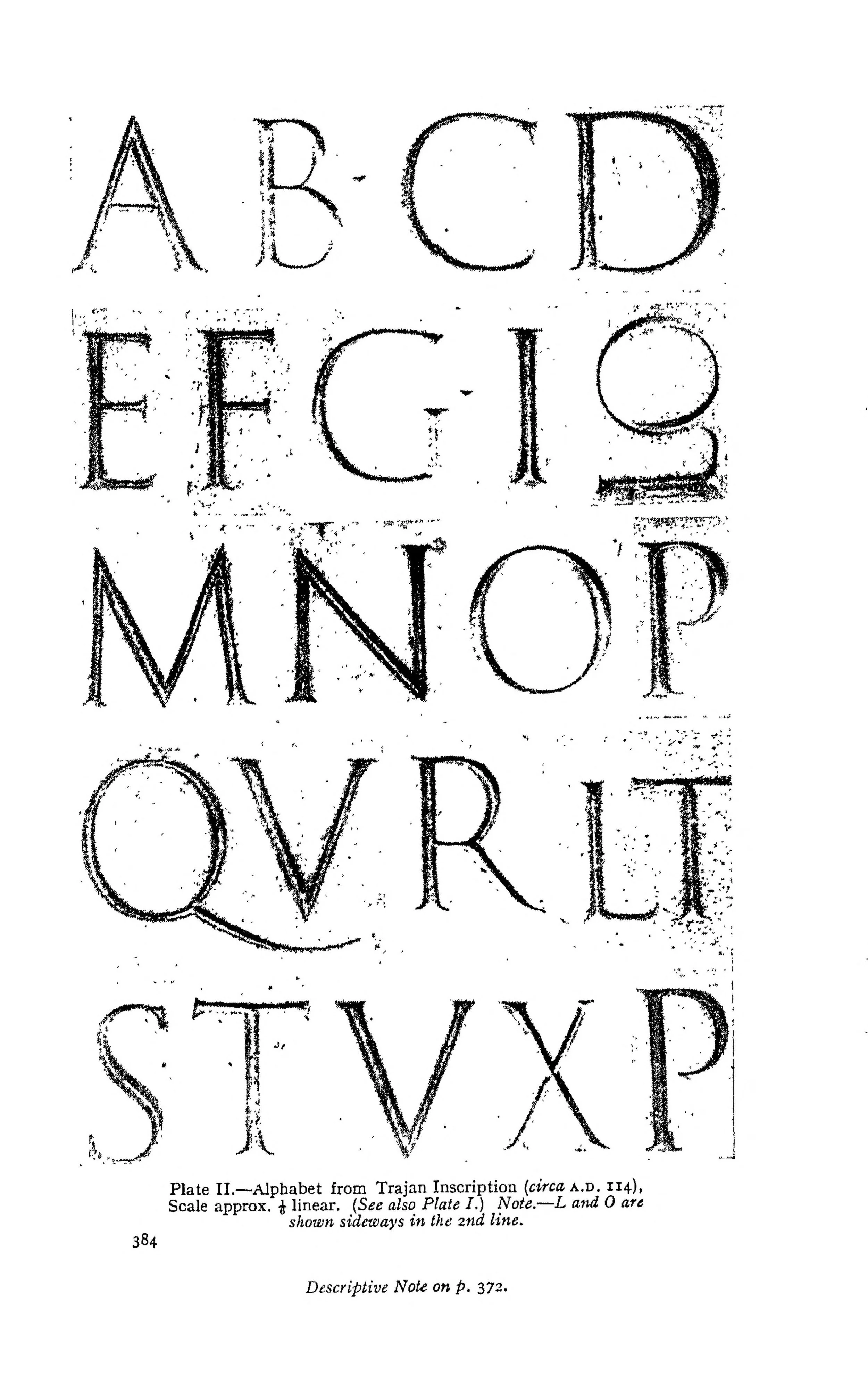
The inscription's alphabet, gathered letter by letter (Johnston's Plate II, 1906). Group them as the lesson does — round, straight, mixed — and check the geometry claims against the stone's own letters.
Letters of the inscription of Trajan's Column, Plate II in Edward Johnston, Writing & Illuminating, & Lettering (1906). Public domain. Scan: Internet Archive, Digital Library of India copy (in.ernet.dli.2015.105487).
The Roman capitals are built on the square. Draw a square, and nearly every capital fits inside it or inside a measured fraction of it. Draw a circle inside the square, and the round letters find their proportions. This is not mysticism; it is workshop practice. The square gives the letters their discipline, and the discipline gives the inscription its even rhythm along the line.
Calligraphy teachers group the capitals by width, and the groups follow the geometry:
★ The circle letters: O, C, G, D, Q. These are built from the circle, filling the full square. The O is the key to the whole alphabet: master the O's even thick-and-thin and its slight overshoot above the cap line and below the baseline, and the C, G, D, and Q follow from it. The D joins a straight stem — the letter's main vertical stroke — to half the O. The Q is the O with a tail. The white space each of these letters encloses is its counter: shaped silence, designed, not leftover.
The three-quarter widths: H, A, V, N, T, U, X, Y, Z. These occupy roughly three-quarters of the square's width. The A and V are built from the square's diagonals. The H is two stems joined by a bar. The N adds the diagonal between two stems. Learn these as variations on a rectangle, and their spacing along a line stays even.
The half widths: B, P, R, K, E, F, L, I. These occupy roughly half the square. The B, P, and R are built from circles in half the square: stem plus bowls — the rounded, enclosed parts of a letter. The E, F, and L follow the proportions of the B's stem and arms. The I is a single stem with serifs, the narrowest letter in the alphabet and the measure of your spacing discipline.
★ The broad letters: M and W. The M fills the entire square; the W is the widest letter of all, built as two V forms set side by side. Give them their full width. A cramped M is the most common fault in beginners' Roman capitals, and it throws off the rhythm of the whole line.
Check in: Which width group claims the M, and what happens to the line when a beginner refuses to give it its full room?
The S stands somewhat apart: it is formed from two circles stacked in half the square, and it is the hardest letter in the alphabet to draw well. Do not be discouraged when your S looks wrong for weeks. Every calligrapher's S looked wrong for weeks.
Spacing matters as much as the letters. Roman inscriptions were not spaced with the mechanical evenness of a typewriter; the carvers fitted letters by eye, giving more air around open letters like L and T and less around the round ones. On your practice page, aim for even color along the line: the white space between letters should look balanced, not measured. Words were separated by the interpunct, the centered dot you learned in the Runes course, or simply by a wider space.
❦ In your workbook: record the four width groups, and the letters that stand apart from them, in your own way — copy, sketch, or note what matters.
In your packet: Exercise III — The Word Study ⚒ begins here. Work it now, or mark the place and take it as homework — your choice.
Professor Nocturne
You have the geometry now, and the groups. Before you pick up the pen for the stroke sequences, a word from your professor.
The square is honest, scholars. It does not flatter your hand and it does not forgive a wandering stem. But it is also generous: once your hand learns the square, it has learned every letter, because every letter is the square, divided and curved. Trust the geometry before you trust your eye. Your eye will catch up.
The Pen and the Angle
★ Take up your broad-edge pen — the broad-edge nib you met in Lesson 11. For Roman capitals the nib is held at a pen angle of 30 degrees to the baseline: the edge of the nib sits at the angle a clock's hands make at two o'clock. Hold this angle constant through every letter. Do not rotate the pen in your fingers as you write. The angle is the machine that makes the thick-and-thin; turn the machine and the letters lose their logic.
★ Letter height is measured in pen widths. Turn your nib sideways and stamp its width on the page: that is one pen width. The standard teaching height for Roman capitals is eight pen widths from baseline to cap line. Rule your guidelines at this height. Eight widths gives the tall, elegant proportions of the inscriptional model; shorter letters look squat and lose the Roman dignity.
Pull every stroke; never push. The broad-edge nib writes when it is drawn across the page and splutters when it is shoved. Downstrokes go from the cap line to the baseline, pulled toward you. Horizontal strokes go left to right. The pen should glide, not scratch: if it catches, you are pushing, or your angle has slipped, or the nib needs attention.
Check in: Your stems are coming out thin and your horizontal bars thick. Before you blame the nib, what single thing should you check?
Two refinements belong to the advanced student but should be named now so you recognize them later. For the upright strokes of the N and the first stroke of the M, experienced calligraphers steepen the pen angle toward 60 degrees, which thins those strokes and keeps the letters from going muddy. For some serifs, the angle flattens toward 5 degrees, letting the corner of the nib draw the small finishing flare. You need not master these tonight. Learn the 30-degree constant first; the refinements will make sense when your hand is ready.
★ Keep the letters upright. Roman capitals have no forward slope: the stems stand vertical, and any lean is a fault. This is one of the first things the eye checks, and one of the last things the beginner's hand learns.
❦ In your workbook: record the angle, the height, and the pull of the stroke in your own way — copy, sketch, or note what matters.
Ductus: The Stroke Order of the Alphabet
★ A letter is not a shape; it is a sequence of movements. Write the strokes in the wrong order and the joins show it: the ink pools where strokes overlap, the corners go blunt, the rhythm stutters. The ductus below is the revival tradition's standard sequence. Learn it letter by letter, group by group, and do not improvise until the standard sits in your hand.
Circle letters. The O is drawn in two strokes: begin at the top, pull the left curve down and around to the bottom, lift, then draw the right curve from the top down to meet it. The two strokes meet at top and bottom; the joins should be invisible. The C is the left stroke of the O alone, beginning at the top right and sweeping down and around. The G is the C with a short horizontal spur added at the waist. The D is a stem first, then the bowl drawn from the top of the stem, around, and back to the bottom. The Q is the O with a straight tail flicked from inside the lower right, crossing the bowl's edge.
Three-quarter letters. The H is two stems, left then right, joined by a horizontal bar at the waist — the letter's mid-height. The A is drawn as two diagonals meeting at the apex, left stroke first, then the crossbar. The V is the same two strokes without the bar. The N is the left stem, then the diagonal pulled down from the top of the left stem to the baseline, then the right stem. The T is the crossbar first, then the stem dropped from its center. The U is two stems joined by a bottom curve, drawn without lifting. The X is two diagonals, the falling stroke first. The Y is the V with a stem dropped from the junction. The Z is the top bar, the diagonal, and the bottom bar.
Half-width letters. The B is the stem first, then the upper bowl, then the lower bowl, each drawn from the stem and returning to it. The P is the stem, then the single bowl from the top. The R is the P with a leg flicked from the bowl's junction down to the baseline. The K is the stem, then the upper diagonal arm, then the lower diagonal leg. The E is the stem first, then the three arms, top to bottom. The F is the E without the bottom arm. The L is the stem, then the foot drawn outward along the baseline. The I is a single stem with serifs top and bottom: the narrowest letter, and the test of your serif hand.
Broad letters. The M is the left stem, then the two inner diagonals, then the right stem: four strokes, full square width. The W is two V forms: draw the first V, then the second, sharing the middle junction. Give the W its full double width; it is the widest letter in the alphabet and it earns the space.
The S. Two stacked curves, drawn in one continuous movement if your hand allows it, or in two strokes meeting at the waist. The upper curve is smaller than the lower; the spine of the S should feel like a single gesture. Practice it more than any other letter. It will resist you, and then one day it will not.
Check in: Why does the lesson forgive a bad S for weeks, but not a wandering angle for a single letter?
Serifs are made with the corner of the nib, added as the final touch on a stem: a small horizontal flick at the top and foot. Keep them crisp and small. A serif should finish the letter, not decorate it.
❦ In your workbook: record the stroke order of one letter from each width group in your own way — copy, sketch, or note what matters.
In your packet: Exercise II — The Alphabet in Groups ⚒ begins here. Work it now, or mark the place and take it as homework — your choice.
Common Faults and Their Cures
Every beginner makes the same mistakes, which means every mistake has a known cure.
The wandering angle. The pen rotates in the fingers mid-letter, and the thick strokes land in the wrong places. Cure: stop and check the angle before every letter until holding it still becomes habit. The angle is the whole machine; guard it.
The cramped M and W. The broad letters are drawn too narrow, and the line goes uneven. Cure: rule the full square for the M and the double width for the W, and fill the space you ruled. Generosity with width is a Roman virtue.
The floating baseline. Letters drift above or below the ruled line. Cure: slow down at the bottom of every stroke. The baseline is a promise; keep it.
The heavy hand. Pressing too hard, so the thin strokes go thick and the nib splutters. Cure: let the pen's weight do the work. Broad-edge writing needs guidance, not force.
The timid serif. Serifs drawn as afterthoughts, blobby or missing. Cure: practice serifs alone, dozens at a time, until the corner of the nib makes them without thought.
The rushed ductus. Strokes in the wrong order, leaving visible overlaps and blunt joins. Cure: there is no cure but the discipline. Say the stroke order aloud as you write until the sequence is in the hand and the mouth can be silent.
❦ In your workbook: record the faults your own hand has already made, and their cures, in your own way — copy, sketch, or note what matters.
Guided Observation: Reading the Inscription
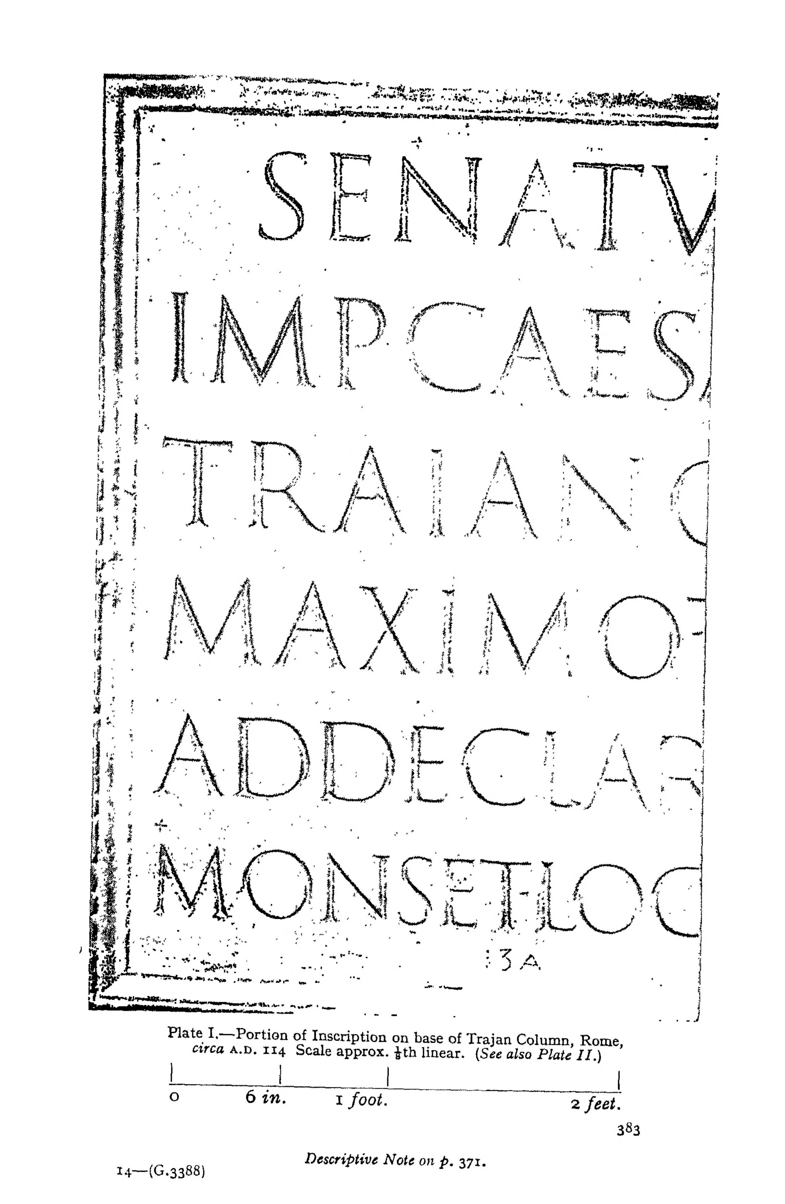
The inscription itself: the opening of the dedication on Trajan's Column (113 CE), reproduced at one-eighth scale as Plate I of Johnston's Writing & Illuminating, & Lettering (1906). SENATVS POPVLVSQVE ROMANVS… — read the letters, not the legend about them.
Inscription of Trajan's Column (113 CE), Plate I in Edward Johnston, Writing & Illuminating, & Lettering (1906). Public domain. Scan: Internet Archive, Digital Library of India copy (in.ernet.dli.2015.105487).
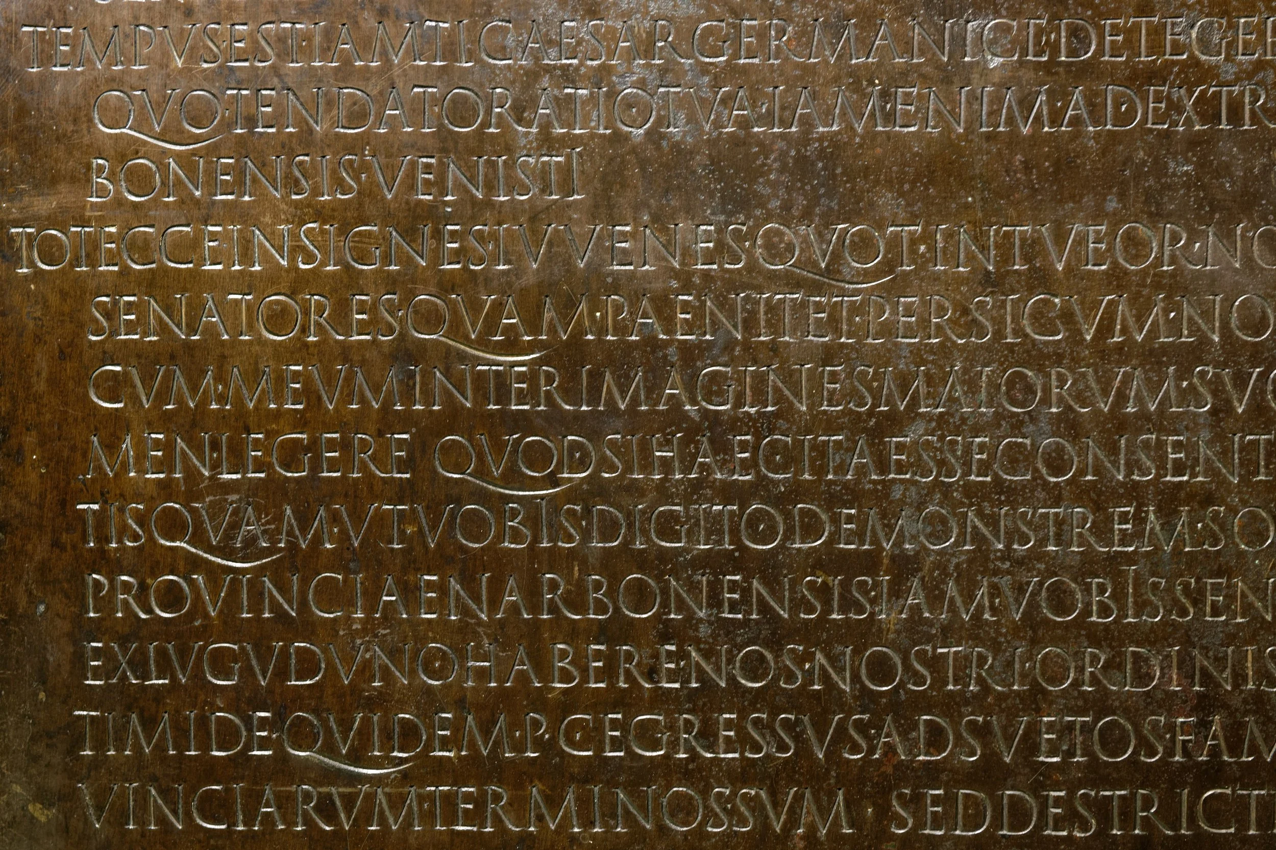
Monumental capitals you can read: detail of the Lyon Tablet (48 CE), Claudius's speech in engraved bronze — note the interpuncts, and the emperor's own extra letters at work.
Lyon Tablet (Tabula Claudiana), 48 CE; photograph by Marie-Lan Nguyen (Jastrow), 2008, released into the public domain by the photographer. Via Wikimedia Commons.
Before your hand attempts the letters, let your eye study them. Find a clear photograph of the Trajan's Column inscription (the Further Reading section gives you destinations). Look at it the way your professor taught you to read a desk: as a system of deliberate choices.
- Find the O and trace its thick-and-thin with your finger. Where does the thick stroke fall? Where does the thin stroke fall? Compare what you see with the 30-degree rule: does the inscription's contrast match what the fixed angle would produce?
- Find an M and an I side by side. Measure their widths against each other with a slip of paper. The M should fill roughly a square; the I is a single stem. Feel the rhythm those two widths set up along the line.
- Find the serifs. Look at how small they are, and how consistently they finish each stem. Notice that they are not decoration added afterward; they belong to the letter's structure.
- Find the interpuncts, the centered dots between words. Notice how they sit at mid-letter height, and how the spacing of the words breathes around them.
- Choose one letter you find beautiful and one you find difficult to read. Sketch both in your workbook, and write one sentence about what the beautiful one does that the difficult one does not.
Demonstration: The Eight-Width Setup
Your professor demonstrates the working setup. Follow along at your own desk.
Rule the Guidelines
Turn the nib sideways and stamp eight pen widths on a scrap: that is your cap height. Rule a cap line and a baseline in light pencil across the practice page. Add a waistline only if you wish; Roman capitals need only the two lines.
Set the Angle
Hold the pen at 30 degrees to the baseline. Draw a row of vertical stems, then a row of horizontal bars. The stems should show the nib's full width; the bars should show its thin edge. If they do not, adjust the angle, not the pressure.
Write the O
Draw the O in two strokes as the ductus teaches. Check the thick-and-thin: thick at the sides, thin at top and bottom. Check the overshoot: the curve should pass just beyond the cap line and the baseline. Draw ten O's. Keep the best and the worst; label what differs.
Build the Groups
Write each width group in turn: the circle letters, the three-quarter letters, the half-width letters, the broad letters, and finally the S. Say the stroke order aloud for the first pass through each group. Speed is the enemy; rhythm is the goal.
In your packet: Exercise I — The Stroke Drills ⚒ begins here. Work it now, or mark the place and take it as homework — your choice.
Materials
Required (Level One — household items)
- A chisel-tip marker or highlighter: the broad-edge stand-in. A wide marker held at a fixed angle reproduces thick-and-thin well enough to learn the ductus. Two widths are ideal if you have them.
- Plain paper: printer or notebook paper for drills and alphabets. You will fill many pages; keep them all.
- A pencil and ruler: for ruling the cap-height and baseline guidelines. Light pencil lines that erase cleanly.
- A printed alphabet reference: print or copy the lesson's width groups so the ductus is always in view while you write.
- Your workbook: for the lesson's workbook prompts and your dated records.
Suggested (Level Two — historically closer)
- A broad-edge dip pen or parallel pen: the real tool. A 3.8mm or 6mm parallel pen with dark ink gives the true thick-and-thin of the lesson. Dip pens with broad nibs also serve.
- Smooth practice paper: marker or layout paper that does not feather, so the thin strokes stay crisp.
- A quill cut with a broad edge: for the ambitious. Lesson 10 taught the cutting; this is where the cut meets the capital.
No purchased kits or specialty tools are required. The core lesson (angle discipline, stroke order, letter geometry) is fully achievable with a chisel-tip marker, paper, pencil, and ruler.
Reflection Questions
Answer the following questions in your workbook.
- Why does the lesson insist that a letter is a sequence of movements rather than a shape? What goes wrong when the ductus is ignored?
- The 30-degree pen angle is called a teaching convention of the revival tradition, not a documented Roman practice. Why does the lesson draw this distinction, and why does it matter for honest scholarship?
- How does the square-and-circle geometry serve the inscription as a whole, beyond making individual letters beautiful?
- What does Catich's brush thesis change about how you understand the relationship between the pen in your hand and the chisel on the monument?
- Which letter group gave your hand the most trouble, and what did the trouble teach you about the group's geometry?
- The Romans had twenty-three letters where we have twenty-six. What does the smaller alphabet gain in the inscription, and what does it lose?
Workbook Checklist — Lesson 14
In my workbook I have:
- ☐ defined ductus and explained why stroke order matters in broad-edge lettering
- ☐ named the stem, bowl, and counter in a capital letter and explained each part's job
- ☐ defined cap height and baseline, and explained how they organize the letter
- ☐ described the square-and-circle geometry behind Roman capital proportions
- ☐ explained why the 30-degree pen angle is the standard teaching convention, and what it does to thick and thin strokes
- ☐ written the twenty-five capitals of this lesson — the classical twenty-three, plus U and W in their later forms — in their width groups, following the correct stroke sequence
- ☐ told quadrata from rustic capitals and named the use of each
- ☐ explained the connection between the brush, the pen, and the chisel in the making of Roman letters
☐ Lesson completed Date: ___ Signature: ___
Professor's Review
You have written the alphabet of an empire, scholars, and your hands are tired. Good. Tired hands have learned something.
Remember what this lesson was. Not the history of the letters: the Runes course keeps that history, and Professor Webblethorn tells it better than I. This was the technique: the angle, the ductus, the geometry, the faults and their cures. You came to the Scrollwork Library to learn how the letters are made, and now you know. The rest is repetition, and repetition is the part no professor can do for you.
Keep your drills page. When the Uncial lesson tempts you to admire its roundness, look back at these capitals and see where the roundness came from. Every script you will learn in this unit is a conversation with these letters. You have met the eldest speaker first, as is proper.
Practice daily. Ten minutes of stems will do more than an hour of admiring the Trajan photographs, though you should do that too.
PROFESSOR QUILLBERRY NOCTURNE
Scrollwork Library
Master Scribe & Illuminator
Cross-Class Connections

Runes · Lesson 9 — Classical Latin: The Architecture of Stone
I keep the centuries of these letters: the inscriptional tradition, the Trajan stone, and Catich's brush thesis argued in full, and my lesson points its scholars to Professor Nocturne's book hands descended from these forms. He gives your hand the geometry; I give you the history. Read mine with your drills page open beside it.
Runes · Lesson 17 — The Need for Speed
My scholars study the cursive and uncial hands that speed made necessary, and my lesson sets them comparing uncial's broad-edge roundness with the Roman capitals of my Lesson 9. When Uncial arrives in your next Scrollwork lesson, you will watch these capitals bend. My classroom holds the reason: speed. Come and learn it.
PROFESSOR THISTLELOOM WEBBLETHORN
Runes & Ancient Writing
Further Reading & Sources
- The Trajan Inscription. High-resolution photographs of the column's inscription are the single best study aid for this lesson. Search museum and university collections for "Trajan's Column inscription" and study the letterforms at large size before each practice session.
- *Edward Catich, The Origin of the Serif (1968).* The brush-thesis argument in full, from the scholar who spent his life on the Trajan stone. Demanding but foundational; the plates alone repay study. (WorldCat listing)
- *Sheila Waters, Foundations of Calligraphy (2006).* The modern teaching tradition's standard manual, including the Roman capitals ductus and the pen-angle refinements for N and M. The lineage of this lesson's technique runs through this book.
- Dartmouth Ancient Books Lab, "Rustic Capitals, Old and New Roman Cursive." A clear illustrated introduction to the Roman scripts for different jobs, including the Vergilius Romanus. (Dartmouth)
- Wikipedia, "Roman Square Capitals." A solid overview with gallery images, including the Catich thesis and its reception. (Wikipedia)
- Wikipedia, "Roman Lettering." The revival story: Edward Johnston, the Arts and Crafts movement, and how Trajan lettering became Britain's official style. (Wikipedia)
Browse the Scrollwork shelf in the school Library for readable editions of these works.
Sealed by Professor Quillberry Nocturne, Master Scribe & Illuminator, in the Scrollwork Library.
Eight pen widths to the cap height, the edge at thirty degrees. The Commission Desk plans whole pieces in this hand — pages, letters, scrolls — with the ladder this lesson set and the margins Lesson 17 will teach. When the capitals are yours, commission something worthy of them.
The Commission DeskPROFESSOR QUILLBERRY NOCTURNE · SCROLLWORK LIBRARY
Submit your work for this lesson using the form below.
CONTINUE IN THE SCROLLWORK LIBRARY
← Previous · Lesson 13: Spacing & Rhythm Next · Lesson 15: Uncial Script →
Unit IV — Foundational Calligraphy Scrollwork Library — All 26 Lessons
The rest of Unit IV: Lesson 12 · Pen Angle & Stroke Control · Lesson 13 · Spacing & Rhythm · Lesson 15 · Uncial Script · Lesson 16 · Insular & Early Medieval Scripts
From the Scrollwork Shelf
The printed companions to this lesson, from Professor Nocturne’s shelf in the shop.