
SCROLLWORK
Unit IV · Lesson 13SPACING & RHYTHM
Professor Quillberry Nocturne
Master Scribe & Illuminator
The Scrollwork Library • School of Evershade
Professor's Introduction
Watch the white, scholars, and welcome to the thirteenth lesson of our course.
In our twelfth lesson, you learned to control the pen: the steady angle, the disciplined stroke, the hand that does what it is told. Tonight we study what the hand is not touching. The empty paper. The silence between the marks.
Every beginner in this craft makes the same error, and I have watched it for longer than I care to admit. They practice their letters until the letterforms are beautiful, and then they write a page, and the page is ugly. The letters are correct. The page is wrong. And the reason is always the same: they were watching the ink and ignoring the paper.
A letter is ink surrounded by space. A word is letters held apart by space. A line is words floating in space, and a page is lines arranged in space. The scribe who masters the pen has learned half the craft. The scribe who masters the space has learned the rest, and the rest is the larger half.
Tonight we study spacing and rhythm: the invisible architecture that makes writing readable, beautiful, and calm. Watch the paper as closely as the ink. The paper is doing more work than you think.
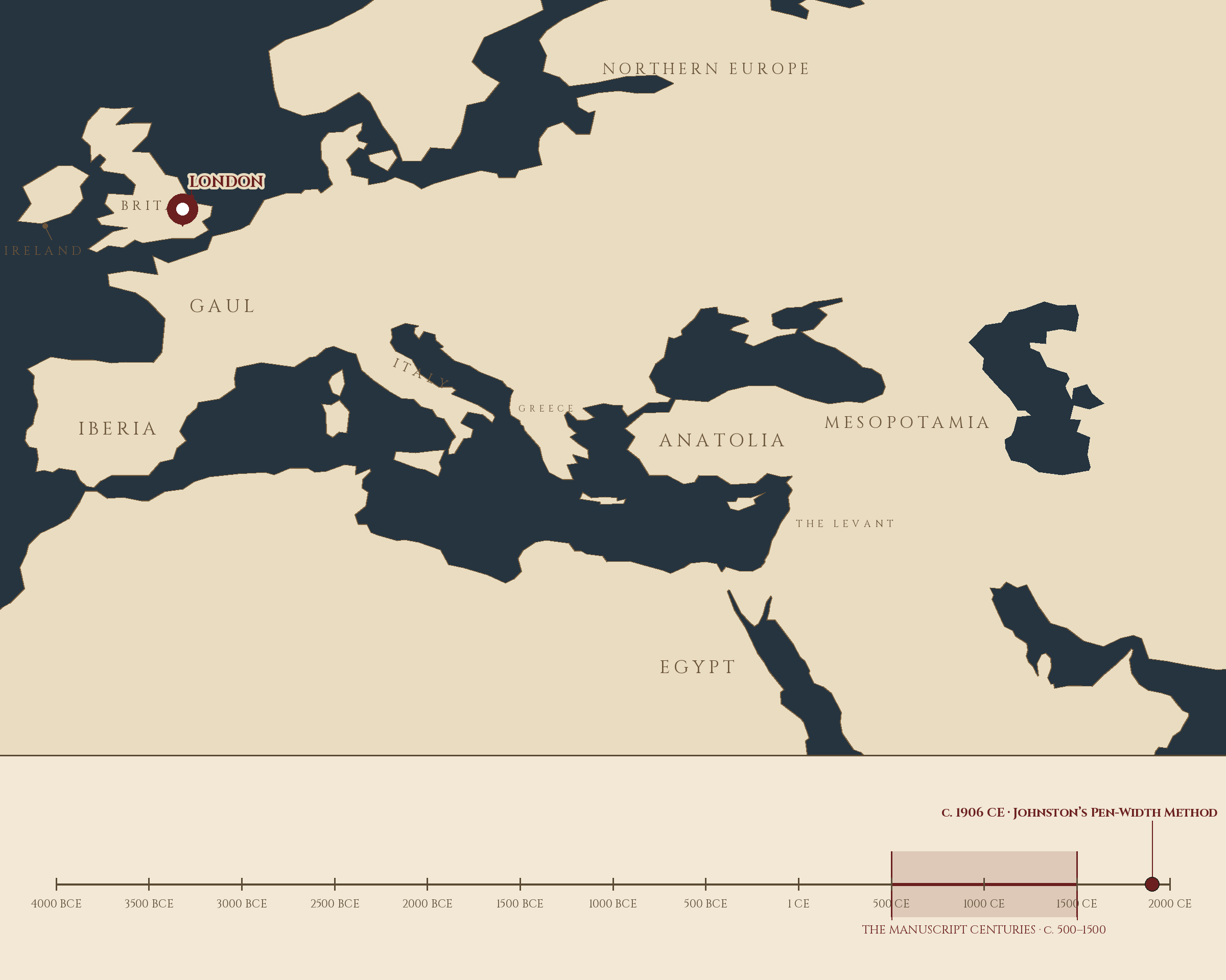
Where and when: London, England, c. 1906 CE — Johnston's Pen-Width Method. The pin is this lesson. The line beneath the map is our road: every stop a place where writing changed, every lesson a pin.
Lesson Objectives
By the end of this lesson, students should be able to:
- Define the baseline, x-height, ascender, descender, and counter and locate each on a written line.
- Explain the difference between letter spacing, word spacing, and leading, and judge each by eye.
- Apply the scribe's word-space guideline (the width of a lowercase n or o) in practice.
- Describe how medieval scribes ruled their pages: pricking, drypoint, leadpoint, and the rastrum.
- Explain the origin of the word "leading" in the lead strips of hand typesetting.
- Define type color and explain how spacing decisions change the apparent darkness of a page.
- Analyze the rhythm of a written page: the cadence of stroke and space that makes reading effortless.
- Space a short passage by eye, achieving even color across the page.
Reading this lesson: ★ marks the passages to remember. They return on the unit quiz and the class test. Check in questions ask the material back as you go; answer them in your workbook when you meet them.
Working this lesson: Your assignment packet is the first download on this page. Work in it as the lesson moves along, answering each assignment as its subject is taught — or read the lesson through for your notes and take the assignments as homework afterward. Both are proper ways to sit this class. Signposts in the reading tell you where each assignment belongs. Written answers are short answers in your own words; a few honest lines are worth more than a filled page.
Your Assignment Packet
This lesson's assignments live in its packet: the Lexicon Handout (every term, course terms marked ◆), Materials, Guided Practice, the Assignment Manual with its answer key for self-checking, the Reflection Questions, and the Workbook Checklist. Download the packet before you begin and keep it beside you as you read.
The Space Between Letters
Begin with the smallest space on the page: the gap between one letter and the next.
Write the word "minimum" in any broad-edge hand and look at what happens between the letters. Between the two straight stems of the n and the i, the gap looks wide. Between the curves of the m's arches, the same measured gap looks narrower. The ink has not changed. The distance has not changed. Only the shapes have changed, and the shapes lie to the eye.
★ This is the first law of spacing, and it governs everything that follows: the eye does not measure distance. It measures apparent closeness. Two straight strokes standing side by side read as farther apart than two curves at the same distance, because the curves lean toward each other and the straights stand apart. A scribe who spaces by ruler, giving every letter pair the identical gap, produces a page that looks uneven. A scribe who spaces by eye, giving straight pairs more room and curved pairs less, produces a page that looks even. The measurements differ. The appearance matches.
Edward Johnston, whose foundational hand you will meet properly when we study scripts, built his teaching on this understanding. The letters themselves matter, he insisted, but the spaces between them matter as much, because reading happens in the spaces as much as in the strokes. A word is not a row of letters. It is a row of letters and a row of gaps, and the gaps carry half the meaning.
Practice this first with pairs. Write "nn" and then "oo" at the same size, and make the white between the letters look the same in both pairs. You will find yourself giving the n pair visibly more room than the o pair. That extra room is not an error. It is optical spacing: the correction the eye demands, applied by the hand that has learned to listen.
Check in: Two letter pairs stand at exactly the same measured distance, yet one pair looks wider than the other. Which shapes make the wider-looking pair, and why?
❦ In your workbook: record the space between letters, and how the eye judges it, in your own way — copy, sketch, or note what matters.
In your packet: Exercise I — The Optical Pair Study ◐ begins here. Work it now, or mark the place and take it as homework — your choice.
The Space Between Words
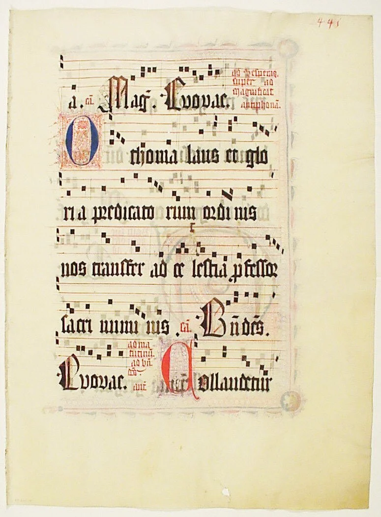
A choir-book leaf: the words are spaced to fit the chant above them, syllable under note, on staves ruled in red — five lines at a stroke with the rake-like pen called a rastrum.
Manuscript Leaf, from an Antiphonary, second quarter 15th century. The Metropolitan Museum of Art, Gift of Miss Alice M. Dike, in memory of her father, Henry A. Dike, 1928 (object 466716). Public domain (Open Access).
If letter spacing — the white adjusted between one letter and the next — is the craft's finest adjustment, word spacing is its most consequential decision. Get the word space wrong and the reader cannot tell where one word ends and the next begins, or the line breaks into islands of text floating in white, and reading slows to a wade.
★ The scribe's guideline is old and simple: make the word space about the width of a lowercase n or o in the hand you are writing. Not measured with calipers. Estimated by eye, and then refined by eye. The n gives a slightly generous space, the o a slightly tighter one; either lands in the right territory, and the choice between them is a matter of the script's character and the scribe's taste.
Why does this measure work? Because it keeps the word space in proportion to the letters themselves. A word space that is too small lets words collide: "the cat" becomes "thecat" to a tired eye. A word space that is too large breaks the line's rhythm: the eye must jump a gap that feels like a full stop, and the phrase falls apart into pieces. The n-width space is the middle path: clearly larger than any letter space within a word, clearly smaller than a line break, a pause the eye can step across without noticing the step.
★ Test it the way the old manuals suggest. Write a line of text, then turn the page upside down and look at it. Upside down, you cannot read the words, so you see only the pattern of black and white. If the words separate into clear islands with even water between them, the spacing is right. If some islands merge and others drift apart, the spacing needs work. The upside-down test removes meaning and leaves only spacing, which is exactly what you are trying to judge.
Check in: In your own words, why does the word space take its measure from the letters themselves, the width of an n or an o, instead of from a fixed measurement on a ruler?
❦ In your workbook: record the word space and the n-width guideline in your own way — copy, sketch, or note what matters.
In your packet: Exercise II — The Word Space Calibration ⚒ begins here. Work it now, or mark the place and take it as homework — your choice.
Professor Nocturne
Eyes up, scholars, and consider what you have learned, because the next section will ask more of your hands than this one has.
You have learned that the eye does not measure distance, and that the scribe must therefore space by judgment rather than by rule. You have learned the n-width word space, and the upside-down test for checking it. These are small things. They are also the entire difference between writing that looks professional and writing that looks practiced.
I am stern about spacing because spacing is where beginners reveal themselves. A student can hide weak letterforms behind enthusiasm. Nobody can hide weak spacing. It is visible from across the room, in the color of the page, before a single letter is examined. The page tells on you.
But here is the generous truth inside the stern one: spacing is the most learnable skill in this craft. Letterforms take months. Spacing takes attention. The student who starts watching the white space today will see the difference in a week. The paper is patient. It will wait for you to notice it.
Now we go downward, to the space between the lines, and to the oldest spacing technology in this craft: the ruled line.
The Space Between Lines
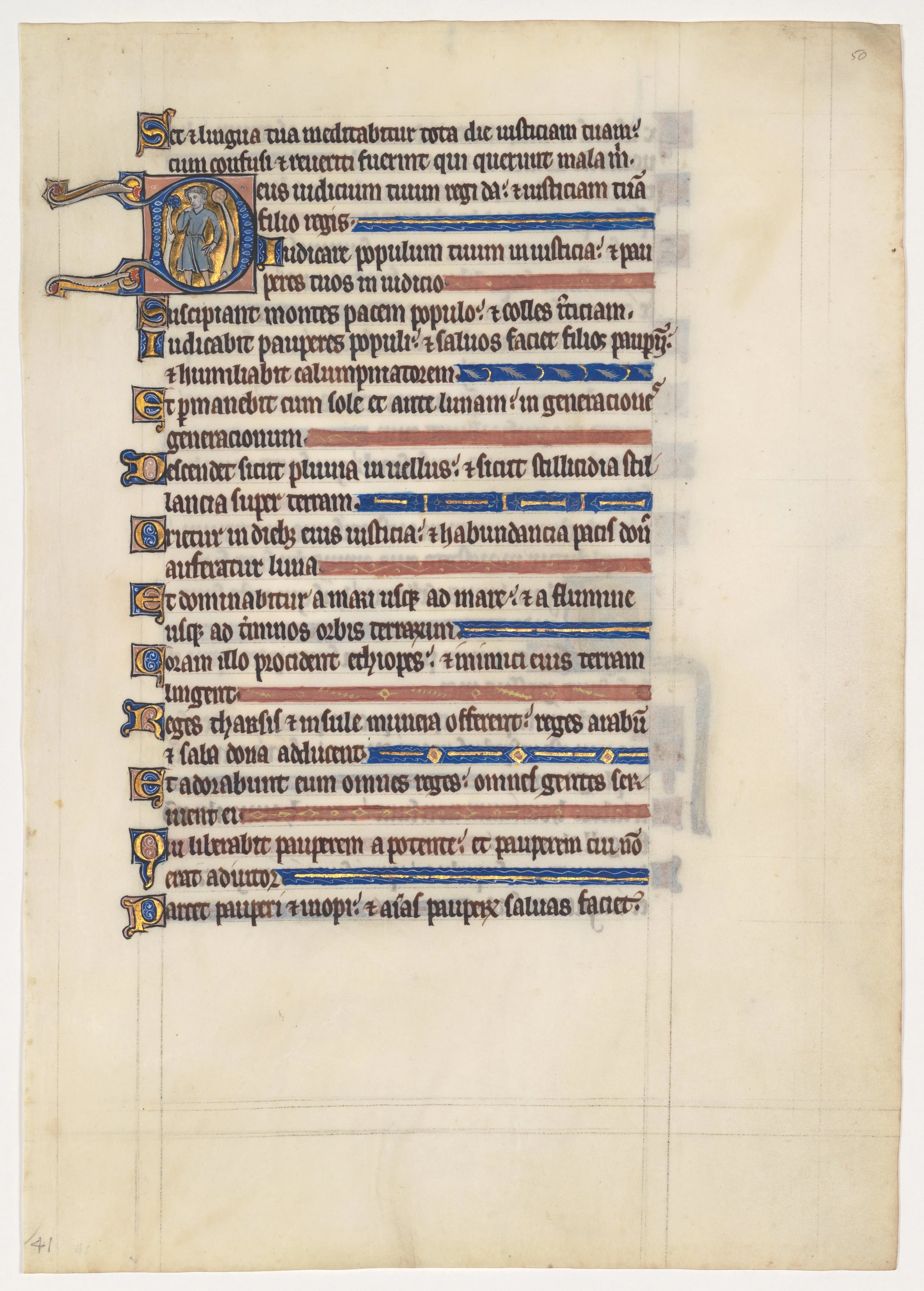
A psalter leaf ruled for more text than it received: below the writing, the scribe's empty ruled lines run on to the foot of the page — the grid every medieval page was built on, caught before the words arrived.
Manuscript Leaf from a Royal Psalter, 13th century. The Metropolitan Museum of Art, Rogers Fund, 1922 (object 466368). Public domain (Open Access).
Every line of writing sits on a baseline, the ruled line every letter rests on, and a line needs room above and below it. The ascenders reach up, the descenders reach down, and without enough vertical space the two neighbors tangle: the tail of a y in one line catches the stem of a b in the next, and the page becomes a thicket.
★ The modern word for this space is leading, pronounced "ledding," and it carries its history in its sound. In the days of hand typesetting, compositors placed thin strips of lead between the lines of metal type to open up the vertical spacing. The practice became common in the eighteenth century, and the strips gave the measurement their name: so much lead, so much leading. The word survived the metal type it described, and every page-layout program still uses it.
But the scribe's version of leading is far older than the printer's, and it begins with the ruled line. A medieval page did not arrive with guidelines. The scribe made them, and making them was a craft in itself.
★ First came pricking. The scribe took a gathered quire of pages and pierced tiny holes through the whole stack at once, using an awl or the point of a knife, marking the line positions in the outer margins. One pricking served every page in the gathering. The holes are still visible in the margins of surviving manuscripts, small punctures that outlived the hands that made them.
★ Then came ruling: joining the prick marks with lines. Before the twelfth century, the standard was drypoint ruling: a dry point, a hard stylus of bone, ivory, or metal, pressed into the parchment to score a groove. Drypoint ruling leaves no ink and almost no color; the guidelines appear only when the page is tilted to catch raking light. It is the most discreet ruling ever devised: a grid that guides the scribe and vanishes for the reader.
★ From the twelfth century, scribes increasingly ruled with leadpoint, a pencil-like instrument that left visible gray lines. From the thirteenth century, ruling in ink became common, often in colored inks that turned the grid itself into part of the page's decoration. And for pages that needed many lines in a hurry, there was the rastrum: several pens bound together like a rake, drawing a whole staff of lines in a single pass — a music scribe's tool, made for ruling the five lines of a music staff.
Notice what this history tells you. Every century found the ruling too slow and invented a faster way to do it, and every faster way left a more visible trace. The dry point was slow and invisible. The leadpoint was quicker and gray. The inked line was quickest and permanent. Speed and visibility traded against each other across four hundred years, and the scribe of each generation chose the balance their work required.
For your own practice, the lesson is simpler: rule your lines. However lightly, however invisibly, give each line of writing its measured space before the pen touches the page. The medieval scribe pricked and scored; you may use a pencil and a ruler. The technology differs. The discipline does not.
Check in: Across drypoint, leadpoint, and inked ruling, what was gained at each step, and what was lost?
❦ In your workbook: record the ruled line's history: pricking, drypoint, leadpoint, and ink, in your own way — copy, sketch, or note what matters.
In your packet: Exercise III — The Ruled Page ◐ begins here. Work it now, or mark the place and take it as homework — your choice.
Rhythm and the Color of the Page
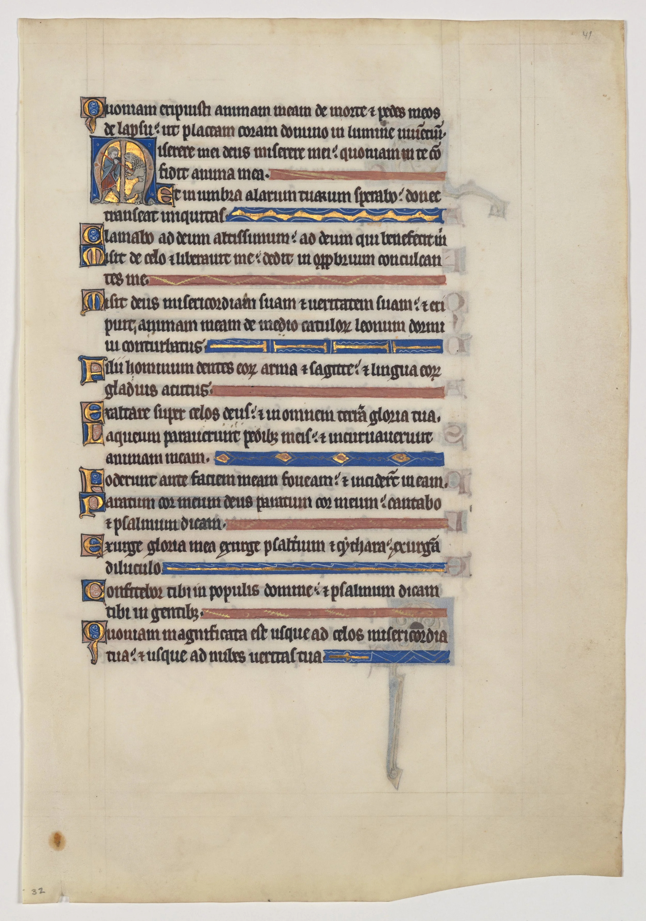
The finished texture of a Gothic psalter page: even, dark, and regular — and where a verse ends short, a painted line-filler in red, blue, and gold fills the measure so the block never breaks its rhythm.
Manuscript Leaf from a Royal Psalter, 13th century. The Metropolitan Museum of Art, Rogers Fund, 1922 (object 466367). Public domain (Open Access).
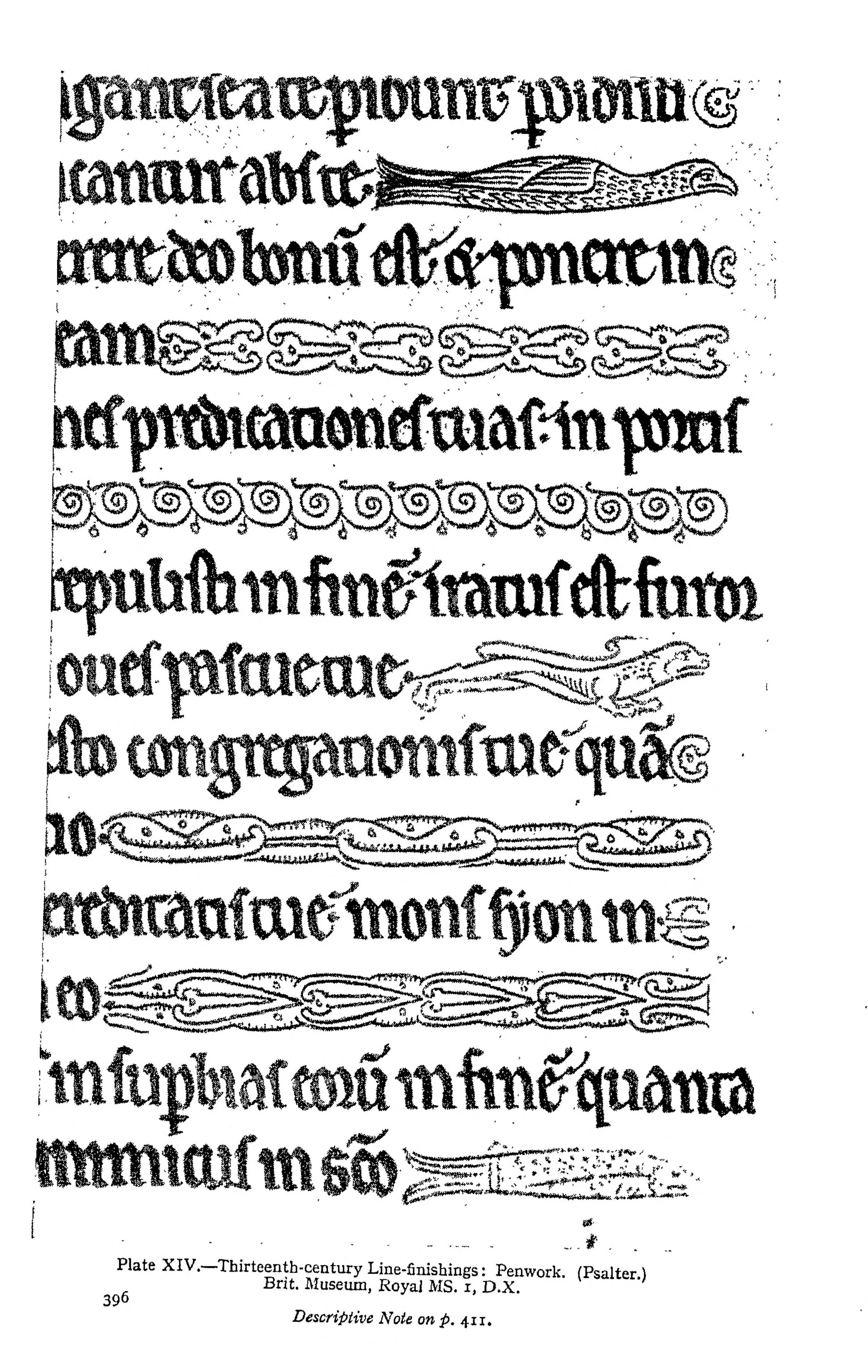
The verse-fillers of the psalter page above, enlarged: Johnston's Plate XIV (1906) — thirteenth-century line-finishings in penwork, from a psalter now Royal MS 1 D X. Decoration doing a spacing job.
Line-finishings from a 13th-century psalter (British Library, Royal MS 1 D X), Plate XIV in Edward Johnston, Writing & Illuminating, & Lettering (1906). Public domain. Scan: Internet Archive, Digital Library of India copy (in.ernet.dli.2015.105487).
Stand back from a page of good writing, far enough that the words blur, and look at the whole. What you see is not letters. It is a texture: a field of gray made of ink and paper in alternation, darker where the strokes cluster, lighter where the spaces open. Printers call this the type color of the page, and though the name belongs to printing, the phenomenon belongs to all writing. It is the first thing a reader perceives and the last thing a beginner learns to control.
★ Type color is set by four decisions working together: the design of the letterforms, the letter spacing, the word spacing, and the leading. Tighten any one of them and the page darkens. Open any one and the page lightens. A page of dense Blackletter with narrow leading is nearly black from across the room. A page of open Carolingian with generous leading is a pale, calm gray. Neither is wrong. But the color must be even: no line darker than its neighbors, no paragraph heavier than the next, no sudden patch where the scribe's attention wandered.
And evenness of color is the visible form of rhythm. Rhythm, in this craft, is the regular cadence of stroke and space repeated until the eye can predict it: the same letter gaps, the same word spaces, the same leading, line after line. When the rhythm holds, reading is effortless, because the eye knows where the next word will be before it arrives. When the rhythm breaks, when one word space gapes and the next pinches, the eye stumbles, and the reader feels the stumble as work, even if they cannot name its cause.
★ This is why spacing is not decoration. It is the mechanism of reading. The letters carry the meaning, but the spaces carry the reader, and a page whose spaces are uneven makes the reader work for every line. The scribe's courtesy to the reader is rhythm: the promise, kept line after line, that the next space will be like the last.
Check in: A page's color has gone dark and heavy. Name the four decisions you could loosen to lighten it.
❦ In your workbook: record type color and rhythm, and how the four decisions set them, in your own way — copy, sketch, or note what matters.
In your packet: Exercise IV — The Color Study ⚒ begins here. Work it now, or mark the place and take it as homework — your choice.
The White Inside the Letter
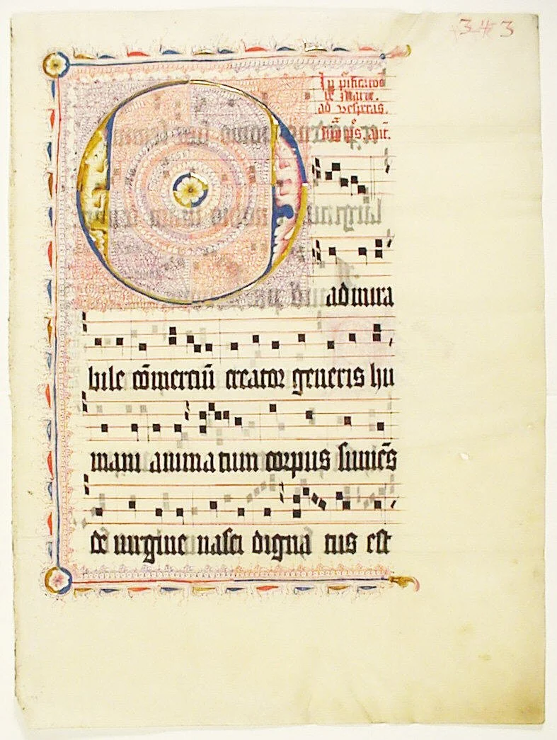
A choir leaf built around a single letter: the great O is nearly all counter — the white inside the letter, filled with pen-flourishing so fine it reads as texture from across a choir.
Manuscript Leaf with Initial O, from an Antiphonary, second quarter 15th century. The Metropolitan Museum of Art, Gift of Miss Alice M. Dike, in memory of her father, Henry A. Dike, 1928 (object 466713). Public domain (Open Access).
There is one more space, and it is the smallest and the most intimate: the white inside the letters themselves.
Look at a lowercase o. The ink is a ring. The meaning of the letter, what makes it an o and not a c, is the white enclosed in the ring: the counter. Look at an e, an a, a g. Every letter is a design in white paper as much as in black ink, and the scribe who draws only the strokes is drawing half the letter.
The counters must be even across a line of text, just as the spaces between letters must be even. If the o's of your line have full round counters and your a's have pinched ones, the line's rhythm breaks at the level of the letter itself. Watch the white inside the letters with the same attention you give the white between them.
And watch the vertical architecture: the x-height that gives the script its body, the ascenders rising to their consistent height, the descenders falling to theirs. These three zones, the body's band, the ascender space, the descender space, are the letter's own leading: the vertical spacing built into every character. A script whose ascenders wander, some tall and some short, has no rhythm in its heights, and the line dances when it should march.
Here is the complete picture, then, from the smallest space to the largest: the counter inside the letter, the gap between letters, the space between words, the leading between lines. Four scales of white, each governed by the same law: make it even, make it optical, and let the eye find its rhythm. The ink gets the admiration. The white does the work.
❦ In your workbook: record the white inside the letter: the counters, and the three vertical zones, in your own way — copy, sketch, or note what matters.
Guided Observation: Reading the White
Before beginning the practical exercises, study spacing the way a scribe studies it: by looking at the paper instead of the ink.
Find or print samples of:
- a page of medieval manuscript (the British Library's digitized manuscripts are freely viewable)
- a page of modern calligraphy, ideally in a broad-edge hand
- a page of ordinary printed text, such as a book page
For each sample, perform the upside-down test: turn the page over (or rotate the image) so the text cannot be read, and observe only the pattern of black and white.
Consider the following questions:
- Is the type color even across the whole page, or do some lines or paragraphs look darker than others?
- Can you see the word spaces clearly, or do some words merge while others drift apart?
- Look at the leading: is there clear air between the descenders of one line and the ascenders of the next?
- Find a line of lowercase text and compare the counters of the o's, a's, and e's. Are the white spaces inside the letters consistent?
Record your observations carefully within your workbook, noting which sample has the most even color and what you believe creates it.
Demonstration: The Three Spaces
Work with ordinary household materials. No special purchases are needed.
The Letter Space
Take a broad chisel-tip marker or a highlighter. Write the pair "nn" and then the pair "oo" at a large size, leaving what feels like the same gap between the letters in each pair. Now look: does the gap look the same in both pairs, or does the n pair look wider? Adjust the gaps until the white between the letters looks equal in both pairs, even though the measured distances differ. This is optical spacing. Note how much wider the n pair's measured gap must be to look the same as the o pair's. The same eye-correction governs the line itself: rounded letters dip a hair below the baseline and rise a hair above the x-height line — overshoot — so that curves look level with their straight neighbours.
The Word Space
Write the sentence "the quick brown fox" three times. In the first version, make the word spaces tiny, barely wider than the letter spaces. In the second, make them enormous, two or three letter-widths. In the third, make each word space about the width of a lowercase n in your writing. Turn the page upside down and compare: which version reads as a calm, even texture, and which versions break into merging or drifting islands?
The Leading
Rule three sets of lines on a sheet of paper: one with the lines close together (barely clearing your ascenders and descenders), one with generous space, one in between. Write the same four lines of text on each set. Compare the three blocks from arm's length: which has the calmest, most even color? Which feels cramped, and which feels disconnected? Note the leading you prefer, and measure it in pen widths (nib widths, in Lesson 12's name).
Materials
Required (Level One — household items)
- Broad chisel-tip marker or highlighter: for the letter-spacing demonstrations and exercises. Any flat-edged marker will do.
- Pen or pencil and plain paper: for word-spacing practice, ruling exercises, and the color study. Printer paper is fine.
- Ruler: for ruling lines and for measuring your optical-spacing results after the fact. The ruler judges afterward; the eye judges during.
- Pin or sharp pencil point: for the pricking demonstration in Exercise III. Handle with care.
- Camera or phone: for the thumbnail-size color check in Exercise IV. Squinting works as a substitute.
Suggested (Level Two — historically closer)
- Broad-edge dip nib and ink: the scriptorium writing kit. Real broad-edge contrast makes the optical-spacing lesson sharper than a marker can.
- Parchment paper: from a craft store. Takes ruling and ink more like the medieval surface.
- Bone folder or spent ballpoint: for a true drypoint ruling line, scored without ink, the way scribes ruled before the twelfth century.
No purchased kits or specialty tools are required. The core lesson (optical spacing, word-space calibration, ruling, and the color study) is fully achievable with a marker, paper, a ruler, and your eyes.
Reflection Questions
Answer the following questions in your workbook.
- Why does equal measured spacing between letters produce an uneven appearance, and what does the scribe do instead?
- The word space is traditionally set at about the width of a lowercase n or o. What goes wrong when the word space is much smaller or much larger than this?
- Medieval scribes moved from drypoint to leadpoint to inked ruling over several centuries. What was gained and what was lost at each step?
- What is type color, and which four decisions set it?
- Why is rhythm, the regular repetition of spacing, a courtesy to the reader rather than merely a decoration?
- You have now studied the counter, the letter gap, the word space, and the leading. Which of the four scales of white do you find hardest to control, and what will you watch for in your next page of writing?
Workbook Checklist — Lesson 13
In my workbook I have:
- ☐ defined the baseline, x-height, ascender, descender, and counter, and located each on a written line
- ☐ explained the difference between letter spacing, word spacing, and leading, and judged each by eye
- ☐ spaced letter pairs optically, and recorded which pairs needed the widest measured gaps
- ☐ stated my word space as a rule, set at the width of my own n or o
- ☐ ruled two pages, one tight and one generous, and compared their color and calm
- ☐ described how medieval scribes ruled their pages: pricking, drypoint, leadpoint, and the rastrum
- ☐ explained where the word "leading" comes from
- ☐ written a passage of even color, marked its faults, and corrected them in a second version
☐ Lesson completed Date: ___ Signature: ___
Professor's Review
And so we arrive at the end of our thirteenth lesson, and I will tell you plainly what you have gained.
You came to this craft watching the ink. You watched the pen make its marks, and you judged your work by the marks. That was natural, and it was incomplete. Tonight you have learned to watch the paper: the white inside the letter, the white between letters, the white between words, the white between lines. Four scales of emptiness, and every one of them is part of the writing.
The paradox of this lesson is that it teaches you to see what is not there. Nobody admires good spacing the way they admire a beautiful capital. Spacing earns no praise because, when it is right, it is invisible: the reader glides across the page and never knows why. That invisibility is the whole achievement. The scribe's finest work is the work nobody notices.
Keep the prick marks of this lesson in your margins. Rule your lines. Space by eye. Watch the white. In our next lesson, we take up the broad edge in earnest and write our first historical hand, and every space you have studied tonight will be waiting in it.
PROFESSOR QUILLBERRY NOCTURNE
Scrollwork Library
Master Scribe & Illuminator
Cross-Class Connections

Runes · Lesson 20 — Spacing & Punctuation
I teach why the spaces came: the unbroken stream of scriptura continua, the three heights of the distinctio, and the Irish invention of word separation in the seventh and eighth centuries. Professor Nocturne teaches your hand to make the spaces well. Between my history and your ruler, the page is fully explained. Come for the history.
Runes · Lesson 19 — The Birth of Lowercase
In my classroom the Carolingian reformers standardize the very anatomy this lesson measures: clear separated letters, ascenders and descenders held to their heights, word separation written into the standard, so a book copied at Tours could be read at Aachen. Their standard is this lesson's craft, frozen into law. Come and read the law, then go back and practice it.
PROFESSOR THISTLELOOM WEBBLETHORN
Runes & Ancient Writing
Further Reading & Sources
For scholars who want to go deeper into the world of spacing, these are the places I send my own students first.
*Edward Johnston. Writing & Illuminating & Lettering. 1906. (Public domain; widely reprinted.)* The founding text of modern calligraphy, and the source of this lesson's central discipline: spacing as the equal partner of letterform. Johnston's chapters on spacing and manuscript planning remain the clearest instruction ever written on the subject.
*Gerrit Noordzij. The Stroke: Theory of Writing. Hyphen Press, 2005.* Noordzij's analysis of how the pen's movement creates letterforms extends naturally to the spaces between them. Demanding but transformative background reading (he is not named in the lesson; its stated foundation is Johnston).
Smarthistory. "The Work of the Scribe." Smarthistory: The Work of the Scribe A clear visual introduction to pricking, ruling, and page preparation, with manuscript details showing blind ruling and plummet (leadpoint) lines. The best short online account of how medieval pages got their guidelines.
University of Nottingham. "Laying Out the Text." Nottingham: Laying Out the Text Pricking, ruling, margins, and columns in medieval books, with photographs of prick marks and ruled lines from the university's manuscript collections. Precise and richly illustrated.
Gresham College. "The Making of Medieval Illuminated Manuscripts." Gresham: Making of Medieval Illuminated Manuscripts A lecture-length account of manuscript production including the history of ruling materials: drypoint before the twelfth century, leadpoint after, pigmented ruling from the thirteenth. Authoritative and freely available.
Fonts.com. "Word Spacing." Fonts.com: Word Spacing The typographer's account of word spacing: the n-width and o-width guidelines, the optical judgment involved, and the upside-down test for checking your work. Written for type, directly applicable to the pen.
Browse the Scrollwork shelf in the school Library for readable editions of these works.
Submit your work for this lesson using the form below.
CONTINUE IN THE SCROLLWORK LIBRARY
← Previous · Lesson 12: Pen Angle & Stroke Control Next · Lesson 14: Roman Capitals →
Unit IV — Foundational Calligraphy Scrollwork Library — All 26 Lessons
The rest of Unit IV: Lesson 12 · Pen Angle & Stroke Control · Lesson 14 · Roman Capitals · Lesson 15 · Uncial Script · Lesson 16 · Insular & Early Medieval Scripts